
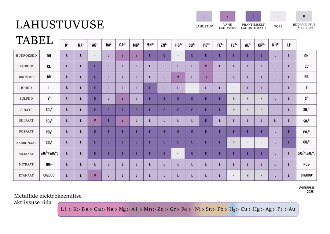
Made a solubility table redesign a while back, mainly because all the other ones felt unjoyous to look at. Let me know if you have corrections, suggestions, or any other notes.
Posted by Lehepeal


Made a solubility table redesign a while back, mainly because all the other ones felt unjoyous to look at. Let me know if you have corrections, suggestions, or any other notes.
Posted by Lehepeal
3 Comments
Love it! Your colour scale is a bit confusing though. The “nope” looks closer to “soluble” than “practically insoluble”.
Other than that, i want this in the wall on my lab as I’m always forgetting solubility!
I am not a chemist. What does “nope” mean?
The symbols for the elements across the top should have lowercase second letters. I would also group similar cations (eg the alkali metals and ammonium).