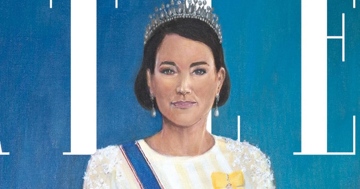
Artist behind ‘dreadful’ Kate Middleton Tatler portrait breaks silence with defiant response
https://www.mirror.co.uk/news/royals/artist-behind-dreadful-kate-middleton-32879038
Posted by Derry_Amc

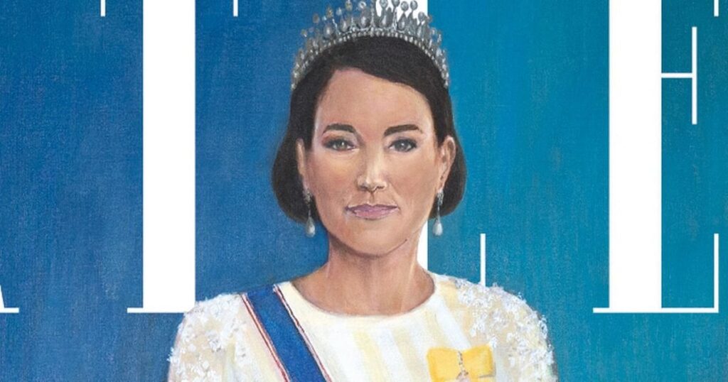
Artist behind ‘dreadful’ Kate Middleton Tatler portrait breaks silence with defiant response
https://www.mirror.co.uk/news/royals/artist-behind-dreadful-kate-middleton-32879038
Posted by Derry_Amc
19 Comments
I don’t see anything dreadful about it. I know I can’t paint anywhere *near* as good as that.
It really is incredibly poor and makes you question how this person can be a professional artist (which they seem to be?).
There’s a near infinite number of artists on Fiver that’d do a better job for about forty quid.
I’ve got it, it’s that bird from this morning! With a bit of Stephen segal thrown in.
What’s wrong with the painting? It doesn’t look to me as if it’s meant to be perfectly accurate, doesn’t seem like that’s the art style of the piece. I’m not clicking on a Mirror link but does it say it’s meant to be a realistic portrait?
Idk what’s happening but I think it looks nice. Very stylised, sure, but if I wanted photorealism I’d want a fucking photo.
I was ready to go to bat to defend this portrait and say that it’s absolutely fucking hilarious how for over 100 years right wing rags have hated any form of Impressionism. Some thing don’t change.
But then I read the quote
> Kate did not sit for the portrait and Uzor researched photos of her to inform her work, saying she had found more than 189,000 images of Kate in a picture archive.
And be real. You did not look at 189,000 images of Kate. You did not need that archive, you could have just Googled her. It’s embarrassing to say that. Just get one and say she didn’t sit and she painted from reference.
Good art ≠ realistic renderings of things exactly as they are in real life. Whether you like the style or not is one thing, but not every artist is trying to create something unmistakable and true to life, so commenting only on that misses the point.
> the British-Zambian artist
Now we know why she got the gig.
I don’t get the dreadful take looks pretty accurate
I honestly feel like I could do as good a job. Like seriously. I know a lot of people say that but before I decided to pack in education I was going to study art at university and oil portraits were my thing. I genuinely feel like I could do a good a job as this
In particular I think it just is flat, there is hardly any tone or dimension to the painting. The colours in the skin are muddied and there is zero depth. The forehead is essentially one block of colour, there’s just *nothing* about it. Personally I prefer much more dramatic colouring.
It also feels like it’s trying to be realism, but fails at doing so.
I dunno, I think it’s nice. Stylised, sure, but it’s not terrible at all.
She needs to go back to Art School, the portrait is a disgrace
I don’t mean to be cruel but that’s DEI policy in a nutshell.
I mean….. that one is shit but compared to the one of the king? At least they don’t need to call the ghostbusters for kates picture 😂
I’m shocked at how many people in this thread are saying that it doesn’t matter that the portrait doesn’t look like Kate because it’s the style the artist wanted..
Style doesn’t have to mean photo realism, but style absolutely should be able to represent subject matter in a way that is recognisable, and this just isn’t..
It’s not THAT bad, it’s a bit Modigliani. I rate it.
When you see how bad modern paintings can be, really makes me wonder how dreadfully inaccurate every painting of royalty in the medieval era must have been. God knows what they really looked like.
I feel like if the right side of her face/right ear wasn’t blurry then it would be much better
Did the editor of Tatler spill her coffee on the only draft?
This is a joke, right?
I have a degree in Fine Art so I can hold some weight and that is genuinely fucking awful for someone that’s a ‘professional’.
I got bones to pick with that right hand for starters, but even proportionally that left arm looks broken!
The length from Kate’s midriff to her hips is so comically short that it looks like she has giraffe legs.
Her melting left ear and the fabric is just streaks of nothing.
Granted Fabric is difficult to do but that doesn’t look like clothing, it has no semblance of flow, ripple or detail. The bottom just looks like rags.
Which angle does the light hit Kate? Fuck knows! Hannah fucking doesn’t but it ain’t where it should be.
The skin colour palette is so muddy and washed and that face… Jesus. Who’s tonal contrast? Ain’t heard of her.
No exaggeration when I say that I know A-level students can and would do better.
It’s a horror story the deeper you look at it.