it makes you realize the cold deserts near the poles really are deserts
analysisdead on
Looks like Manchuria has my kinda weather
kalipeeli on
Crazy to see southeast Asia just drowning in blue while central Asia looks bone dry.
Fornicatinzebra on
Your scale is unintuitive and should be flipped – more red = hotter (intuitively), you have red for precip. More precip should be more blue, because water is blue.

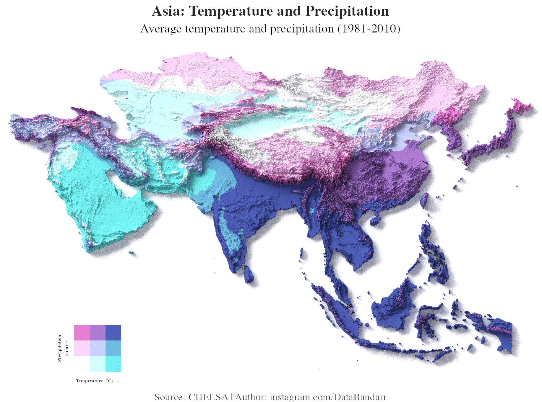
![[OC] Temperature and Precipitation Across Asia (1981-2010)](https://www.byteseu.com/wp-content/uploads/2025/08/dtann83tnrlf1-1536x1141.png "[OC] Temperature and Precipitation Across Asia (1981-2010)")
5 Comments
**Source:** [CHELSA Climate Data](https://chelsa-climate.org/?utm_source=chatgpt.com) (1981–2010).
**Tools:** R + Rayshader. Code: [GitHub](https://github.com/databandar/asiatempvsprec?utm_source=chatgpt.com).
Adapted from [u/milosmakesmaps](https://x.com/milosmakesmaps/status/1908898897646268686?utm_source=chatgpt.com), modified for Asia.
Colors represent **temperature (x-axis)** vs **precipitation (y-axis)** (quantile-based 3×3 bivariate scale). also here is another version of same plot , upvote this if you prefer this version.
https://preview.redd.it/sq4yd58bprlf1.png?width=1920&format=png&auto=webp&s=193182d79926c883d50f9d467a064adb215479f9
it makes you realize the cold deserts near the poles really are deserts
Looks like Manchuria has my kinda weather
Crazy to see southeast Asia just drowning in blue while central Asia looks bone dry.
Your scale is unintuitive and should be flipped – more red = hotter (intuitively), you have red for precip. More precip should be more blue, because water is blue.