They are dumb. Adoption is exponential yet they still think linear…
Natac_orb on
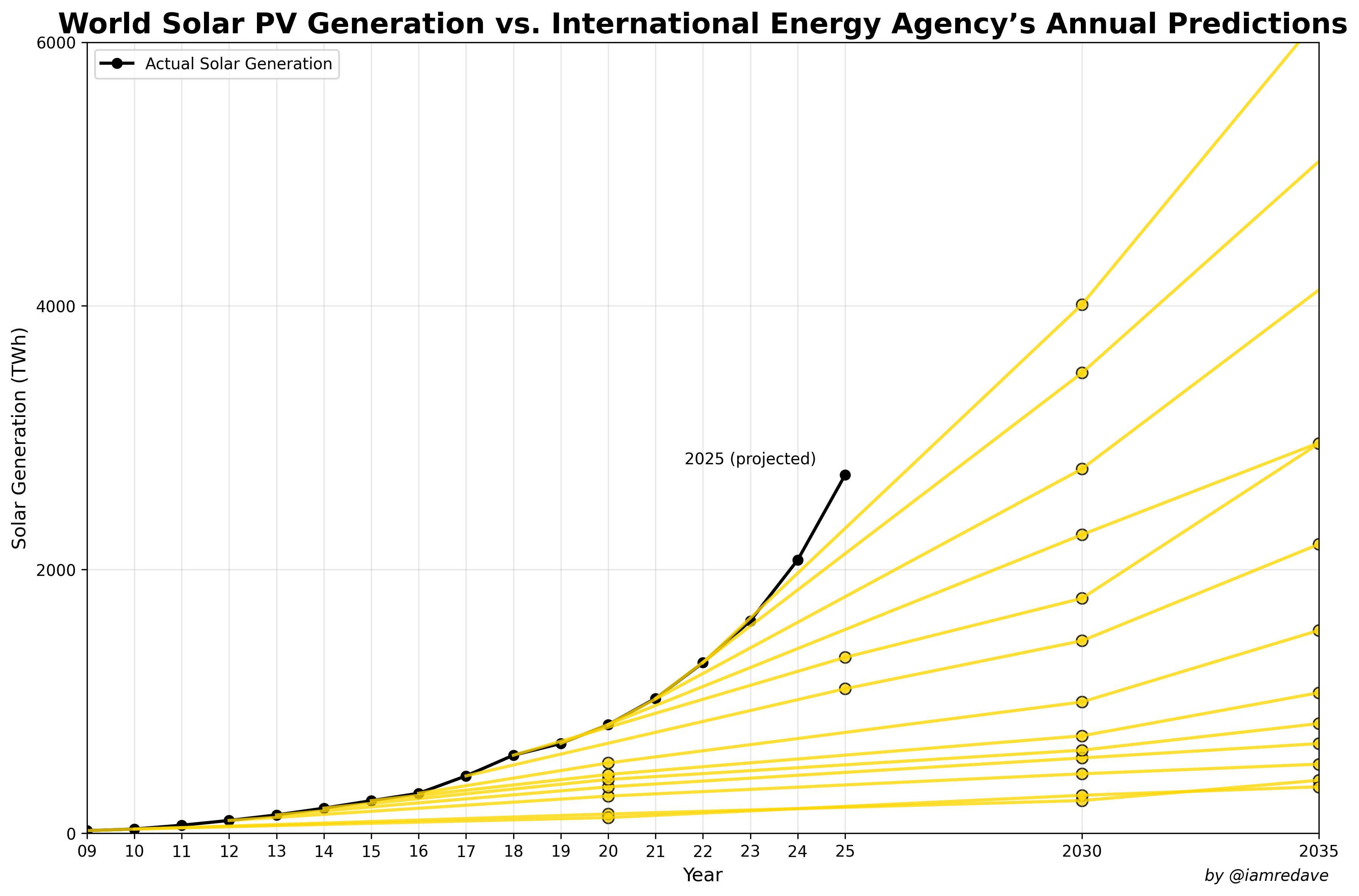
Why is the black line in the plot labelled “(projected)” but in the legend called actual generation?
Gedankensortieren on
Yellow lines are prediction?
jjpamsterdam on
I’ve seen this graph a few times over the last couple of days, but I think I like this version the most. It clearly outlines the past predictions still reaching into our current future and how the actual adoption has constantly outperformed them (and in all likelihood will continue to do so).
For most places solar energy is already a complete no-brainer both from the perspective of cost as well as resilience. The only issue we will increasingly have to face is the inherent volatility of solar energy generation, which will require better storage and/or a clever energy mix and distribution – nothing that can’t be overcome. Currently the only problem is the unfounded ideological opposition against solar energy by irrational governments, especially in the world’s largest economy.
sfrattini on
This is a good thing, right? Reddit?
shadesofglue on
What does each of the yellow lines represent?
Chemical-Gammas on
The yellow lines need some sort of labeling. I’m assuming the lower projections are earlier projections? Would be helpful to know which year they were projected.
DM_Me_Your_aaBoobs on
IAEA is a Fossil Energy lobby club. They constantly predict the prices and production of everything wrong, to make politicians worldwide believe, that nuclear and fossils are the way to go.
One example that really proves this: To be a member of the IAEA a country needs to have a strategic oil reserve of 90 days worth of consumption.
If you read something from the IAEA forget it, it’s bullshit paid by the oil dictators and fossil companies.
RwKroon on
Do they have a cheap excel version that only supports linear models? They should try exponential for a change
kushangaza on
What happened in 2019? That year is the only one clearly not following an exponential curve and looks like a major setback. Or was 2018 unusually good in some way that didn’t help future adoption?
harponen on
data scientists doing linear regression ffs
CamperStacker on
The storage problem is a massive hurdle because storage costs an order of magnitude more the production. It’s easy for solar to have its currently trajectory up to the point where it provides all the power during the day, but after that… there are no large grids on earth running off solar/wind/batteries.
CavemanSlevy on
Sources used? Labels for different yellow lines?
I guess not surprising that a top 1% contributor to this sub posts worthless information graphs. Line go up on a graph we like and monkeys clap with joy.
Slouchingtowardsbeth on
Thank whatever gods there be that China exists
Monsjoex on
steps scenario : stated policy scenario (what did countries commit to?
NZE: net zero emmissions scenario by 2050
Im not really sure whether these two scenarios in the report are actually meant as forecasts? More like this is what countries and committed to and this is what is needed to reach net zero in 2050?
_0h_no_not_again_ on
Yeah, I mean the initial capital is extremely manageable from 1kW to mutli-GW installation to access free fusion…
Shame it doesn’t always shine, and winters can be a bit slow, but the 5MW of generation off my roof this year in London says a lot IMO.

![Solar Electricity keeps beating Predictions [OC]](https://www.byteseu.com/wp-content/uploads/2025/08/1g6n1u9fobmf1-1536x1013.png "Solar Electricity keeps beating Predictions [OC]")
17 Comments
Data [from IEA](https://www.oecd.org/en/publications/world-energy-outlook_20725302.html) and ember-energy
Original was for capacity it is [here](https://www.abc.net.au/news/2024-07-03/energy-power-solar-leave-nuclear-in-the-shade/104049276) and i wanted to make an updated version using actual production that others could update and mod. [Python code and data are here](https://github.com/cavedave/Solar/blob/main/README.md)
They are dumb. Adoption is exponential yet they still think linear…
Why is the black line in the plot labelled “(projected)” but in the legend called actual generation?
Yellow lines are prediction?
I’ve seen this graph a few times over the last couple of days, but I think I like this version the most. It clearly outlines the past predictions still reaching into our current future and how the actual adoption has constantly outperformed them (and in all likelihood will continue to do so).
For most places solar energy is already a complete no-brainer both from the perspective of cost as well as resilience. The only issue we will increasingly have to face is the inherent volatility of solar energy generation, which will require better storage and/or a clever energy mix and distribution – nothing that can’t be overcome. Currently the only problem is the unfounded ideological opposition against solar energy by irrational governments, especially in the world’s largest economy.
This is a good thing, right? Reddit?
What does each of the yellow lines represent?
The yellow lines need some sort of labeling. I’m assuming the lower projections are earlier projections? Would be helpful to know which year they were projected.
IAEA is a Fossil Energy lobby club. They constantly predict the prices and production of everything wrong, to make politicians worldwide believe, that nuclear and fossils are the way to go.
One example that really proves this: To be a member of the IAEA a country needs to have a strategic oil reserve of 90 days worth of consumption.
If you read something from the IAEA forget it, it’s bullshit paid by the oil dictators and fossil companies.
Do they have a cheap excel version that only supports linear models? They should try exponential for a change
What happened in 2019? That year is the only one clearly not following an exponential curve and looks like a major setback. Or was 2018 unusually good in some way that didn’t help future adoption?
data scientists doing linear regression ffs
The storage problem is a massive hurdle because storage costs an order of magnitude more the production. It’s easy for solar to have its currently trajectory up to the point where it provides all the power during the day, but after that… there are no large grids on earth running off solar/wind/batteries.
Sources used? Labels for different yellow lines?
I guess not surprising that a top 1% contributor to this sub posts worthless information graphs. Line go up on a graph we like and monkeys clap with joy.
Thank whatever gods there be that China exists
steps scenario : stated policy scenario (what did countries commit to?
NZE: net zero emmissions scenario by 2050
Im not really sure whether these two scenarios in the report are actually meant as forecasts? More like this is what countries and committed to and this is what is needed to reach net zero in 2050?
Yeah, I mean the initial capital is extremely manageable from 1kW to mutli-GW installation to access free fusion…
Shame it doesn’t always shine, and winters can be a bit slow, but the 5MW of generation off my roof this year in London says a lot IMO.