
![One of the most impressive things I’ve ever seen - the first completed map 2024 Presidential Election with demographic analysis for every single neighborhood in the country: [OC]](https://www.byteseu.com/wp-content/uploads/2025/09/esy3kfoadxpf1-1024x858.jpeg "One of the most impressive things I’ve ever seen – the first completed map 2024 Presidential Election with demographic analysis for every single neighborhood in the country: [OC]")
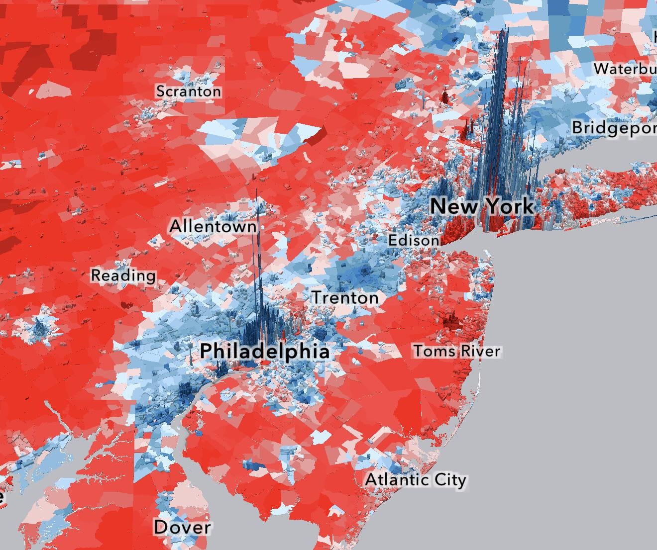
Kudos to VoteHub and Zachary Donnini for their crazy impressive work on this project! Requested by popular demand, I have reposted this map with the version that reflects population density, and on Thursday because that’s the only day r/DataIsBeautiful allows posts about politics. You can view that option, along with many other options to view neighborhood data, at the link below:
Posted by Hoosier_49
25 Comments
crazy how it looks like a huge red map until you see those massive blue spikes in NYC/Philly
Super cool visualization. The difference between black and hispanic voters is crazy to me considering how aggrssive Trumps rhetoric has been towards hispanics, also before the election. The white votes are pretty much as expected. Asian are more diverse than I expected, maybe a bit more blue.
It’s like a map of population density
Am I doing something wrong? When I hover over precints in dowtown Chicago [in the loop] it is showing well under 1,000 total votes.
Also, land doesn’t vote. These maps that color entire districts or regions for the winner make it look like a landslide. There are some that also show a consideration for the population, and some that show the proportion of votes not just the majority, much like the spikes in this map. Tends to make it way more neutral and much less red.
Trump played the electoral college well and won through that game.
The blues lost through optimism and lack of effort. Precipitous drop in turnout, probably thinking there’s no way it could turn out like it did.
As someone who spent the last three years leading up to the 2024 election in South Jersey… this tracks.
why are there blank sections next to Miami? surely there’s voting data
The Times did this 8 months ago: https://www.nytimes.com/interactive/2025/us/elections/2024-election-map-precinct-results.html?unlocked_article_code=1.pk4.zj25.J2BcBrgzv6V7&smid=url-share. (Last month’s update was minor.)
Yeah.. Long Island is a weird place
When people live near other people they like policies that benefit all people.
Maybe a dumb question, but does anyone know what software was used to build and make this interactive map on a website? It looks a bit more complex than ArcGIS online.
Wait till you overlay the average education level of individuals over the age of 25 on top of this…Near identical. When DT (FDT) said smart people don’t like him, this is what he meant. EDUCATED people don’t vote for him.
[https://www.reddit.com/r/dataisbeautiful/comments/s50gq9/oc_zip_county_and_statelevel_maps_showing_the/#lightbox](https://www.reddit.com/r/dataisbeautiful/comments/s50gq9/oc_zip_county_and_statelevel_maps_showing_the/#lightbox)
I’m sorry, I’m sure they did great in the information, but this is such an odd way to do population density… Why not blocks or add, the Racial Dot Map of America did, dots that show it on a 2D surface?
Something something *Land Doesn’t Vote People Do* something something
And yet another map that forgets land doesn’t vote
All these people advocating for civil war over different political ideologies thinking there will be any sort of contiguous clearly defined borders for either side need to look at this carefully and also just fucking stop it.
Why are Brooklyn and Staten Island so conservative compared to the rest of the city?
Most rural folks see a sea of red and don’t fully understand that land does not vote, people do. This is also why the Senate representation is all screwed up. States with small rural populations shouldn’t have two Senators, which is the same number of Senators states with large populations get.
I would like to see a color for unregistered voters and registered voters that didn’t vote. That might add to the story.
You can always spot Lakewood from a mile away on every NJ election map😂
Nothing impressive or valuable in this, it’s just a map of population density. Poor methodology results in useless results.
Now we know where the fascists who destroyed this country live.
Doesn’t mean ppl live where it’s red. lotta open fields there.
It’s a population density map
Very impressive work. Thanks.