Oh look, it’s a map of how poverty and crime correlate again.
WeekendQuant on
Now remove the 60% of gun deaths that are suicides.
pimpsilo on
Mississippi is that Major league baseball team that doesn’t try to win championships, but just enjoys the shared revenue
RDOCallToArms on
Weird how the state with the most consistently liberal laws (Massachusetts) is almost always in the best colors of these maps
Purple_Xenon on
I’m loving seeing LA MS and AL in the lead (worse ranked?) for all these graphs recently!
[deleted] on
[removed]
_CMDR_ on
Rhode Island and Massachusetts killing it yet again. Pun intended.
stutter406 on
Shit data when you don’t remove suicides. Not to mention, you just straight-up copied this visual from Wikipedia. What a dog shit post all around.
WirelessWavetable on
I feel like this graphic would be better if it wasn’t 4 shades of red.
nomaDiceeL on
Counting or not counting gang viole-
AustinTheCactus on
Now remove gun deaths from suicide and self defense
CockroachFinancial86 on
Minnesota once again showing how it’s the best state in the Midwest.
Cherry_Springer_ on
Honestly, it makes sense that modern conservatives focus so feverishly on arts and crafts culture wars – their worldview is completely unsupported by actual empirical data LMAOO
Spongedog5 on
Like I imagine many things do, this follows along a bit closely with a poverty rate map, doesn’t it?
I think the big difference are the big rural states like Alaska or Montana and Wyoming, something else is going on there. Wonder what’s doing it in Missouri.
thebigabsurd on
The color scheme is relatively misleading compared to the numbers. The numbers actually don’t seem as bad as I had anticipated
25 gun deaths per 100k people is .025% of the population
Obligatory ‘gun violence is bad’ qualifier
WartimeHotTot on
Looks like they need the national guard deployed to the Deep South. Such chaos and disorder.
Flipppyy on
Very heavily skewed because of population density.
tkd77 on
I wonder if what this map is showing is the effectiveness of gun ownership laws.
Thoughts?
dotalpha on
Sorry OP, your visualization is fine, if a bit unsurprising. But these types of visualizations are getting a bit tiresome. Can we add a rule to this sub that color coded maps of the US are only allowed every fourth Monday of the month or something?
Also I’m confused by the tool you linked. Did you literally just recreate by hand the exact map in the cdc page you linked using that tool?
Real-Psychology-4261 on
I come from Minnesota to take our winner’s prize.
chaos0310 on
It’s wild how every state that fights for guns has the worst rates. 🤷 and they’re also the most poorly educated, have poor healthcare, poor birth care, poor child care, poor….hmm what do those states have in common? 🤔🤔🤔
Kage9866 on
Huh funny that states with stricter gun laws have less deaths overall..
sirkilgoretrout on
Suspiciously high correlation with the other map just posted showing the Trump election results margins for white americans by state…
amatulic on
Now it would be interesting to see how that map correlates with state gun laws such as open/concealed carry permissiveness.
pogidaga on
LA, MS, and AL are like Harry, Ron, and Hermine. It’s always those three deep in some bad juju.
speyck on
always funny to me how this looks quite similar to the map of the black population percentage per state
Hundredth1diot on
The average for the EU is 1.5.
Grumptastic2000 on
Red states are dead states
Workforyuda on
What percentage of these deaths are suicide?
DarthGlazer on
Do it for counties and then compare it to demographics and income.

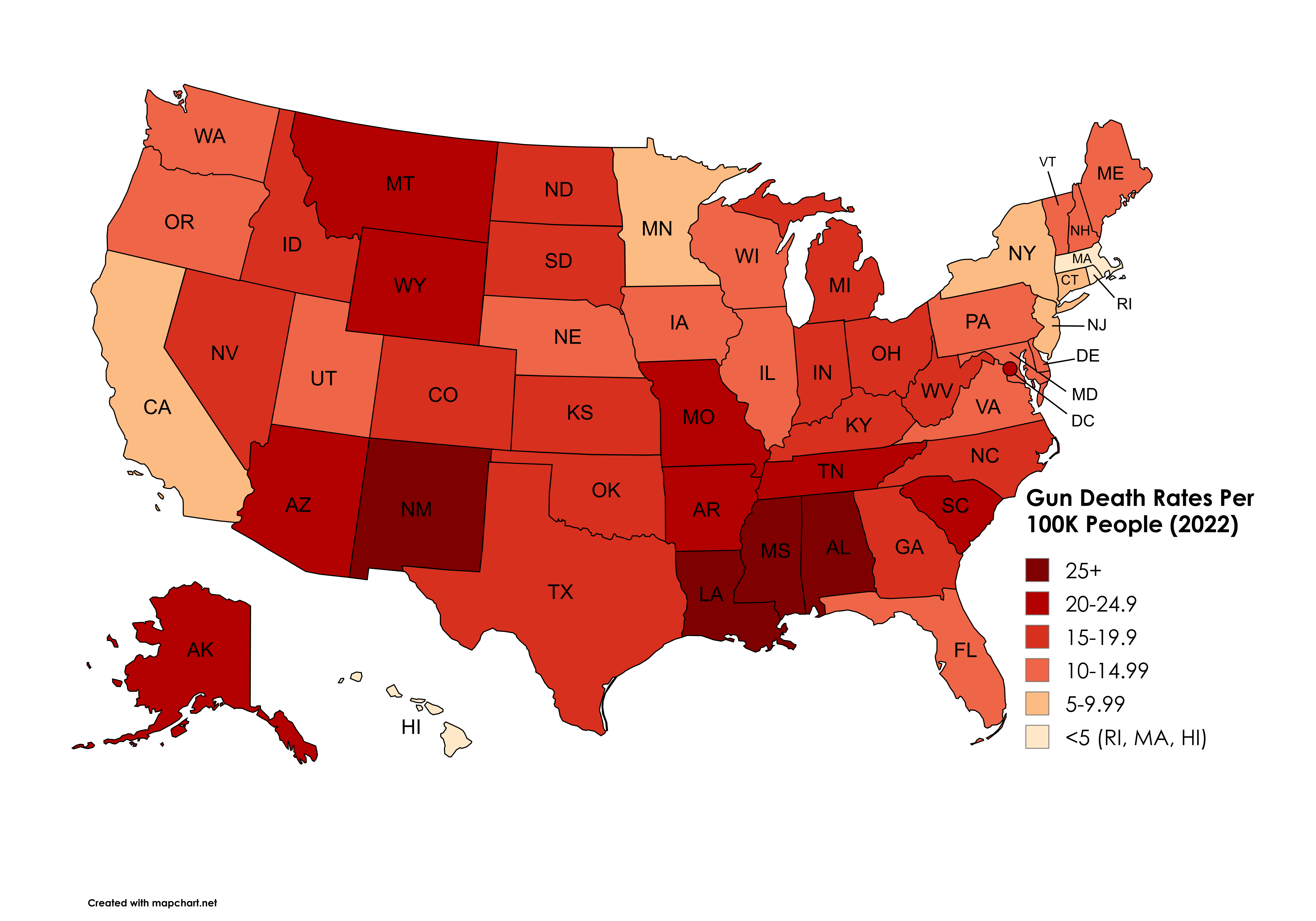
![[OC] Gun Death Rates Per 100K People (2022)](https://www.byteseu.com/wp-content/uploads/2025/09/1oijcdrqh1qf1-1536x1075.png "[OC] Gun Death Rates Per 100K People (2022)")
30 Comments
Oh look, it’s a map of how poverty and crime correlate again.
Now remove the 60% of gun deaths that are suicides.
Mississippi is that Major league baseball team that doesn’t try to win championships, but just enjoys the shared revenue
Weird how the state with the most consistently liberal laws (Massachusetts) is almost always in the best colors of these maps
I’m loving seeing LA MS and AL in the lead (worse ranked?) for all these graphs recently!
[removed]
Rhode Island and Massachusetts killing it yet again. Pun intended.
Shit data when you don’t remove suicides. Not to mention, you just straight-up copied this visual from Wikipedia. What a dog shit post all around.
I feel like this graphic would be better if it wasn’t 4 shades of red.
Counting or not counting gang viole-
Now remove gun deaths from suicide and self defense
Minnesota once again showing how it’s the best state in the Midwest.
Honestly, it makes sense that modern conservatives focus so feverishly on arts and crafts culture wars – their worldview is completely unsupported by actual empirical data LMAOO
Like I imagine many things do, this follows along a bit closely with a poverty rate map, doesn’t it?
https://preview.redd.it/tdbq5q20o1qf1.png?width=1200&format=png&auto=webp&s=e44735bcf72fa6073f1e3ee42c5e2544a37ea6b1
I think the big difference are the big rural states like Alaska or Montana and Wyoming, something else is going on there. Wonder what’s doing it in Missouri.
The color scheme is relatively misleading compared to the numbers. The numbers actually don’t seem as bad as I had anticipated
25 gun deaths per 100k people is .025% of the population
Obligatory ‘gun violence is bad’ qualifier
Looks like they need the national guard deployed to the Deep South. Such chaos and disorder.
Very heavily skewed because of population density.
I wonder if what this map is showing is the effectiveness of gun ownership laws.
Thoughts?
Sorry OP, your visualization is fine, if a bit unsurprising. But these types of visualizations are getting a bit tiresome. Can we add a rule to this sub that color coded maps of the US are only allowed every fourth Monday of the month or something?
Also I’m confused by the tool you linked. Did you literally just recreate by hand the exact map in the cdc page you linked using that tool?
I come from Minnesota to take our winner’s prize.
It’s wild how every state that fights for guns has the worst rates. 🤷 and they’re also the most poorly educated, have poor healthcare, poor birth care, poor child care, poor….hmm what do those states have in common? 🤔🤔🤔
Huh funny that states with stricter gun laws have less deaths overall..
Suspiciously high correlation with the other map just posted showing the Trump election results margins for white americans by state…
Now it would be interesting to see how that map correlates with state gun laws such as open/concealed carry permissiveness.
LA, MS, and AL are like Harry, Ron, and Hermine. It’s always those three deep in some bad juju.
always funny to me how this looks quite similar to the map of the black population percentage per state
The average for the EU is 1.5.
Red states are dead states
What percentage of these deaths are suicide?
Do it for counties and then compare it to demographics and income.