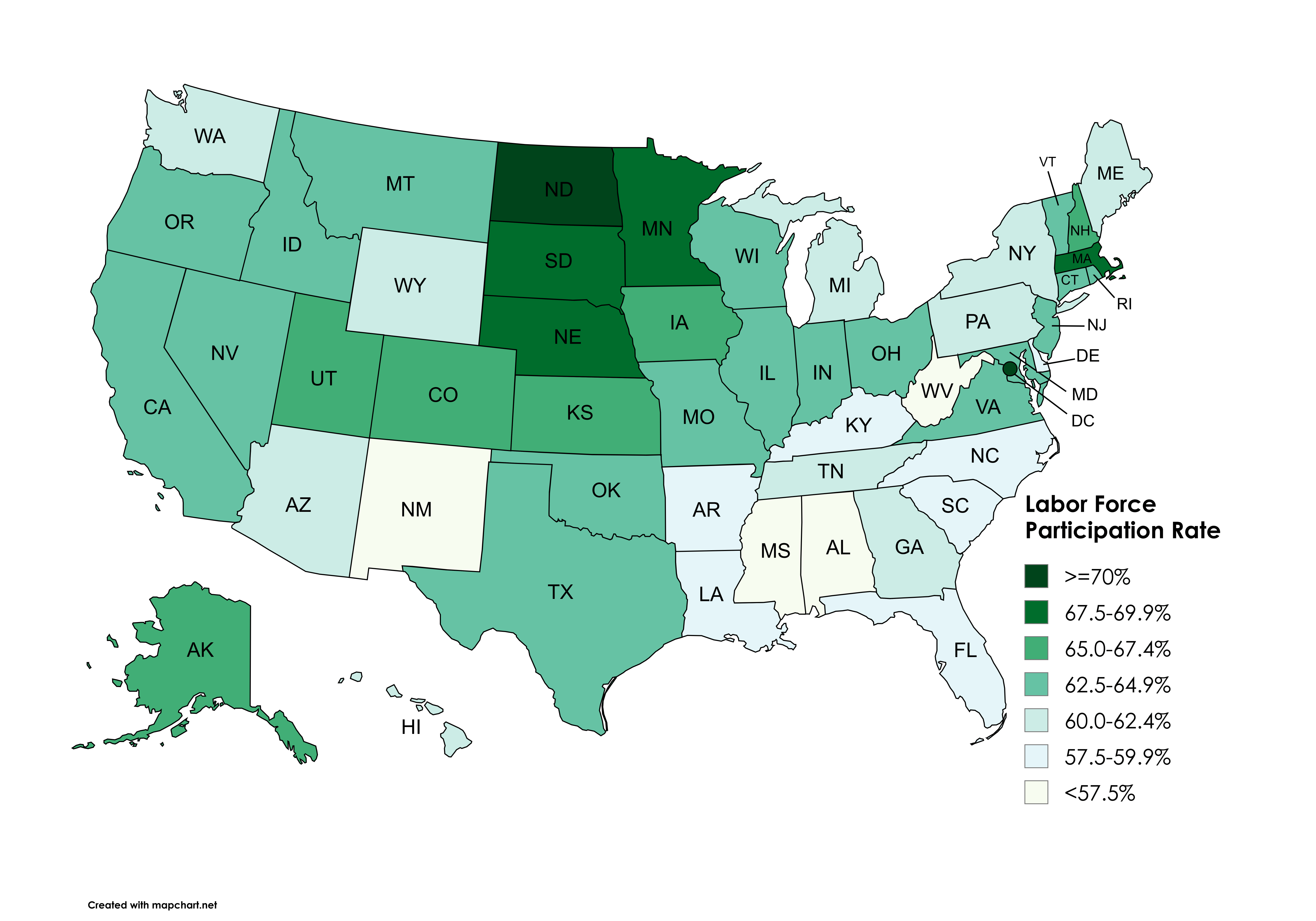
Data: U.S. Bureau of Labor Statistics , retrieved via FRED, Federal Reserve Bank of St. Louis https://fred.stlouisfed.org/release/tables?eid=784070&rid=446
Tool: Mapchart: https://www.mapchart.net/usa.html
Posted by snakkerdudaniel

![[OC] Labor Force Participation Rate by US State (August 2025)](https://www.byteseu.com/wp-content/uploads/2025/09/iocrtncc18qf1-1536x1075.png "[OC] Labor Force Participation Rate by US State (August 2025)")
Data: U.S. Bureau of Labor Statistics , retrieved via FRED, Federal Reserve Bank of St. Louis https://fred.stlouisfed.org/release/tables?eid=784070&rid=446
Tool: Mapchart: https://www.mapchart.net/usa.html
Posted by snakkerdudaniel
19 Comments
Data: U.S. Bureau of Labor Statistics , retrieved via FRED, Federal Reserve Bank of St. Louis [https://fred.stlouisfed.org/release/tables?eid=784070&rid=446](https://fred.stlouisfed.org/release/tables?eid=784070&rid=446)
Tool: Mapchart: [https://www.mapchart.net/usa.html](https://www.mapchart.net/usa.html)
All 17 people in North Dakota found work.
Good on ya ND!
Southern states suck! 😡😮💨
What does this information tell us? What does it tell us about the population in those states?
Low-population states have higher employment, and Bible-belt states suck.
My ex is single handedly holding Minnesota back
Is there a way to get this for ‘prime age” e.g. 25-54 or is this already that?
Edit: also not surprised MA is a workhorse.. I feel that M-F.
Alabama: “Thank god for Mississippi.”
Some feedback on the data visualization,
The heat map view is misleading as the values are hovering between 58 – 70 %. Basically you’re showing a shift in color when there’s only a 3 percentage point difference.
This visually exaggerates differences when a better analysis would show that by and large, states labor force participation rates are quite similar and have a small Range.
This is a map of retiree states.
This is the Massachusetts stroke-fest sub
The southern states are holding us back. We should have kept them out of the union.
Participation vs unemployment stats are mind bending.
“Alabama’s unemployment rate dropped to 2.9% in August”
also
“Alabama’s labor force participation rate dipped to 57.7% in August. The percentage of prime-age workers, those aged 25-54 years, decreased by one-tenth of a percentage point to 78.3%.
As the number of people searching for jobs reached historic lows, Alabama policymakers have focused on the labor rate and those people – now 42.3% – not participating in the state’s workforce.”
*tf*
[https://aldailynews.com/alabama-unemployment-rate-drops-to-2-9-labor-force-participation-dips/](https://aldailynews.com/alabama-unemployment-rate-drops-to-2-9-labor-force-participation-dips/)
Education levels have a big impact on labor participation rates. High school education levels have participation rates around 57% vs ~75% for a bachelors degree.
One day we’ll see a map where the South isn’t an embarrassment.
Not every map of the US. Finally.
As a Texan I expect mediocrity. And I’m glad to see it.
Once again Bible Belt causing the issues. And they call us lazy!
I’d like to see the correlation with GDP per capita, I’d imagine it’s a pretty similar map but I’m curious if there’s any outliers