EDIT: this makes sense. The only thing I’m wondering now is why it’s log? Is that to make it easier to see everything?
I’m sorry but is it possible to make this chart easier to read?
I don’t understand why the chart says the median matters when none of the values start or end at the median. “Relative to the the overall median on a log scale”.
What is the overall median? Like for the entire economy? On a log scale? Why?
I dont really get what arrows are saying, and the order of occupations in each group seems to be totally random

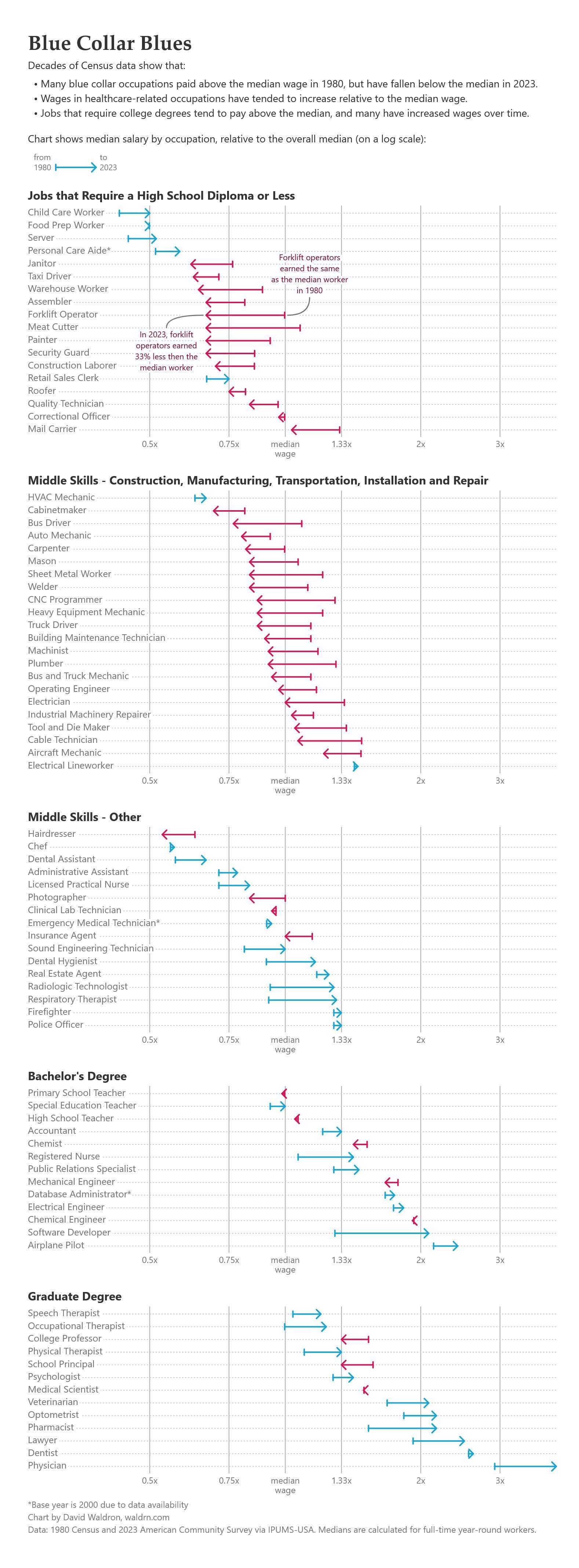
![Occupational wage relative to overall median, 1980 to 2023 [OC]](https://www.byteseu.com/wp-content/uploads/2025/10/duhbmkhufvsf1-567x1536.jpeg "Occupational wage relative to overall median, 1980 to 2023 [OC]")
2 Comments
[Full blog post here](https://blog.waldrn.com/p/the-truth-about-middle-skills-jobs)
Data: IPUMS-USA
Tools: R and d3.js
[Code on GitHub](https://github.com/dawaldron/occupation-wages)
EDIT: this makes sense. The only thing I’m wondering now is why it’s log? Is that to make it easier to see everything?
I’m sorry but is it possible to make this chart easier to read?
I don’t understand why the chart says the median matters when none of the values start or end at the median. “Relative to the the overall median on a log scale”.
What is the overall median? Like for the entire economy? On a log scale? Why?
I dont really get what arrows are saying, and the order of occupations in each group seems to be totally random