**Sharing my take on data about Ukrainian strikes on Russian oil refineries.**
I wanted to create a visual that could easily fit in a newspaper and convey a few key points:
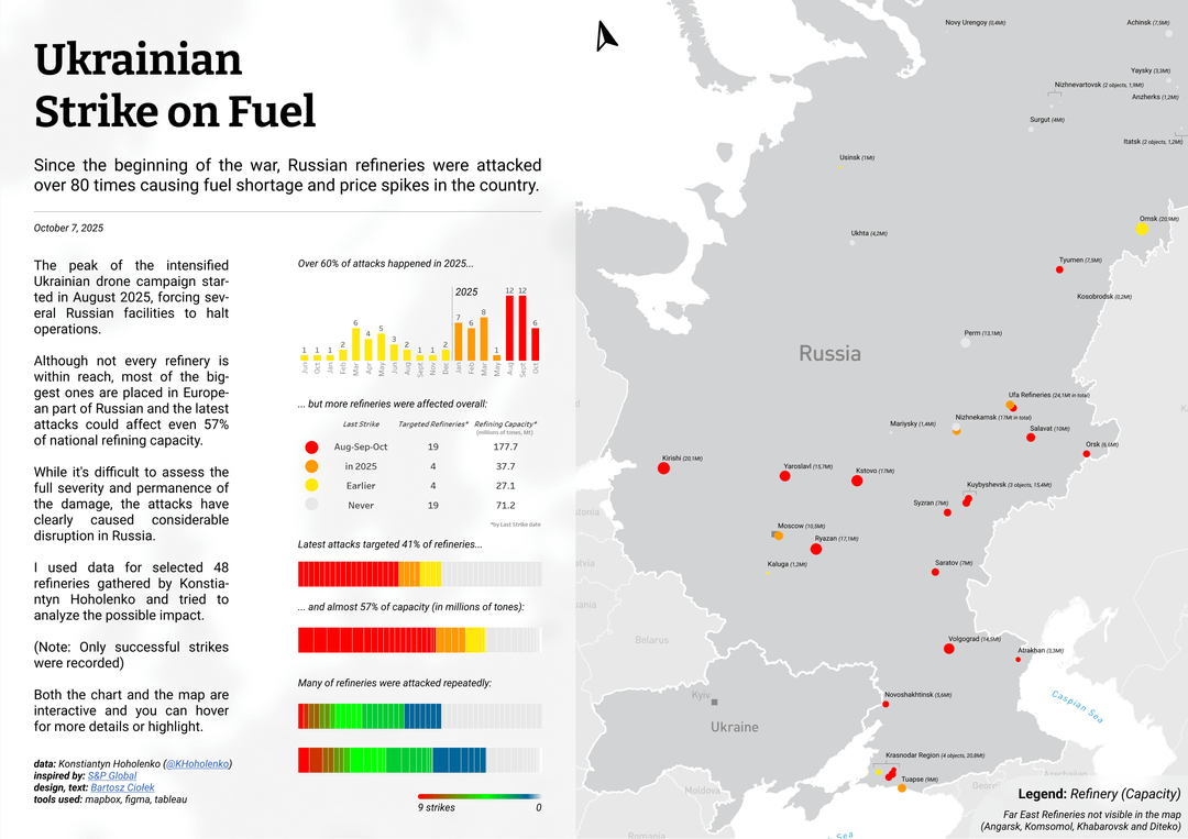
* recent attacks have become more intense,
* it’s hard to assess the exact damage, but a significant part of Russia’s key industry is affected,
* Ukrainian strikes often hit refineries far from the border, though most of the time the larger and closer ones are targeted.
I also handcrafted the map used in the visual.
I did my best to find accurate locations and names of the refineries, which wasn’t easy for someone who doesn’t speak Russian very well.
The Tableau version includes some additional features (like tooltips and highlights), but here I tried to capture a clean, all-in-one, newspaper-style layout.
Is it informative? Easy to understand?
What would you change?
Do share your feedback!
PS – no idea why, but the images got downgraded, I just added them to [imgur here](https://imgur.com/a/MLeAnNU)
BlaBlaMaker on
Well present data. Would be interesting to see a range indicator as well to see if the range changed over time.
draxlok_ on
How they can attack something that is so deep in Russian territory?
Justme3331176 on
Cool. I live in one of these cities
Bzikiman on
Russia should have been doing the same in Ukraine since the beginning 🚀
kiltebeest on
Nice job. One little thing that messed with me for a sec is that the red/yellow bars for % refineries targeted increases from left to right, but the bars for the number of strikes increases from right to left. The reader has to consciously adjust between the 2 sets of bars.
DrTonyTiger on
I like the projection. Russia is a hard country to fit in the space provided without also including a lot of uninformative area. This layout makes the distance from Ukraine especially clear.
flunky_the_majestic on
I don’t understand the difference between the two graphics, except that they show different refinery capacities. Are they at two different times?
SzJack on
Love the map but if you could change ‘never’ to ‘not yet’ that’d make it more realistic.

![[OC] Ukrainian Strike on Russian Fuel - infographics](https://www.byteseu.com/wp-content/uploads/2025/10/4cogf6qphwtf1-1024x723.png "[OC] Ukrainian Strike on Russian Fuel – infographics")

9 Comments
**Sharing my take on data about Ukrainian strikes on Russian oil refineries.**
I wanted to create a visual that could easily fit in a newspaper and convey a few key points:
* recent attacks have become more intense,
* it’s hard to assess the exact damage, but a significant part of Russia’s key industry is affected,
* Ukrainian strikes often hit refineries far from the border, though most of the time the larger and closer ones are targeted.
I also handcrafted the map used in the visual.
I did my best to find accurate locations and names of the refineries, which wasn’t easy for someone who doesn’t speak Russian very well.
The Tableau version includes some additional features (like tooltips and highlights), but here I tried to capture a clean, all-in-one, newspaper-style layout.
Is it informative? Easy to understand?
What would you change?
Do share your feedback!
Tools used: Tableau, Mapbox, Figma
Map was recreated based on [this article](https://www.spglobal.com/commodity-insights/en/news-research/latest-news/crude-oil/040224-strike-on-russias-taneco-refinery-marks-leap-in-ukrainian-drone-radius)
[Data adapted from this post by @KHoholenko](https://x.com/KHoholenko/status/1975557528743518677)
[Interactive version here](https://public.tableau.com/app/profile/bartoszciolek/viz/UkrainianStrikeonFuel/UkrainianStrikesonFuelsmall)
PS – no idea why, but the images got downgraded, I just added them to [imgur here](https://imgur.com/a/MLeAnNU)
Well present data. Would be interesting to see a range indicator as well to see if the range changed over time.
How they can attack something that is so deep in Russian territory?
Cool. I live in one of these cities
Russia should have been doing the same in Ukraine since the beginning 🚀
Nice job. One little thing that messed with me for a sec is that the red/yellow bars for % refineries targeted increases from left to right, but the bars for the number of strikes increases from right to left. The reader has to consciously adjust between the 2 sets of bars.
I like the projection. Russia is a hard country to fit in the space provided without also including a lot of uninformative area. This layout makes the distance from Ukraine especially clear.
I don’t understand the difference between the two graphics, except that they show different refinery capacities. Are they at two different times?
Love the map but if you could change ‘never’ to ‘not yet’ that’d make it more realistic.