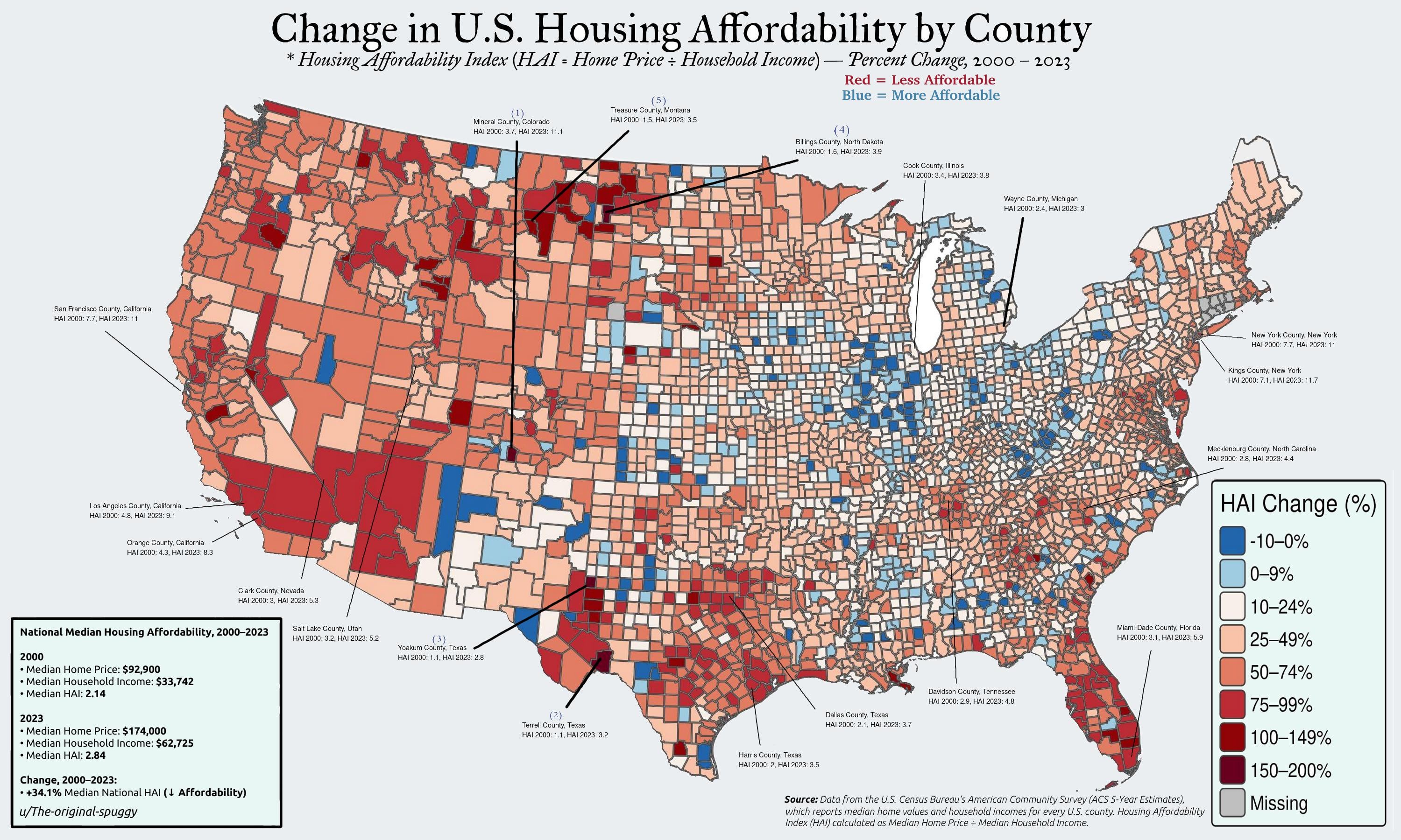
median HAI in 2000 should be 2.8, according to the formula in subtitle
thedeepestofstates on
How has Illinois become pretty much the only state where housing affordability has improved?
Godloseslaw on
That one county in Nevada has like 1500 total people in it.
yeah87 on
Having -10-0% and 0-9% be the same color was a weird choice here.
hellerinahandbasket on
What the hell happened on the East side of Utah? There is virtually nothing there right??
Jets237 on
CT is missing? I can tell you personally, shits too expensive
michiplace on
Since you’re using 5-year ACS, some of the most recent changes will be masked: you’re not actually looking at “2023” as your end point, but at “the 2019-2023 time period”.
Might be worth redoing the map using the 1-year ACS for more specificity. That would mean that you need to leave out low-population counties in that version of the map, but would better tell the story of what most people are experiencing.
leithal70 on
I would recommend getting rid of the outline around the counties, it makes areas woth smaller counties a bit difficult to read
doglywolf on
I am “sure” this has nothing to do with mega corps buying even 2 family homes as part of investment portfolios or the fact that in some metro markets ad much as 17% of all home sales have been to corporations in the past few years. Fuck you blackrock and blackstone.
THSSFC on
Look, a map of population density
Ed: never mind, there are some surprises here.
Marty_Br on
Color me confused because 92,900 / 33,742 = 2.75 and 174,000 / 62,725 = 2.77 which looks nearly identical to me and does not match the numbers you show in your legend at all.
hybridaaroncarroll on
WTF is going on in Terrell County, TX?
MustardLabs on
The day Californians learn downstate Illinois is cheap and not shit will be catastrophic
[deleted] on
[deleted]
Catsuponmydog on
The line for Harris County (in Texas) is pointing at Fort Bend County
holmiez on
Yall are aware of the Realpage Rent Algorithm scam Landlords are/were using, right?
Landlords colluded with RealPage software company to inflate rent across the nation, driving up prices.
I have no doubt this affected housing affordability, as well.
alkrk on
Don’t get fooled by Illinois. Municipality property tax is killing us. Seniors and retirees are leaving by the droves.
SsooooOriginal on
How many dark blue places are NOT in the actual middle of nowhere? I know a few are an hour mininum speeding with no traffic or weather to get to a decent sized store.
The Detroit area is the only one I can name. But that area has to be extra funky costs wise being so close to Canada during these insane times.
ixikei on
Fascinating map! Well done.
Roughneck16 on
New Mexican here. The housing market has gone up the most in Lea County, in the southeastern corner. And Eddy County next to it. The petroleum boom played the biggest role in that change.
redditismylawyer on
Flipping the script – how are the shittiest parts of the nation the least affordable? Where is the demand coming from to live in Barstow, CA???? I mean… they have a Denny’s, so there’s that.
homeboi808 on
Yeah, I’m looking to purchase a SFH in the near future, but housing prices have literally doubled since 10 years ago in my region (wages have not kept up in the slightest), and even shitty areas that no one wanted to live in are getting new developments of $500k homes.
meanie_ants on
The coloring is a bit off. I was like “ain’t no way central Iowa stayed relatively flat” and then I checked the legend. The beige/white color should be centered on 0% change, and light blue certainly shouldn’t be 0-9% either as on a bi-color map like this the first thing people think is (if there is a negative), blue means negative cost change.
But yep, 10-49% change in cost for where I lived seems about right. Wild that that’s mild. I live in a deep red area now. It has seemed like the rest of the country is starting to catch up with the price increase rates seen in the major cities.

![The Continued Story of Housing Affordability in the US, by County [OC]](https://www.byteseu.com/wp-content/uploads/2025/10/c44bpawgj3uf1-1536x922.jpeg "The Continued Story of Housing Affordability in the US, by County [OC]")
23 Comments
median HAI in 2000 should be 2.8, according to the formula in subtitle
How has Illinois become pretty much the only state where housing affordability has improved?
That one county in Nevada has like 1500 total people in it.
Having -10-0% and 0-9% be the same color was a weird choice here.
What the hell happened on the East side of Utah? There is virtually nothing there right??
CT is missing? I can tell you personally, shits too expensive
Since you’re using 5-year ACS, some of the most recent changes will be masked: you’re not actually looking at “2023” as your end point, but at “the 2019-2023 time period”.
Might be worth redoing the map using the 1-year ACS for more specificity. That would mean that you need to leave out low-population counties in that version of the map, but would better tell the story of what most people are experiencing.
I would recommend getting rid of the outline around the counties, it makes areas woth smaller counties a bit difficult to read
I am “sure” this has nothing to do with mega corps buying even 2 family homes as part of investment portfolios or the fact that in some metro markets ad much as 17% of all home sales have been to corporations in the past few years. Fuck you blackrock and blackstone.
Look, a map of population density
Ed: never mind, there are some surprises here.
Color me confused because 92,900 / 33,742 = 2.75 and 174,000 / 62,725 = 2.77 which looks nearly identical to me and does not match the numbers you show in your legend at all.
WTF is going on in Terrell County, TX?
The day Californians learn downstate Illinois is cheap and not shit will be catastrophic
[deleted]
The line for Harris County (in Texas) is pointing at Fort Bend County
Yall are aware of the Realpage Rent Algorithm scam Landlords are/were using, right?
Landlords colluded with RealPage software company to inflate rent across the nation, driving up prices.
I have no doubt this affected housing affordability, as well.
Don’t get fooled by Illinois. Municipality property tax is killing us. Seniors and retirees are leaving by the droves.
How many dark blue places are NOT in the actual middle of nowhere? I know a few are an hour mininum speeding with no traffic or weather to get to a decent sized store.
The Detroit area is the only one I can name. But that area has to be extra funky costs wise being so close to Canada during these insane times.
Fascinating map! Well done.
New Mexican here. The housing market has gone up the most in Lea County, in the southeastern corner. And Eddy County next to it. The petroleum boom played the biggest role in that change.
Flipping the script – how are the shittiest parts of the nation the least affordable? Where is the demand coming from to live in Barstow, CA???? I mean… they have a Denny’s, so there’s that.
Yeah, I’m looking to purchase a SFH in the near future, but housing prices have literally doubled since 10 years ago in my region (wages have not kept up in the slightest), and even shitty areas that no one wanted to live in are getting new developments of $500k homes.
The coloring is a bit off. I was like “ain’t no way central Iowa stayed relatively flat” and then I checked the legend. The beige/white color should be centered on 0% change, and light blue certainly shouldn’t be 0-9% either as on a bi-color map like this the first thing people think is (if there is a negative), blue means negative cost change.
But yep, 10-49% change in cost for where I lived seems about right. Wild that that’s mild. I live in a deep red area now. It has seemed like the rest of the country is starting to catch up with the price increase rates seen in the major cities.