
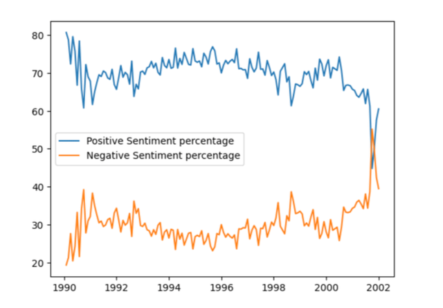
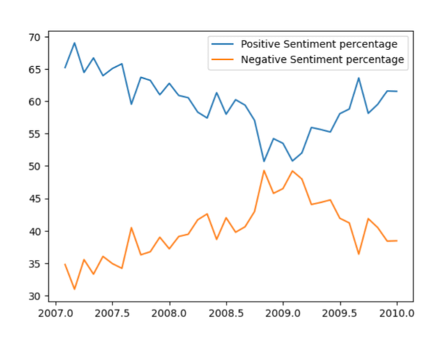
Sentiment Analysis over time of headlines of financial articles from the New York Times. Sentiment was derived using the Vader NLP Model in python. Data has been collected using the NY Times API : https://developer.nytimes.com/apis. Graph visualized using matplotlib in Python.
The sharp fluctuations where positive and negative sentiment get flipped correspond to the DotCom crash and 2007 recession.
Posted by anxious_beaver99
7 Comments
Source : [https://developer.nytimes.com/apis](https://developer.nytimes.com/apis) New York Times developer API for obtaining headlines of articles over the years.
Tools : Python (matplotlib for visualization and Vader for obtaining sentiment)
What about a more recent timeframe? I’d be curious to see how the past few presidencies plus COVID affected sentiment.
OK, Disco Stu. Now show us the sales for 1977 through 1981.
Was it not a possible option to just go 1990 through 2010? Why cut out the years 2003-2006?
The lines are just literally opposites of eachother right? Like, wouldn’t a bar chart with positives above the x and negatives below make more sense?
the infection point is 2001, ok
still pretty skeptical of how this data is framed by “Vader NLP Model” as OP claims.
somewhat arbitrary timeframes. why not a continuous time series?