damn, we really need to speed back in time to catch that 1.5°k
Particular_Neat1000 on
How can I invest in this stock
celeb0rn on
This is not beautiful data, this is a confusing graph.
Simple_Jellyfish23 on
This data is not beautiful.
KenyaFitThisDick on
Do we have any temps during the warming period during medieval times
BasedInMunchen on
Sea temperature warming is kinda nice, we’re getting more diverse wildlife in parts of the world that didn’t use to have any (e.g dolphins in the UK)
Forking_Shirtballs on
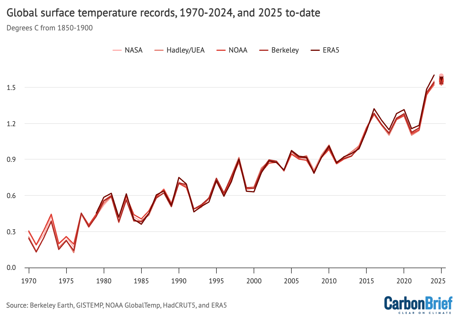
What does “surface temperature records” mean, and what is the zero point?
EmotionalProgress227 on
The chart is accurate, but omits key data that doesn’t fit a neat narrative. It’s to the point where one could make the case it is not intended to inform (like any good science should), but to obfuscate and mislead.
Here’s a longer snapshot. Notice that the original posted chart conveniently starts is the 1970s – right after a 20-30 flat stretch (that is omitted). Further, it omits the decline in the 1940s.
Temps *are* rising, but it’s important to understand the full picture and not cherry pick.
It is a pretty upward trending graph, but on geologic time scales, 55 years is completely insignificant. It’s like looking at a 7 second blip of the S&P 500 over the course of 100 years.
Global warming is most likely occurring, but this is not the graph to prove it.
Pizzafriedchickenn on
As a Brit I’m not complaining
tduanebarr on
Using 5 different shades of red was a choice….
avocado_juice_J on
My grandpa said that 50 years ago, weather was cooler than it is today, and there were fewer tornadoes and floods.

![[OC] Global surface temperature records between 1970 and 2025.](https://www.byteseu.com/wp-content/uploads/2025/10/9womhzkufxwf1-1536x1073.png "[OC] Global surface temperature records between 1970 and 2025.")
15 Comments
You mean temperature anomaly not temperature? And you should say what range the ‘norm’ is
Sorry, but 1.5 degrees C? From average? How are you accounting for seasonality? This is hard to read.
OP hasn’t followed [rule 3](https://www.reddit.com/r/dataisbeautiful/wiki/index), so this may not be [OC]. Original source: [https://interactive.carbonbrief.org/state-of-the-climate/2025-04/records-with-2024-to-date.html](https://interactive.carbonbrief.org/state-of-the-climate/2025-04/records-with-2024-to-date.html)
damn, we really need to speed back in time to catch that 1.5°k
How can I invest in this stock
This is not beautiful data, this is a confusing graph.
This data is not beautiful.
Do we have any temps during the warming period during medieval times
Sea temperature warming is kinda nice, we’re getting more diverse wildlife in parts of the world that didn’t use to have any (e.g dolphins in the UK)
What does “surface temperature records” mean, and what is the zero point?
The chart is accurate, but omits key data that doesn’t fit a neat narrative. It’s to the point where one could make the case it is not intended to inform (like any good science should), but to obfuscate and mislead.
Here’s a longer snapshot. Notice that the original posted chart conveniently starts is the 1970s – right after a 20-30 flat stretch (that is omitted). Further, it omits the decline in the 1940s.
Temps *are* rising, but it’s important to understand the full picture and not cherry pick.
https://preview.redd.it/yrpd2394fywf1.jpeg?width=454&format=pjpg&auto=webp&s=ee13559872dd4afffb7f8547facb6ef7520954d2
It is a pretty upward trending graph, but on geologic time scales, 55 years is completely insignificant. It’s like looking at a 7 second blip of the S&P 500 over the course of 100 years.
Global warming is most likely occurring, but this is not the graph to prove it.
As a Brit I’m not complaining
Using 5 different shades of red was a choice….
My grandpa said that 50 years ago, weather was cooler than it is today, and there were fewer tornadoes and floods.