
Source: https://data.un.org/Data.aspx?d=UNHCR&f=indID%3aType-Ref#UNHCR
Hi all,
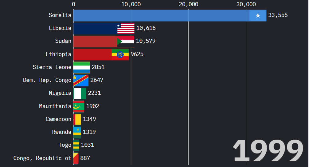
I Made a chart showing how many refugees from African countries were in the US from 1988 to 2024. Data's from the UN.
You can see spikes after wars and stuff like that. Eritrea, Sudan, Ethiopia, all jump at different points.
Video if you want to watch: https://www.youtube.com/watch?v=Cf6g90EHg-k
Data Source & Verification:
All figures come directly from the official UNHCR Resettlement dataset via the United Nations Data Portal:
The data and overlays are based on verified UN records, nothing is estimated or made up. If you think something looks off, feel free to check the source yourself.
I’m not debating numbers; they’re publicly available for anyone to confirm. UN data shows how many refugees from each country were residing in the U.S. at the end of each year. These are year-by-year population figures, not cumulative.
Posted by Dismal-Remove4070
5 Comments
The flags were a nice touch.
I see what you’re going for but I think racing bar charts giving the impression of cumulative running totals. In fact I thought this was a running total till I saw the axis change. Possibly less pretty, but I would imagine a line chart might be more effective here.
What do you mean by the term „resettled“? It sounds like they left and then came back, but your description doesn’t align with that.
This seems to just be the total number of refugees from each African country.
Sudan will be the top on one year believe me
This is a vanishingly small number of people compared to the total population (including growth since then,) and more should be allowed.
American here. White as fuck, happy to have more people here too.
Data is beautiful, so is context and scale. What is the big 1999 for?