
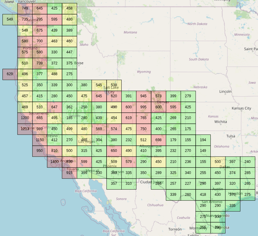
I've been priced out of my native southern California, and I couldn't find a good tool to visualize median home prices so I built one for myself, and then decided to take a little extra time to stick it on a cheap web host for others to play with.
This tool shows *all* zillow home listings for a subset of states[1], and calculates the median price for all home listings within each color coded tile. There are 558224 listings which were collected using hasdata.com on 9/28/2025.
The frontend is react and OpenLayers, backend is flask, and the server is a 1 core hostinger vps (we'll see how it holds up!). It's a little rough around the edges, but hopefully someone finds it useful.
[1]: States collected: Washington, Oregon, California, Nevada, Utah, Colorado, New Mexico, Texas
Posted by f33tpix
26 Comments
Nevada National Security Site or….Kansas… choices choices
People say CT is an expensive state but i couldn’t afford to live as an OINK (one income no kids) on the west coast
What are the units on these figures?
Ignore this.
What a fucked up grid/heat map.
Fun fact: Those squares are called Quadkeys
But I heard Trump is coming out with 50-year mortgages to help lower the monthly mortgage payment so hopefully that will save us from having to rent for the rest of our lives
What the hell are these random blocks
The view shown in your thumbnail isn’t very useful, but the tool is actually pretty cool when zoomed in more on a metro region.
I like that you can manually set the color-code gradient to values of your choice, but it would also be nice if there was a mode that would automatically set them based on the data distribution. Help give you a sense of the relative affordability across the region (rather than the absolute affordability), without having to scan the whole map first to get an idea of the ranges.
So only nice area are for the rich now.
Completely useless when not adjusting for incomes. Sure houses are cheap in Missouri, but incomes are substantially lower too.
Why not use do this by county?
Starting with a 1 is either really good or really bad
Here is a similar map for Japan:
https://porty.co.jp/data/price/map
That section of Utah that’s 391.
Why so low?
I would happily live in 315 California. I love the desert 🌵 🏜️ 🐪
I went to the website that’s in the description and it’s actually a neat tool. What is looks like it does is average all the listed home values in the area — whatever area you’re zoomed into. You can zoom down into a single house if you want. I zoomed into my neighborhood and the surrounding area and the only thing to watch out for is it’s just the listed homes. If I look at the “cheaper” neighborhoods in my area there are fewer listings whereas the more expensive neighborhood had more listings which makes my area look more expensive than it is.
That spot in Nevada that’s 185,000. Don’t do it.
The tool is awesome! I wouldn’t say really love to see it nationwide – selfishly interested in the Midwest and northeast. Really love how it’s dynamic as you zoom. Ignore the downvotes – obviously most haven’t clicked your link!
I also got prices out of So Cal. I was born and raised there, lived my entire life there… had to say goodbye at 38.
It’s too expensive to get ahead even with a good job, the reality young people are going to face is you are going to need to save up what you can, and move to an area that is cheaper.
I spent more on rent than the value of my house now… it’s just not gonna happen for most of us that were born there, at least not on our own
You really need more than 3 colors; there’s not much dynamic range with so few. The splits are also kind of curious; looks like yellow is 450 – 550?
Wow didn’t know CO has areas near 1mil.
Please do the rest
I think it was Case/Schiller that pointed out that the home price isn’t actually as important as the monthly payment (including taxes and insurance) compared to income.
Texas might look cheap, but friends that moved there from California are returning because they could get a somewhat better house for the same monthly payment, but it was actually a bigger percentage of their paycheck.
this is extremely well done, ty for making this 😀
How did you decide your color scale? There’s more range I. Red then the rest combined and you only used three colors
Lazy coding for approval is certainly a hobby
Is there anything that you need from others to complete the process for more states.