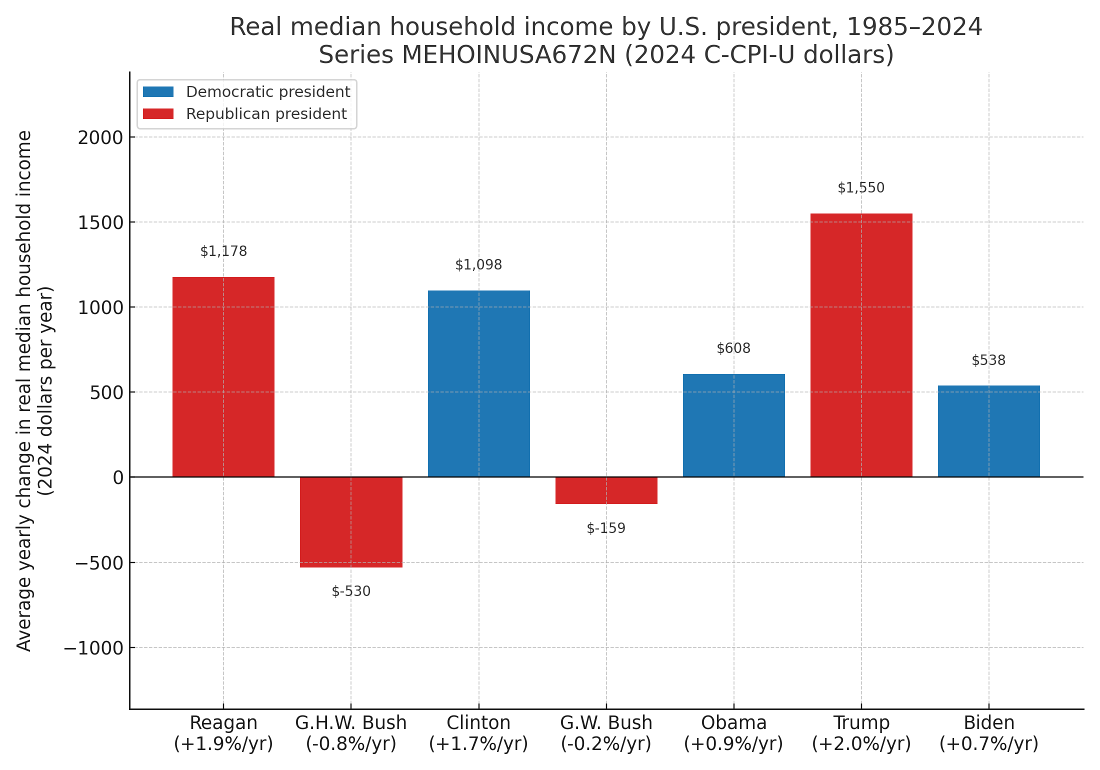
[OC] Average yearly change in U.S. real median household income by president 1985-2024 (inflation adjusted)
Posted by itchynisan

![[OC] Average yearly change in U.S. real median household income by president 1985-2024 (inflation adjusted)](https://www.byteseu.com/wp-content/uploads/2025/11/5zx5m312n01g1-1536x1075.png "[OC] Average yearly change in U.S. real median household income by president 1985-2024 (inflation adjusted)")
[OC] Average yearly change in U.S. real median household income by president 1985-2024 (inflation adjusted)
Posted by itchynisan
7 Comments
I’m no expert but isn’t this data quite misleading? Economic policies take years if not decades sometimes to show effect. Meaning a policy could positively impact the next presidents statistics.
This chart demonstrates a glaring lack of basic understanding of how an economy works.
Can we do better than a basic bar chart? This is “data visualization as the result if a default excel bar chart.”
There’s a lag effect that’s not illustrated in this graph. Economics isn’t like a light switch. Jesus Christ.
Interesting. Using median rather than mean is the correct choice to alleviates skew from high-earner tax cuts. The chart overall is unfortunately misleading because it does not show macroeconomic factors influencing each administration’s performance. For example, Obama’s term started with the aftermath of the Great Recession and successfully turned it into a small gain. This positive momentum benefitted the beginning of Trump’s first term, which he squandered and had near zero growth by the end even before the pandemic hit. Biden, similar to Obama, came in and successfully cleaned up the inherited mess for a small gain.
How is data misleading? Op didn’t say interpret this in a certain way.
funny how this chart makes it look like presidents control the whole economy. swap the labels for “global cycle phase” and the bars probably stay the same. OP, do you have the year-by-year data? I kinda want to throw it into Power BI and check the trend without the political buckets