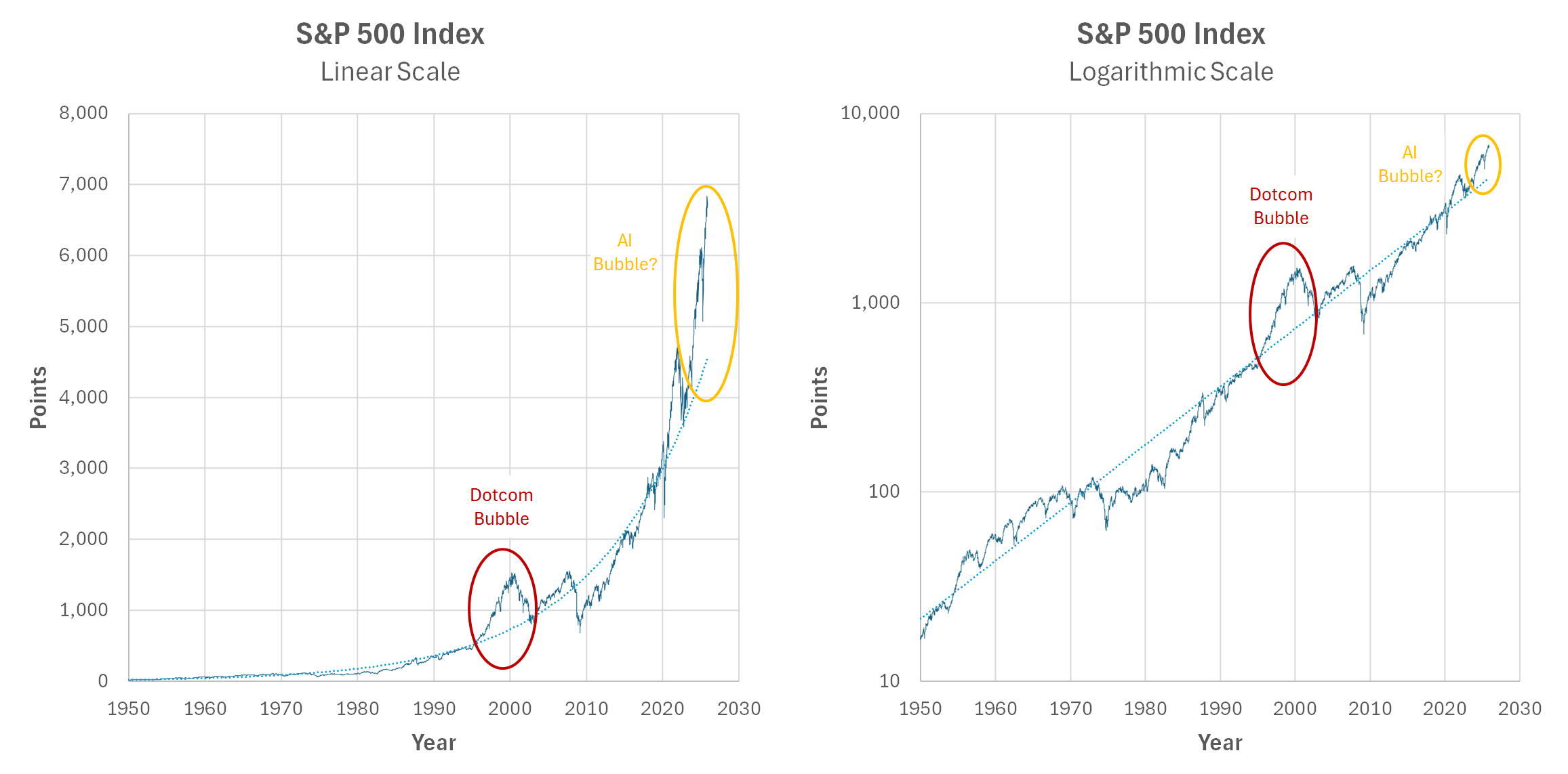
I’ve been seeing posts around Reddit that raise an alarm about a possible AI bubble by comparing it to the Dotcom bubble using the S&P 500 and a linear scale. I thought I’d add a chart with a logarithmic scale, which I think is more appropriate for this kind of comparison.
This is definitely a better visualization, but the trend line is weird to interpret.
If we’re estimating magnitude of bubble by area above the trend line then you can’t really do that for a bubble you’re currently in. If it’s a bubble, once the bubble pops it’ll drag the trendline down with it. Whereas now it’s pulling the trendline up. The comparison only works if you estimate your trend line on a point in time that isn’t a bubble or recession, which is very hard to define and prove.
yalag on
why is reddit so obsessed with the AI bubble, I dont get it. Is it the classic global warming thing again? Or anti corp? Anti capitalism? I dont see how this narrative is aligned with any of the usual reddit tropes.
psumack on
What’s driving the choice of 1950 as a starting point for the trend line? It looks like starting mid-70’s or early 80’s would make the trend fit better.
irrelevantusername24 on
It sure is a good thing that -logarithm- isn’t the same thing as an algorithm and definitely can’t be applied to your accounts specifically
that would be like, fraud
especially if that was like, the entire way the whole financial industry functioned
that would be like, fraud on an industrial level requiring some Nuremberg shit
we’re gonna need more Nuremberg trials at this rate we’re on to multiple levels of mostly unrelated forms of systemic abusive criminal fraud I’ve almost lost count (almost)
ryry1237 on
What I’m seeing from the chart is that we’re likely close, but it’s really hard to call a top except in hindsight.

![[OC] S&P 500 Comparing Dotcom and AI Bubbles with Two Scales](https://www.byteseu.com/wp-content/uploads/2025/11/hjvpic1za32g1-1536x759.png "[OC] S&P 500 Comparing Dotcom and AI Bubbles with Two Scales")
6 Comments
I’ve been seeing posts around Reddit that raise an alarm about a possible AI bubble by comparing it to the Dotcom bubble using the S&P 500 and a linear scale. I thought I’d add a chart with a logarithmic scale, which I think is more appropriate for this kind of comparison.
– Data from https://finance.yahoo.com/quote/%5EGSPC/history/
– Made in Excel
This is definitely a better visualization, but the trend line is weird to interpret.
If we’re estimating magnitude of bubble by area above the trend line then you can’t really do that for a bubble you’re currently in. If it’s a bubble, once the bubble pops it’ll drag the trendline down with it. Whereas now it’s pulling the trendline up. The comparison only works if you estimate your trend line on a point in time that isn’t a bubble or recession, which is very hard to define and prove.
why is reddit so obsessed with the AI bubble, I dont get it. Is it the classic global warming thing again? Or anti corp? Anti capitalism? I dont see how this narrative is aligned with any of the usual reddit tropes.
What’s driving the choice of 1950 as a starting point for the trend line? It looks like starting mid-70’s or early 80’s would make the trend fit better.
It sure is a good thing that -logarithm- isn’t the same thing as an algorithm and definitely can’t be applied to your accounts specifically
that would be like, fraud
especially if that was like, the entire way the whole financial industry functioned
that would be like, fraud on an industrial level requiring some Nuremberg shit
we’re gonna need more Nuremberg trials at this rate we’re on to multiple levels of mostly unrelated forms of systemic abusive criminal fraud I’ve almost lost count (almost)
What I’m seeing from the chart is that we’re likely close, but it’s really hard to call a top except in hindsight.