
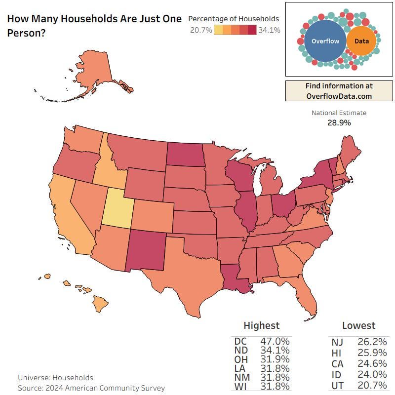
Using newly released data from the 2024 American Community Survey, this map shows the percentage of households in each state that consist of just one person.
Nationally, 28.9% of households are single-person, but the range varies a lot across states:
• Highest: DC (47.0%), ND (34.0%), OH (31.9%), LA (31.8%), NM (31.8%), WI (31.8%)
• Lowest: NJ (26.2%), HI (25.9%), CA (24.6%), ID (24.0%), UT (20.7%)
Map created using ACS 1-year estimates.
Source: U.S. Census Bureau, 2024 ACS.
Posted by OverflowDs
6 Comments
Map created using tableau and ACS 1-year estimates.
Source: U.S. Census Bureau, 2024 ACS.
You can find more at [overflowdata.com](https://overflowdata.com) or on our [instagram](https://www.instagram.com/overflow_data?igsh=MXdtZTJqaWRtcHZhdw%3D%3D&utm_source=qr).
I get it, but it’s a little weird having the scale go from 20.7% to 34.1%. This is highly exaggerating a measure that really has very little variation.
The color scale is far to close to see clearly. Two colors that are more differentiated should be use, IE red to green, blue to orange, yellow to purple, and so on.
Would be interested to seeing how many live alone for economic vs social reasons.
E.g. you’re living with family and roommates in California because rent is too damn high, whereas in Utah it’s cause you’re already married.
This one seems easier to read: https://www.reddit.com/r/dataisbeautiful/s/04NHRdX8jB
Including DC is obviously a mistake. It’s an entirely urban city, and even among cities is a bit of an outlier. It does not compare reasonably against states in most of these types of comparisons.