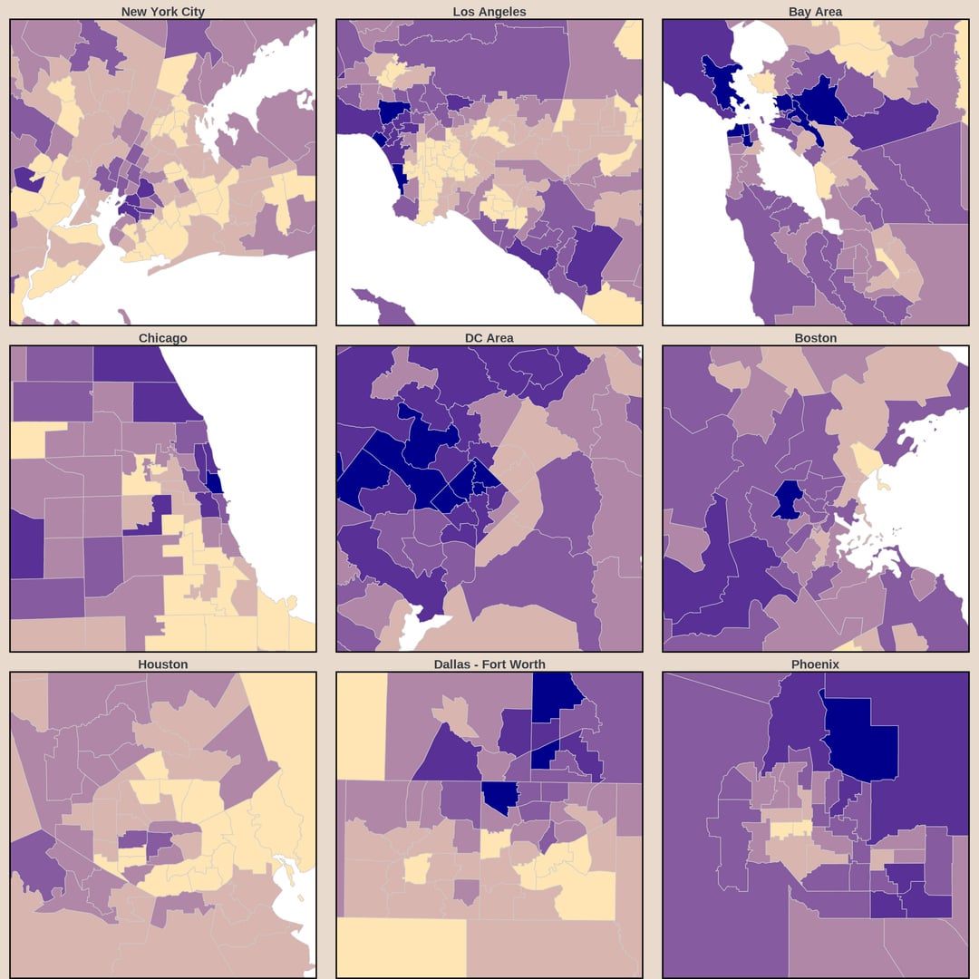
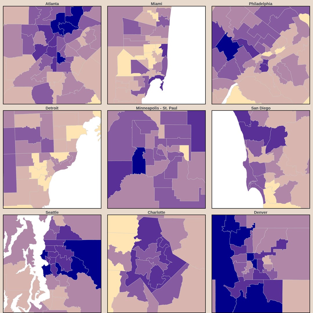
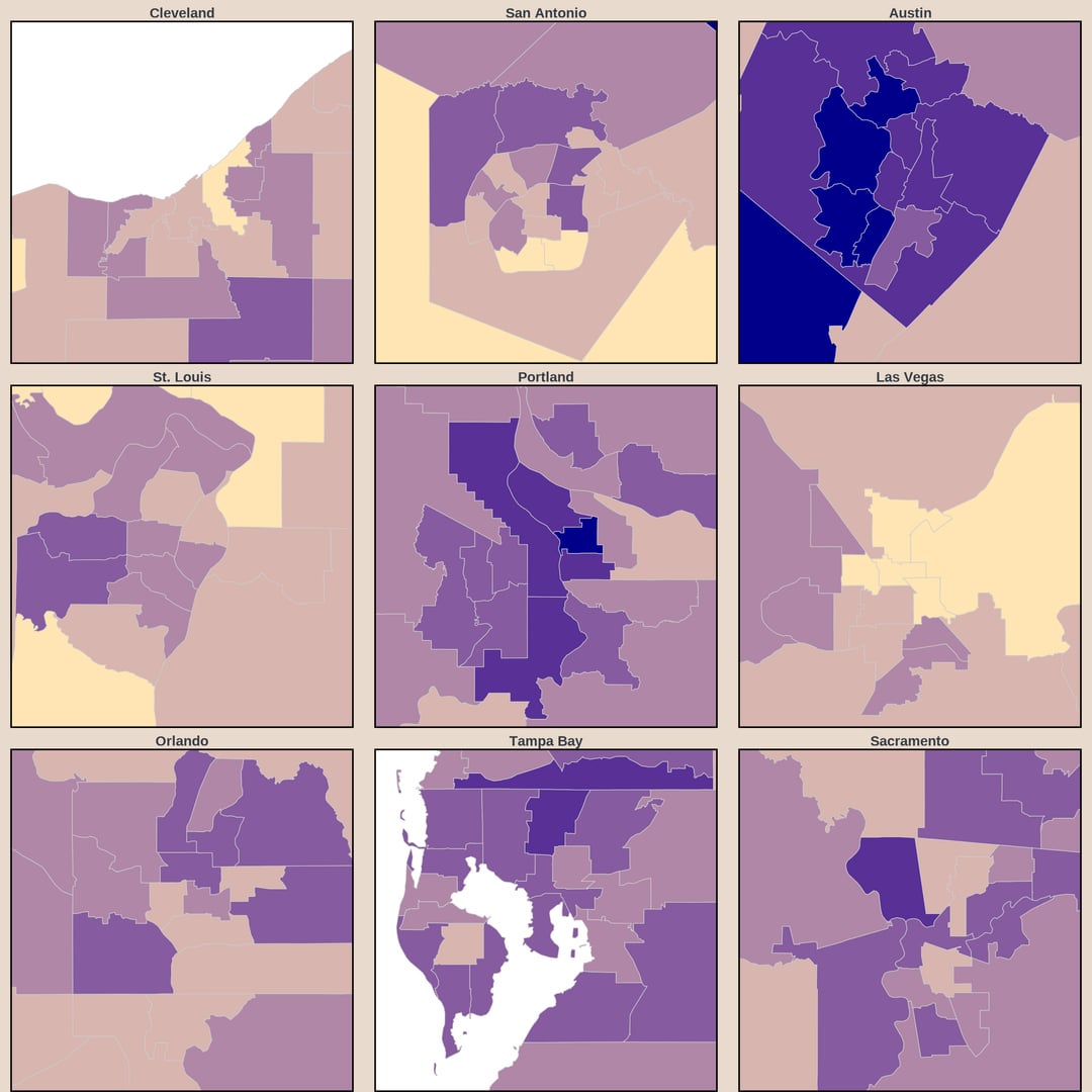
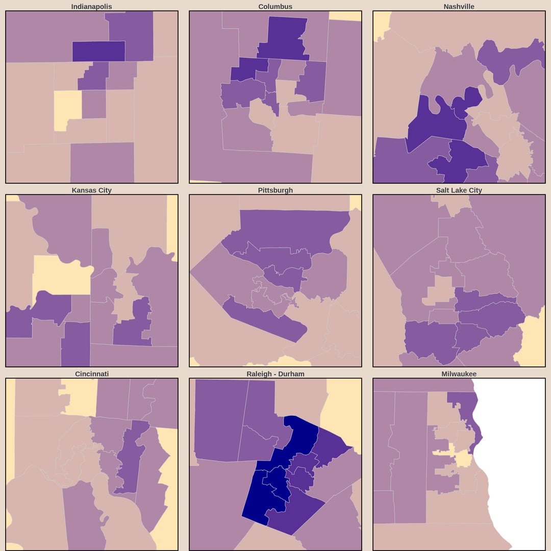
PUMA stands for Public Use Microdata Area. PUMAs are areas designated by the Census Bureau for statistical reporting. They each have between 100k and 200k residents, don’t cross state lines, and follow county and city boundaries when possible. Their big advantage over county maps is letting us see much more detail in urban areas, but it does come at the cost of being able to present all the information in one image. Additionally, many counties often have very high margins of error for survey data like this. The relatively consistent size of PUMAs ensures reasonably low margins of error across the whole map.
napleonblwnaprt on
Is this the percentage of people that *live* in these places, or is it that the job is *based* in the location?
PeterCorless on
Paying SF rents but not willing to go to the SF office is peak SF.
Low-Helicopter-2696 on
The middle of the country works remotely at some of the lowest rates in America because its economy is built on hands-on jobs rather than laptop-based work.
michigan_matt on
Obviously see spikes in cities which makes sense.
The one area in the second chart that surprises me is Cincinnati being so low. I would expect a lot of financial jobs to have WFH opportunities.
PostPostMinimalist on
“Working from home” means 100% working from home? Hybrid is not counted?
GreenFeather05 on
Source is from *2023*. These numbers are likely greatly inflated compared to the current year.
Notten on
Aren’t all farmers working from home?
CleanDataDirtyMind on
This is hilarious if you look closely at Oregon there’s a light purple blurb in the middle of the state with a dark purple small dot. I live there with close to 50% us working from home. I forget how rare we are.
Sure-Astronomer4364 on
Love to see a table by cities ranked for future job search
RoscoeSgt on
I RTO and sit on Teams/zoom with others in my office, even the woman in the next cube. We never use the conference rooms. Work has changed but management can’t accept it.
kaminaripancake on
Could easily be 50% but we would rather live in hell than gives workers even a glimmer of hope in a dark and bleak world
clonxy on
Working from home for how long? As in you never go to the office or are you there 1-5 days a week?
underlander on
wow, it kinda seems like you’re letting the data make you work instead of making the data work. What’s with the variable number of decimals? Why the arbitrary binning (where your bins stop just above the midpoint of the highest value in your dataset)? Let your color scale do the work for you — smooth it into a continuous color scale into of bins, or at least break it into twice as many bins. If you just can’t help yourself from labeling all the states individually (personally I think if you need to label every data point you should just make a table), round to the nearest integer (or technically to the nearest hundredth, as these are percentages).
Maz2742 on
What even are those boundaries in Slide 3? What exactly do Wellesley, Natick, Sherborn, Holliston, and Hopkinton have in common that Framingham doesn’t with any of them, but instead shares with Marlboro? Also, why are some towns grouped together like Belmont, Arlington, and Watertown, but some are just on their own like Milton, Quincy, Somerville, Cambridge, and Lowell?

![[OC] Percent of Workers Working From Home in the US](https://www.byteseu.com/wp-content/uploads/2025/11/otmbbcb08g4g1-1024x1024.jpg "[OC] Percent of Workers Working From Home in the US")


15 Comments
Source: IPUMS USA Census Microdata – 2023 1-year data
Citation: IPUMS USA, University of Minnesota, [www.ipums.org](http://www.ipums.org)
Tools: R (packages: dplyr, ggplot2, sf, usmap, tools, ggfx, grid, scales, cowplot, showtext, sysfonts)
You may be wondering what a PUMA is…
PUMA stands for Public Use Microdata Area. PUMAs are areas designated by the Census Bureau for statistical reporting. They each have between 100k and 200k residents, don’t cross state lines, and follow county and city boundaries when possible. Their big advantage over county maps is letting us see much more detail in urban areas, but it does come at the cost of being able to present all the information in one image. Additionally, many counties often have very high margins of error for survey data like this. The relatively consistent size of PUMAs ensures reasonably low margins of error across the whole map.
Is this the percentage of people that *live* in these places, or is it that the job is *based* in the location?
Paying SF rents but not willing to go to the SF office is peak SF.
The middle of the country works remotely at some of the lowest rates in America because its economy is built on hands-on jobs rather than laptop-based work.
Obviously see spikes in cities which makes sense.
The one area in the second chart that surprises me is Cincinnati being so low. I would expect a lot of financial jobs to have WFH opportunities.
“Working from home” means 100% working from home? Hybrid is not counted?
Source is from *2023*. These numbers are likely greatly inflated compared to the current year.
Aren’t all farmers working from home?
This is hilarious if you look closely at Oregon there’s a light purple blurb in the middle of the state with a dark purple small dot. I live there with close to 50% us working from home. I forget how rare we are.
Love to see a table by cities ranked for future job search
I RTO and sit on Teams/zoom with others in my office, even the woman in the next cube. We never use the conference rooms. Work has changed but management can’t accept it.
Could easily be 50% but we would rather live in hell than gives workers even a glimmer of hope in a dark and bleak world
Working from home for how long? As in you never go to the office or are you there 1-5 days a week?
wow, it kinda seems like you’re letting the data make you work instead of making the data work. What’s with the variable number of decimals? Why the arbitrary binning (where your bins stop just above the midpoint of the highest value in your dataset)? Let your color scale do the work for you — smooth it into a continuous color scale into of bins, or at least break it into twice as many bins. If you just can’t help yourself from labeling all the states individually (personally I think if you need to label every data point you should just make a table), round to the nearest integer (or technically to the nearest hundredth, as these are percentages).
What even are those boundaries in Slide 3? What exactly do Wellesley, Natick, Sherborn, Holliston, and Hopkinton have in common that Framingham doesn’t with any of them, but instead shares with Marlboro? Also, why are some towns grouped together like Belmont, Arlington, and Watertown, but some are just on their own like Milton, Quincy, Somerville, Cambridge, and Lowell?