
![Black Friday Online Spending (2017–2025, 2025 Projected) [OC]](https://www.byteseu.com/wp-content/uploads/2025/12/0nf7215l274g1-1024x1024.png "Black Friday Online Spending (2017–2025, 2025 Projected) [OC]")
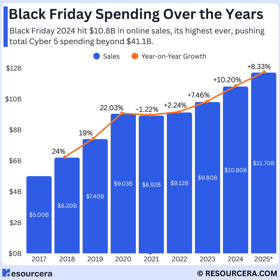
Here’s a visualization I made showing Black Friday online spending over the last eight years. 2025 is a projection based on current market trends.
Data source: Resourcera.com
Tool used: Canva
Happy to provide the dataset if anyone wants it.
Posted by Ibhaveshjadhav
6 Comments
Yeah it’s called inflation. Really this years is probably down when you account for that.
What is the point of having a line graph that is attached to the top of each bar chart? You might as well not have the line there at all. Separate the axis for data sets with different units.
did you account for inflation?
“The Annual Holiday Tradition of Fabricating Holiday Sales”.
[https://ritholtz.com/2013/11/enjoy-black-friday-but-ignore-nrf-surveys/](https://ritholtz.com/2013/11/enjoy-black-friday-but-ignore-nrf-surveys/)
Every year companies are starting their “Black Friday” sales earlier, sometimes starting as early as a week or two before the actual Black Friday. The data source references the days during Thanksgiving weekend and cyber Monday, but doesn’t clearly define Black Friday.
Are these pre-Black Friday sales contributing to the Black Friday sales in the data source?
If so, then the visual may be misleading because it depicts that sales on Black Friday (the day after Thanksgiving) are increasing every year, when in reality the date range for Black Friday sales is extending every year.
Your prediction was close. It’s 11.8 billion USD. For US online sales