
![[OC] MBTA commuter rail ridership by station](https://www.byteseu.com/wp-content/uploads/2025/12/qs8rc1uwjo4g1-656x1536.png "[OC] MBTA commuter rail ridership by station")
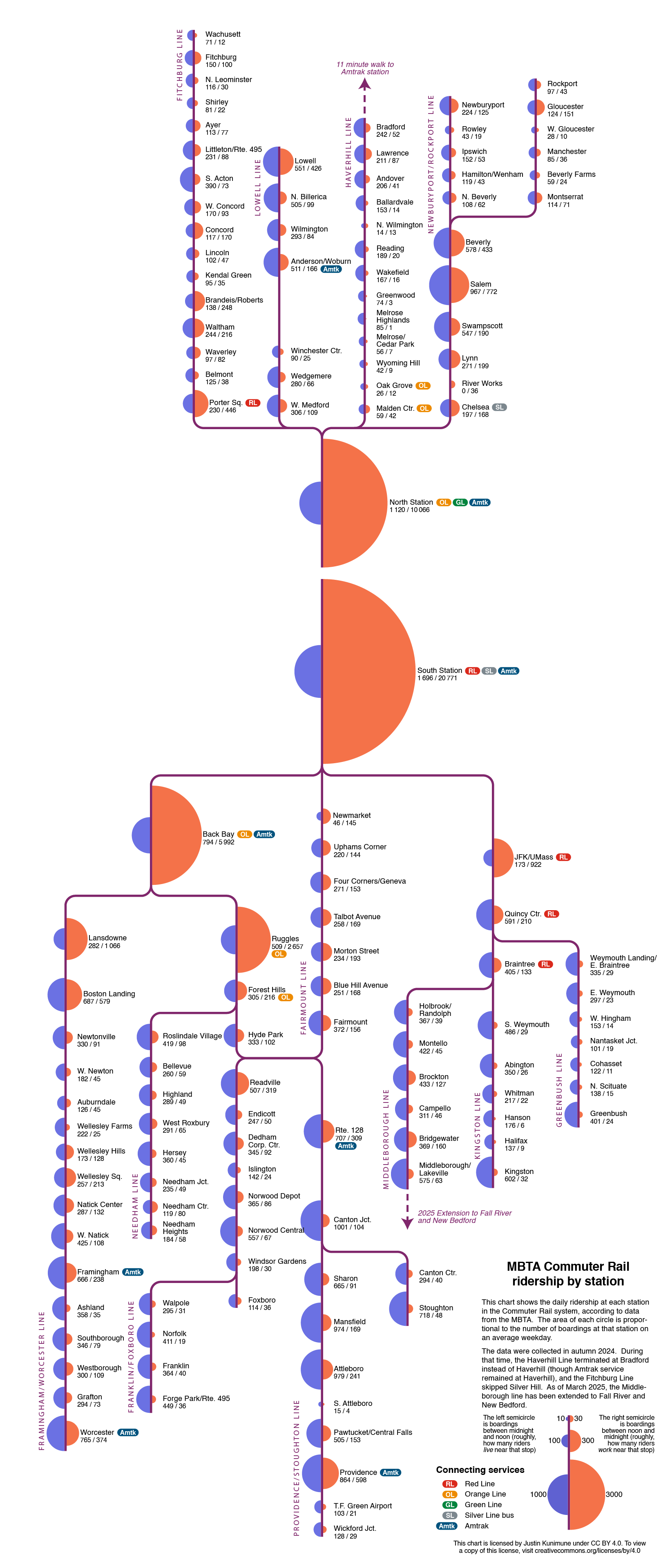
I made a chart of ridership numbers for the Boston-area commuter rail system. It shows the number of boardings at each station on an average weekday, divided into AM (left/blue) and PM (right/orange). I made this using a Python script (with lots of manual adjustment in Adobe Illustrator) based on the MBTA's official dataset "Commuter Rail Ridership by Trip, Season, Route Line, and Stop."
I'm specifically using data from autumn 2024, so a few stations that were closed at the time don't appear here. Specifically Haverhill at the end of the Haverill Line (closed for a year to replace a bridge) and Silver Hill on the Fitchburg Line (indefinitely closed during COVID but surprise-reopened last November) are absent, as are the new extension to Fall River and New Bedford.
Posted by whegmaster
7 Comments
As someone who has commuted via this rail system, I find this interesting and well-executed. Only nitpick on the format is that I had to hunt for what the blue and orange meant (I clicked on the graphic before reading the text).
Hm… wouldn’t it be great if those two middle stations were… connected?
Without knowing much about the area, it’s interesting how the bottom ones are predominantly morning boardings but the top ones seem to be more equal morning/evening. Are people commuting to those stops for work or do the people who live there come into Boston more in the evenings for work or other things? Is this a weekday map?
Source: [MBTA Commuter Rail Ridership by Trip, Season, Route Line, and Stop.](https://mbta-massdot.opendata.arcgis.com/datasets/MassDOT::mbta-commuter-rail-ridership-by-trip-season-route-line-and-stop-/about)
Tools used: Python and Adobe Illustrator
I’m never not shocked that the daily boardings at South Station are lower than the peak hour passenger load of Toronto’s Lakeshore line.
this is creative and stunning. the first actual data is beautiful i’ve seen in a while. nice!
Would like to see this updated with data from the Fall River/New Bedford branches at some point, see how they compare. I drive by both stations pretty frequently and don’t see as many riders as I would think after… 20 some odd years of planning?