
![[OC] SF Housing Development 1901-present](https://www.byteseu.com/wp-content/uploads/2025/12/zk3bg4x6926g1-1024x1024.gif "[OC] SF Housing Development 1901-present")
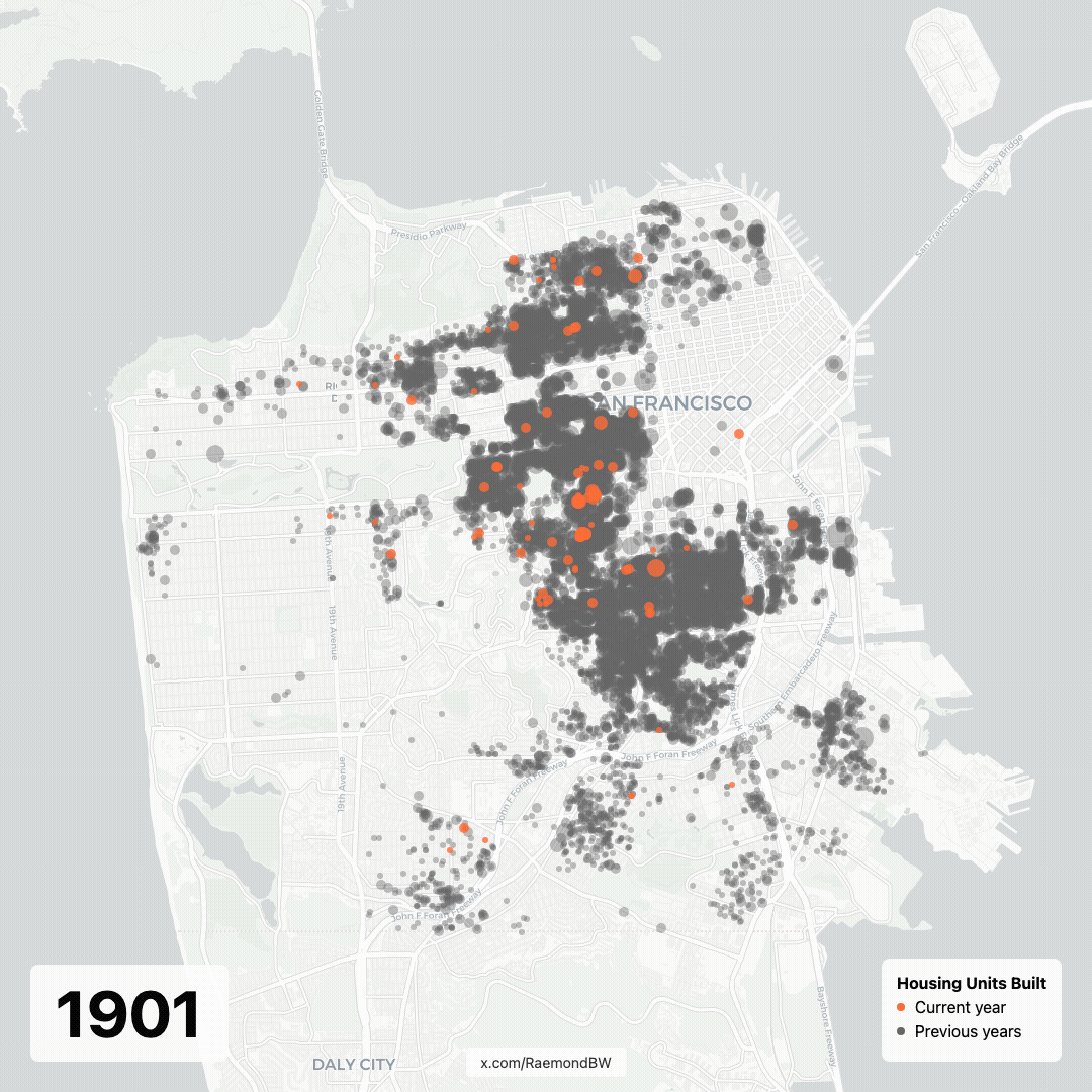
This visualization is part of a series, I'm working on, attempting to visualize the San Francisco housing shortage. Some other interesting plots are visible here: https://raemond.com/sf_development/ The data is all sourced from the SF opendata portal https://data.sfgov.org/
Posted by ofdm
7 Comments
yep, that’s a lot of flashing dots
Why is there only one dot at the end on Treasure Island? There’s a whole neighborhood there that wasn’t there in 1901.
Probably worth mentioning that this is basically a map of ages of current buildings which is a little different from a map of construction activity each year
There is housing in the Presidio. It does look like they have pretty much used up every single spot on the map though. It makes me wonder what the next step would be. I saw this video on the Saudi Arabian Archology called Neom. It seemed like a cool idea. Maybe San Francisco could be re-imagined as an Archology. One giant city/building seven miles high and like a pyramid with a seven mile long square base.
Almost like space has run out
Interesting to see public land slowly get bitten off and consumed – except the military land. Can give away parkland but can’t touch the absolutely giant chunk of prime real estate occupied by the presidio.
You can so clearly see when the repairing after the 1906 earthquake happened