
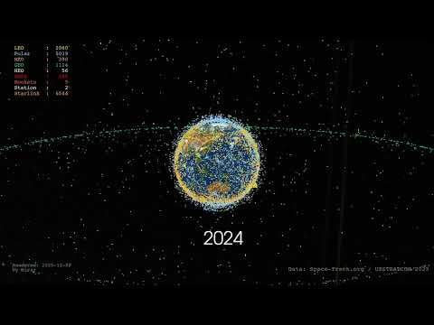
I got tired of the animation on how many satellites there were around our planet, that didn't have the correct orbits. So I wrote a python script and used TLE data from #Space-Track.org.
Due to rate limit problems it's using the first TLE it gets, which both miss a few satellites (still in TBD) and sometimes shows the early or even transfer orbit.
But it shows what's happening in geostationary orbit, LEO, and with Starlink pretty ok. I might spend more time on this later and see if I can fix the problems or if people at space-track can help me get the TLEs I need.
The script uses the API from space-track.org, loops over every half year, checks what's new, downloads the TLEs for those, and starts calculating the positions using SGP4, plotting the orbit from that point in time. It will keep using a "local time" for the satellite from that point, so if the orbit is changed later it's not going to update the orbit (the script is a bit fuzzy to solve the rate limit from space-track). But it was good enough to give an idea.
The green ring is of course geostationary mostly. Starlink trails appear at the end.
I will probably play around more with the script later, the star sky cube lines I especially dislike, and probably should ask again for an updated TLE now and then – I know it's not perfect. I had to hack in Skylab because my script insisted it was a "to be decided". Maybe the historical data isn't correct.
Edit: Doh, GNSS got the wrong colour in the render. Most of the ones in the cloud between LEO and GEO are GNSS.
12 Comments
Incredible. I am speechless but must say more words so r/space is happy
This is super rad! So nice to see some original content.
Very cool! I would love it if size could be represented more accurately? Like one of those dots is equivalent to like 100’s of miles of ground.
Even if it’s completely fine/manageable, a loop of 2025 belongs on a sub for anxiety inducing gifs.
Pretty insane. And while I understand that they are tiny in reality and thus there’s plenty of space, it does look quite congested. Especially if considering it from a ground based telescope with broad viewing angles. Practically impossible to get a shot of the sky without satellites somewhere.
Also crazy to see how the starlink satellites are pretty much creating a pseudo grid by the end. I really dislike the thought of that much information power residing in the hands of one guy with very questionable ethics and political viewpoints.
Awesome work, OP!
This is fabulous. Do you have data about sat nationality or company ownership. It would be great to see who’s been doing what and where.
Awesome! I want to see a zoomed out version so they are all in frame at once.
So scary to see, amazing, well done.
I would make the dots smaller and have them leaving a faint disappearing tail, just a suggestion
If you want to expand based on this, I’d suggest to zoom in in the end to the point where satellite pixels are to scale. It would put a better perspective for the space congestion. It may be quite hard tho, as distances are really big…
Sorry if I missed that part somewhere. Which libraries did you use to render the video?
There’s plenty of live view satellite visualisations that pull data from space-track and UDL.
TAROT for one.
Trying to lift off from this planet in outer wilds would be a nightmare :0