Top 20% seems way too high bc Its inflatet by the few very rich
JackfruitCrazy51 on
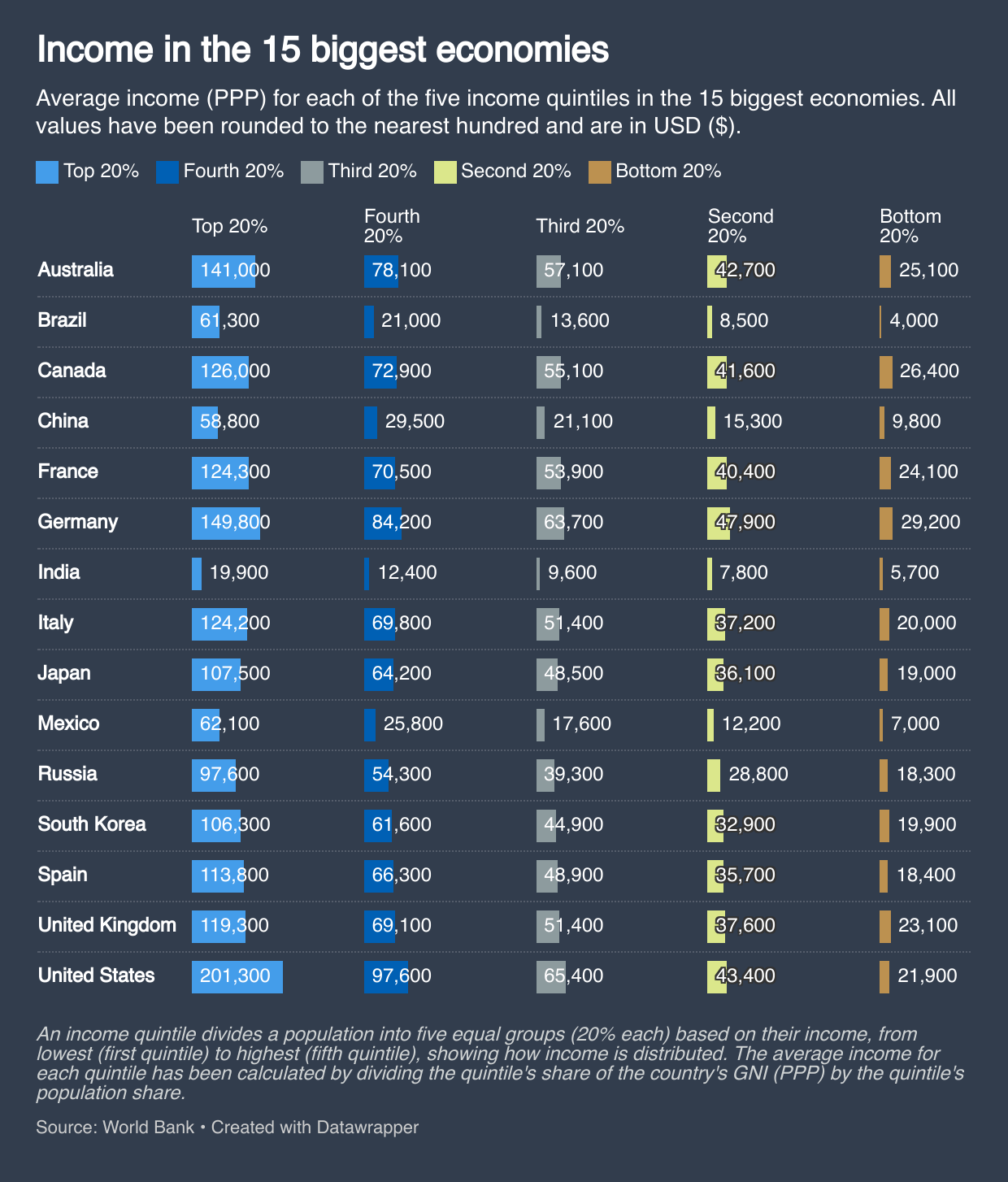
So basically, if you’re in the top 75% of wage earners in the U.S., your income is higher on average than the next 14th largest economies in the world. Is that correct?
Rameez_Raja on
Brazil’s bottom 20% are worse off than India’s bottom 20%?! Goddamn, that’s some crazy poverty.
Economy_Ask4987 on
Americans are entitled though, they all deserve more.
tripping_on_phonics on
Is this mean income? Median income would be much more appropriate.
FilthyCasual2k17 on
Now do 1% and 0.1% for all of them.
RatkeA on
chinese numbers are 100% fake
Innuendum on
Data is beautiful, it’s also painting Russia to be more distributionally sound than murica here.
JBSwerve on
Redditors will look at this chart and find a way to blame capitalism for something.
AardvarkSam on
So this is all crap, since the highest 1% / 0.1% are fudging the results.
In Germany the median income is at about 54K per Person
So like third 20%
If you make 150K, you’re in the top 0.1% in germany.
My numbers are from the federal buero of statistics in germany.
darks1d3_al on
I want to see above after taxes
Sebanimation on
Is this household income? Seems very high for individuals…
In switzerland f.e. 200k puts you in the top 1%.
And in the US that‘s 20%??
NestedForLoops on
What does PPP mean in this context?
CervusElpahus on
Comparing India to Brazil truly shows how unequal Brazil actually is.
TravelPhotons on
Is it per person or household?
Zealousideal_Ad_6922 on
You should add two specific ones, Top 1% and Top 10%. Especially the top 1%. The elephant curve might do its wonders, and we might see numbers similar to each other in many countries listed here.
carlospum on
The Spain data is not true
NighthawkT42 on
China always looks more balanced in things like this because they ignore non cash benefits to the politically connected.
warderbob on
I don’t understand the value of this information when looking at the average of the top 20%. The top 1% earners (billionaires and millionaires) likely skew everything.
PositiveLow9895 on
How German managed to take care of their poor and not allow social inequality to get crazy like in US and Brazil?
Logical_Delivery_183 on
While the US is in a league of its own, the real take away is the gap between so-called “rich” countries vs developing economies. I turns out they really are rich countries. The bottom 20% in Canad/Austraila/ GB/Italy/Germany is doing better than to 4th quintile in Mexico, even with adjustments for PPP. Being at the bottom sucks everywhere, but it sucks more in some places.
Jannis_Black on
ITT: People not knowing what PPP means and not bothering to look it up either.
harmyb on
The one that screams out the most to me is Brazil.
The financial disparity between levels…
* 113% increase from Bottom to Second 20%
* 192% increase from Fourth to Top 20%
* 1433% increase from Bottom to Top 20%
Rocketman03 on
Resumo: só dá pra migrar pro 🇺🇸
No-Veterinarian8627 on
90% talk about the top earners. I like that Germany has the bottom 40% as the highest and from then on, second place.
BTW. The reason is mostly the minimum wage (~12.50€/hr) that we cut down on poverty. The next two increases are 2026 and 2027 (January the first). It will be ~14.50€/hr in the end and we hopefully cut further on relative poverty and increase also all other wages a bit more, too 🙂
Now the problems: I would like to see the average tax rate, cost of living, and overall cost. There is also a great difference when it comes to labor laws and other things, that may show the data very differently. For example: mandatory paid vacation that would shift the data since it is basically free pay. Then the USA have this weird tipping culture. On paper you may make ’20k’ but in real it could be 35~40k. At least I heard that tipping is insane.
However, it is I think impossible. USA is too massive with states having great autonomy that the difference from place to place would be also massive.
Sadly, too many variables but nice whatsoever, the statistic! 🙂
TheGhostofJoeGibbs on
I bet this is after government transfers to the lower income levels.
goyafrau on
“If you’d look at medians or the top 1%, this quintile plot would look very different”
Guys …
What bothers me is the top earners are on the right and the bottom earners on the left.
The data is very interesting though. I’d like to have it as a sortable table. You can see for example how the spread is so much wider in the US than in other countries.

![[OC] Income in the 15 biggest economies](https://www.byteseu.com/wp-content/uploads/2025/12/4uog2z9le66g1-873x1024.png "[OC] Income in the 15 biggest economies")
31 Comments
Source: [World Bank ](https://www.worldbank.org/ext/en/home)
Tools: [Datawrapper ](https://www.datawrapper.de/)
Why not label it as 80th percentile, 60th percentile. etc?
That graph could use some normalization over total income in order to facilitate easier comparisons.
Its finally nice to see a more meaningful statistic than simply “GDP of country x to z”
https://preview.redd.it/hqnmbnajf66g1.jpeg?width=640&format=pjpg&auto=webp&s=17eb63d284011b6d7116e48e338a792b9a6e3bdf
Top 20% seems way too high bc Its inflatet by the few very rich
So basically, if you’re in the top 75% of wage earners in the U.S., your income is higher on average than the next 14th largest economies in the world. Is that correct?
Brazil’s bottom 20% are worse off than India’s bottom 20%?! Goddamn, that’s some crazy poverty.
Americans are entitled though, they all deserve more.
Is this mean income? Median income would be much more appropriate.
Now do 1% and 0.1% for all of them.
chinese numbers are 100% fake
Data is beautiful, it’s also painting Russia to be more distributionally sound than murica here.
Redditors will look at this chart and find a way to blame capitalism for something.
So this is all crap, since the highest 1% / 0.1% are fudging the results.
In Germany the median income is at about 54K per Person
So like third 20%
If you make 150K, you’re in the top 0.1% in germany.
My numbers are from the federal buero of statistics in germany.
I want to see above after taxes
Is this household income? Seems very high for individuals…
In switzerland f.e. 200k puts you in the top 1%.
And in the US that‘s 20%??
What does PPP mean in this context?
Comparing India to Brazil truly shows how unequal Brazil actually is.
Is it per person or household?
You should add two specific ones, Top 1% and Top 10%. Especially the top 1%. The elephant curve might do its wonders, and we might see numbers similar to each other in many countries listed here.
The Spain data is not true
China always looks more balanced in things like this because they ignore non cash benefits to the politically connected.
I don’t understand the value of this information when looking at the average of the top 20%. The top 1% earners (billionaires and millionaires) likely skew everything.
How German managed to take care of their poor and not allow social inequality to get crazy like in US and Brazil?
While the US is in a league of its own, the real take away is the gap between so-called “rich” countries vs developing economies. I turns out they really are rich countries. The bottom 20% in Canad/Austraila/ GB/Italy/Germany is doing better than to 4th quintile in Mexico, even with adjustments for PPP. Being at the bottom sucks everywhere, but it sucks more in some places.
ITT: People not knowing what PPP means and not bothering to look it up either.
The one that screams out the most to me is Brazil.
The financial disparity between levels…
* 113% increase from Bottom to Second 20%
* 192% increase from Fourth to Top 20%
* 1433% increase from Bottom to Top 20%
Resumo: só dá pra migrar pro 🇺🇸
90% talk about the top earners. I like that Germany has the bottom 40% as the highest and from then on, second place.
BTW. The reason is mostly the minimum wage (~12.50€/hr) that we cut down on poverty. The next two increases are 2026 and 2027 (January the first). It will be ~14.50€/hr in the end and we hopefully cut further on relative poverty and increase also all other wages a bit more, too 🙂
Now the problems: I would like to see the average tax rate, cost of living, and overall cost. There is also a great difference when it comes to labor laws and other things, that may show the data very differently. For example: mandatory paid vacation that would shift the data since it is basically free pay. Then the USA have this weird tipping culture. On paper you may make ’20k’ but in real it could be 35~40k. At least I heard that tipping is insane.
However, it is I think impossible. USA is too massive with states having great autonomy that the difference from place to place would be also massive.
Sadly, too many variables but nice whatsoever, the statistic! 🙂
I bet this is after government transfers to the lower income levels.
“If you’d look at medians or the top 1%, this quintile plot would look very different”
Guys …
What bothers me is the top earners are on the right and the bottom earners on the left.
The data is very interesting though. I’d like to have it as a sortable table. You can see for example how the spread is so much wider in the US than in other countries.