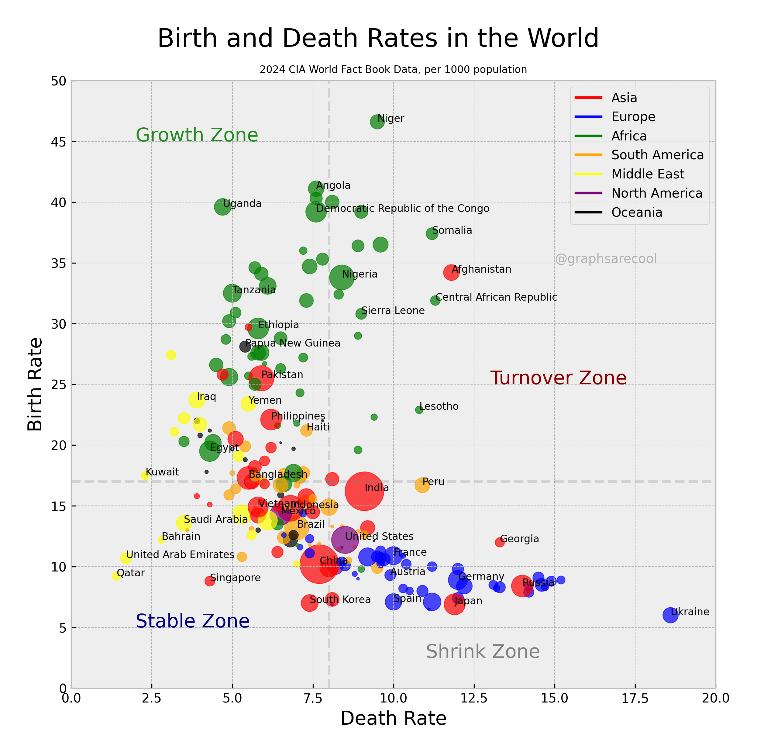
Birth and death rates are 2024 numbers listed as per 1000 people. A handful of countries are named as well. Dashed lines are global means for birth and death rates. All data from CIA World Factbook.
Posted by graphsarecool

![2024 Birth and Death Rates by Country [OC]](https://www.byteseu.com/wp-content/uploads/2025/12/npx1ucaen96g1-1536x1534.png "2024 Birth and Death Rates by Country [OC]")
Birth and death rates are 2024 numbers listed as per 1000 people. A handful of countries are named as well. Dashed lines are global means for birth and death rates. All data from CIA World Factbook.
Posted by graphsarecool
7 Comments
Source: https://www.cia.gov/the-world-factbook/countries/. Tools: numpy, matplotlib.
Damn. Sad face for Ukraine.
🙁
Let’s go Niger and Nigeria!!
All relatively developed countries are cooked.
Is this a living example of the famous experiment of mice utopia universe no.25? If so, it is not good
Interesting idea for a plot.
I feel like because both axes are in the same units, their scale should also be the same. Line y = x is meaningful, it’s no change in population number (from stable to high turnover), and it’d be natural to be at 45 degrees to the axes.
More, the dashed lines around x = 8, y = 17 are medians? Are those medians by number of entries (countries) on both sides or does it take into account the size of the countries?
Moreover, cutting into those 4 zones should not be done by median lines. Eg. Indonesia around (6, 15) is growing (15 > 6), even if in ‘stable’ area.
I’d also change lines in the legend to some rectangles.
This would be awesome as a time series, watching the bubbles grow and shrink and move around the map…
What does turnover zone mean?