
![How Inflation and Unemployment Moved Through the Pandemic and Recovery (2015–2025) [oc]](https://www.byteseu.com/wp-content/uploads/2025/12/d78cpnn80g6g1-1536x878.jpeg "How Inflation and Unemployment Moved Through the Pandemic and Recovery (2015–2025) [oc]")
Data Source Links
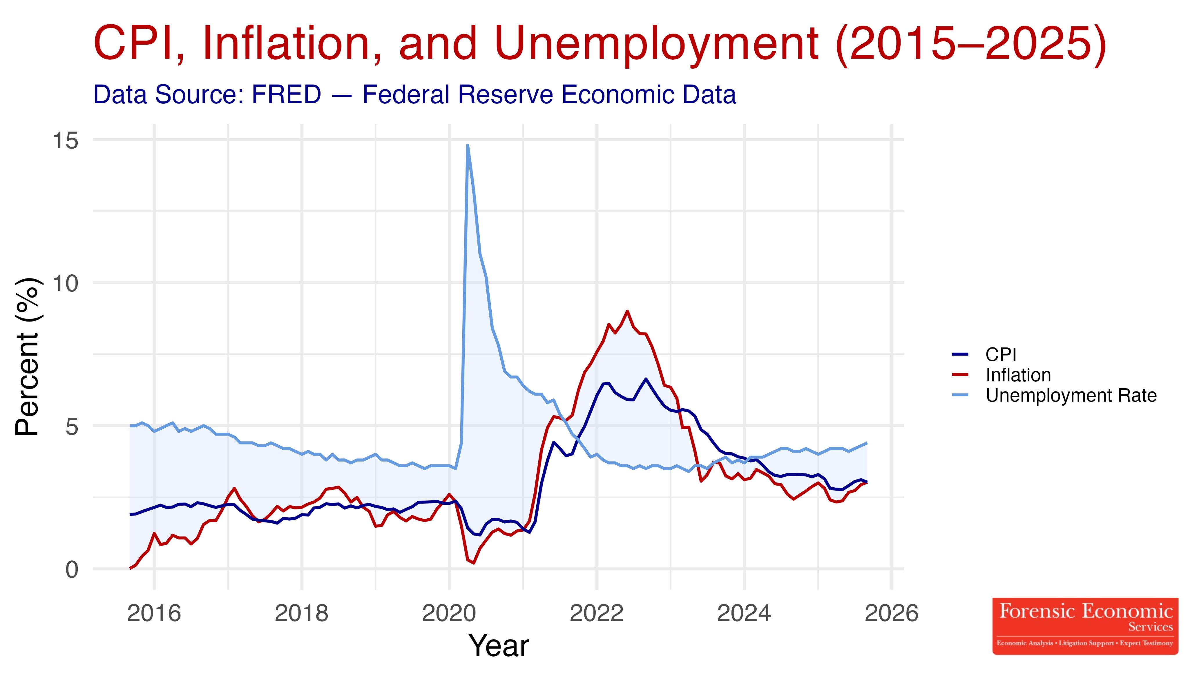
- CPI (CPIAUCSL): https://fred.stlouisfed.org/series/CPIAUCSL
- Core Inflation (CPILFESL): https://fred.stlouisfed.org/series/CPILFESL
- Unemployment Rate (UNRATE): https://fred.stlouisfed.org/series/UNRATE
Software: R (tidyverse, ggplot2)
We created this visualization to show how CPI, year-over-year inflation, and the unemployment rate have moved from 2015 through 2025. The chart highlights the economic volatility around the pandemic, the inflation surge of 2021–2022, and the gradual cooling that followed. It also shows unemployment beginning to rise again in 2023–2025, which aligns with the Federal Reserve’s recent concerns about a “riskier employment picture.”
Our goal was to capture all three indicators together so you can clearly see how they diverged during the post-pandemic period and why policymakers are now facing mixed signals: inflation is easing, but labor markets are softening.
Created by Forensic Economic Services LLC (Rule703.com).
We’re happy to share code, data steps, or updated versions if helpful!
Posted by forensiceconomics
4 Comments
It would be interesting to do this against the federal funds rate.
I think a graph like this should mention the country lol. Is this Brazil?
This would be a good time to remind people that inflation going down doesn’t mean prices are going down. It’s slowing the pace at which prices rise.
Does FRED publish labour participation rate?