
")
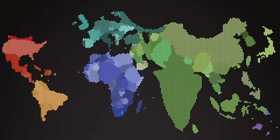
I grabbed a screenshot from this video showing the world map in 2020, where each hexagon represents 1 million people. Countries with less than 500k people don't get any hexagon.
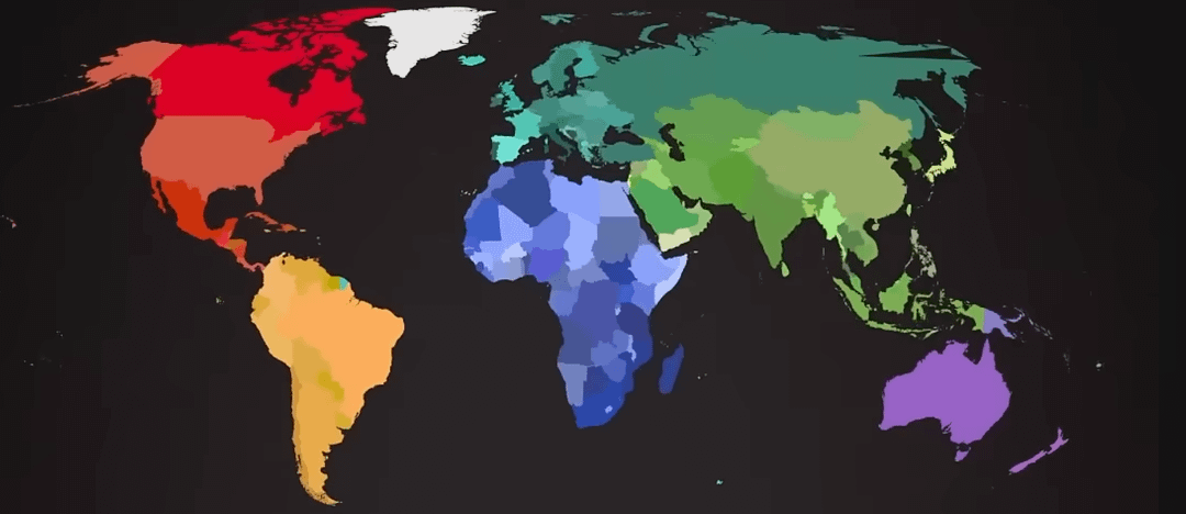
The full video visualizes how human population has grown and shifted across the globe from ancient times to today and into the future.
Video (youtube short) can be found here: https://www.youtube.com/shorts/S4qkMsPTtsE
Posted by 72chambers
11 Comments
Italy really let itself go…
Nice.
Just to nitpick: might be better to color contiguous countries very differently rather than very similarly to make the borders prominent.
well, it looks like “overpopulation” is a very new problem.
Cool use of Ravel’s string quartet.
At first, I thought Russia didn’t have that large a population. Then I realised it was China and that Russia was very distorted.
Madagascar and Haiti are a lot more densely populated than I thought.
The animations in the short is spectacularly done
It’s actually more balanced than I expected – except for the big northern countries, and that’s partly because their landmass is so exaggerated by the standard projection.
Finally a map with the true size of Canada.
Just watched this and it’s really interesting. Seeing population laid out like that makes everything click in a way numbers usually don’t.
There are more people in India or China alone than in the entire continents of the Americas, from Canada to Argentina.