
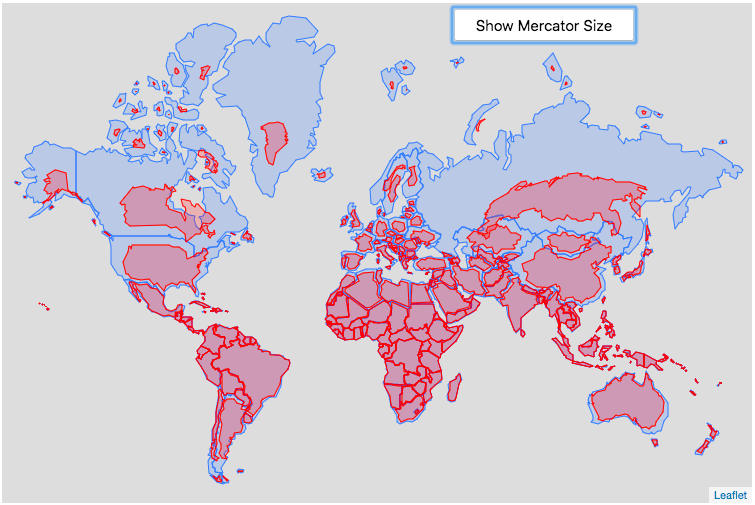
Blue outlines show countries as we usually see them on Mercator maps.
Red overlays show their true relative sizes when area distortion is removed.
Africa and South America expand dramatically, while Greenland, Europe, and North America shrink to their real proportions. A simple but powerful reminder of how map projections shape our perception of the world.
Posted by GlitteringHotel8383
10 Comments
Russia’s excuse is that it’s really cold there
Idk somehow this doesn’t really add up, Russia is 2x as big as Brazil but on here Russia only looks slightly bigger.
Wow. Russia, in comparison to how it usually appears in maps, is actually pretty tiny. It’s only slightly larger than China.
The Maghreb is absolutely gigantic and almost larger than all of Europe.
Here you can drag a country to others to compare [https://thetruesize.com/](https://thetruesize.com/)
Look how they massacred my Russia!
I dislike about this representation, that Antarctica is missing. The Mercator projection distorts symmetrically with the equator being the symmetry axis. This map makes it look like the distortion is asymmetric.
>Africa and South America expand dramatically
No they don’t? They basically keep their size, because they are so close to the equator. And both Argentina and Chile shrink quite a lot.
Lol look at Nordic country
r/WeKnowAboutMercator
I see that a good way of showing how distorted the Mercator projection is, is showing that Greenland is actually 1/3 smaller than India.