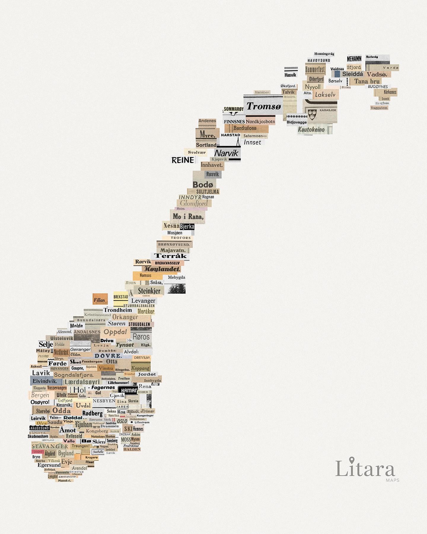
[OC] I created a map of Norway manually assembled from vintage clippings
https://i.redd.it/lqqz3kulkm8g1.jpeg
Posted by paveloush

![[OC] I created a map of Norway manually assembled from vintage clippings](https://www.byteseu.com/wp-content/uploads/2025/12/lqqz3kulkm8g1-1229x1536.jpeg "[OC] I created a map of Norway manually assembled from vintage clippings")
[OC] I created a map of Norway manually assembled from vintage clippings
https://i.redd.it/lqqz3kulkm8g1.jpeg
Posted by paveloush
11 Comments
Heisann! Creator here.
Some of you might remember the typographic map of Norway I posted a while back. While I usually use code to generate maps, lately I’ve been experimenting with a more analog approach.
I built this collage manually. I spent some time researching scans of old newspapers to find the names of cities, towns and villages cutting them out name by name.
It’s not meant to be a perfect atlas, but an artistic tribute to the geography of Norway.
Hope you enjoy this break from the digital world!
This is pretty neat!
Bjerkvik is very forgettable, so understand why its not there.
Cool👍
With a coloured background, i would definitely buy this poster to hang in my house. (Dislike white backgrounds)
The dimensions are funny, but it is a neat idea.
I love this 😃
Next time include Solbergelva, outside Drammen
Very important place, I’m from there 😁
Great work 👍
Awesome i love it!
that’s so cool!
Nice of you to use the original name with the original font from Rjukan Arbeiderblad. The paper has just had a boring “RA” logo for the last 20 years or so.
I love you for using Glomfjord instead of Ørnes