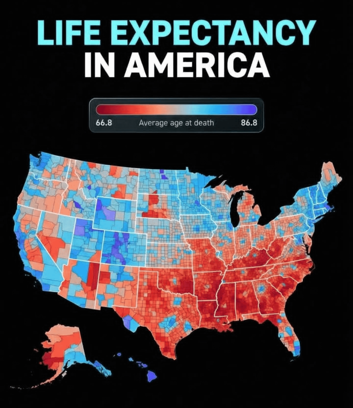
66 is pretty fucking bad, it’s the average of the *CONGO*
Deep_In_Uranus on
I wonder what the stark difference between the Dakotas is due to
Own-Transition-5170 on
Now add in race and job opportunities. The lowest death rate has the highest job opportunities. Many, many actual studies.
XSC on
What’s up with that streak in Colorado?
AngryQuadricorn on
It just means more…..?

ThatLittleMonkeyGuy- on
Greatest country in the world
stevetursi on
it is both surprising and not surprising at all how closely this matches political voting results maps.
Ok-Measurement2553 on
The food in the south is great, but damn.
calibrae on
So, basically, third world level.
HENMAN79 on
Mississippi always last in everything ..what a terrible place to live
Cool-Gear3465 on
Wow, almost looks like a republican vs democrat election map…interesting
DickNotCory on
the south fuckin suuuuuuucks lol
AnalogAficionado on
A few demographic factors certainly leap to mind. My own county is an island of blue in a sea of red. The flagship state university is here, there are two major medical centers, a lot of white-collar work. The surrounding state is mostly rural, underdeveloped, and conservative.
FatPotato8 on
I love how in the red areas, you can spot the major cities.
eltedioso on
I don’t trust this map. Any time there are giant differences that follow state borders exactly, it means that there are differences in how the data is being gathered.
kingtyler1 on
What is the source of this data, because anything I look has much more generous numbers? Especially for the Southern states.
Defiant_Band_4485 on
Everybody talking about how this matches political voting results with blue states having higher life expectancy are so rotted by partisanship. States like Utah, Wyoming, Colorado, and the mountainous parts of Idaho and Montana have the highest life expectancy due to the environment likely encouraging people to go outside and exercise more. Republican areas like the Dakotas, rural Minnesota, a ton of Kansas & Nebraska, and parts of rural Nevada are doing fine, likely due to oil money allowing for more healthcare. The only real conclusion here is that The South and minority groups have the lowest life expectancy.
xHourglassx on
People live (longer) in cities
KyuuMann on
Why red areas red and blue areas blue?
buttsnuggles on
Blue states and red states
Derelicticu on
Weird that most coastal areas have decent life expectancy, except the southern states.
the_realJV on
Living a long time is woke culture
Much-Egg-8353 on
MAGA states dominate with lowest life expectancy. They’re not interested in healthcare & science.
Acrobatic_Customer64 on
The people are being fooled by the wealthy politicians and pedophiles. Wake up.
strypesjackson on
I wonder if walkable areas have an advantage on non walkable areas?
Red_Nine9 on
Now lay this over a political map to really understand the situation.
Ybenax on
People live longer in countries where health is not a premium service
Code_Kai on
I thought it was a Reps vs Demos map
peopeopeopeo10 on
European here. How can you have such a low life expectancy in south east?
shlomangus_II on
Damn wonder how it feel for Southerners to be outlived by “soyboys” 😂
hydrated_purple on
I’m in Missouri, and it’s while how Kansas City (where I live) is one of the few outliers in the state. I’m not surprised though.
EpicBlasphemeTroll on
“jarvis, overlay the ethnic map of the US”
bandita07 on
Seems living long is a democrat woke stuff
Engineerxd on
yeah I call bs
mjltmjlt on
Brings a little extra meaning to r/peopleliveincities
xSushi on
Republicanism is a disease.
S_thescientist on
Would be interesting to have this next to an income map


39 Comments
Red state death spiral
66 is pretty fucking bad, it’s the average of the *CONGO*
I wonder what the stark difference between the Dakotas is due to
Now add in race and job opportunities. The lowest death rate has the highest job opportunities. Many, many actual studies.
What’s up with that streak in Colorado?
It just means more…..?

Greatest country in the world
it is both surprising and not surprising at all how closely this matches political voting results maps.
The food in the south is great, but damn.
So, basically, third world level.
Mississippi always last in everything ..what a terrible place to live
Wow, almost looks like a republican vs democrat election map…interesting
the south fuckin suuuuuuucks lol
A few demographic factors certainly leap to mind. My own county is an island of blue in a sea of red. The flagship state university is here, there are two major medical centers, a lot of white-collar work. The surrounding state is mostly rural, underdeveloped, and conservative.
I love how in the red areas, you can spot the major cities.
I don’t trust this map. Any time there are giant differences that follow state borders exactly, it means that there are differences in how the data is being gathered.
What is the source of this data, because anything I look has much more generous numbers? Especially for the Southern states.
Everybody talking about how this matches political voting results with blue states having higher life expectancy are so rotted by partisanship. States like Utah, Wyoming, Colorado, and the mountainous parts of Idaho and Montana have the highest life expectancy due to the environment likely encouraging people to go outside and exercise more. Republican areas like the Dakotas, rural Minnesota, a ton of Kansas & Nebraska, and parts of rural Nevada are doing fine, likely due to oil money allowing for more healthcare. The only real conclusion here is that The South and minority groups have the lowest life expectancy.
People live (longer) in cities
Why red areas red and blue areas blue?
Blue states and red states
Weird that most coastal areas have decent life expectancy, except the southern states.
Living a long time is woke culture
MAGA states dominate with lowest life expectancy. They’re not interested in healthcare & science.
The people are being fooled by the wealthy politicians and pedophiles. Wake up.
I wonder if walkable areas have an advantage on non walkable areas?
Now lay this over a political map to really understand the situation.
People live longer in countries where health is not a premium service
I thought it was a Reps vs Demos map
European here. How can you have such a low life expectancy in south east?
Damn wonder how it feel for Southerners to be outlived by “soyboys” 😂
I’m in Missouri, and it’s while how Kansas City (where I live) is one of the few outliers in the state. I’m not surprised though.
“jarvis, overlay the ethnic map of the US”
Seems living long is a democrat woke stuff
yeah I call bs
Brings a little extra meaning to r/peopleliveincities
Republicanism is a disease.
Would be interesting to have this next to an income map
It’s always Massachusetts