
![[OC] 10 years of weighing my Saturday Breakfast burrito](https://www.byteseu.com/wp-content/uploads/2026/01/3uwsrk2sujbg1-1536x1196.png "[OC] 10 years of weighing my Saturday Breakfast burrito")
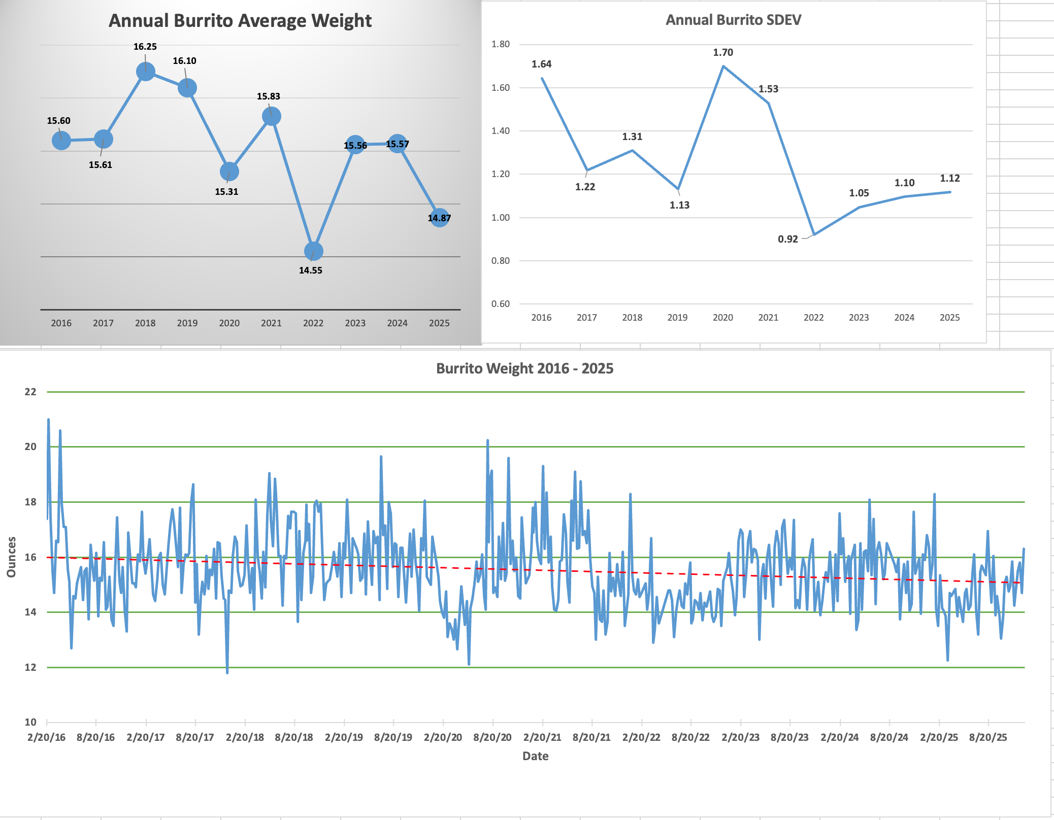
For the last 10 years I have been weighing my Saturday morning breakfast burrito. I pick up a sausage breakfast burrito from the local Los Favs and take it home and weigh it. I have been recording the weights in excel and used it to make the graphs. I have used the same kitchen scale the entire time.
Posted by chiefd59
13 Comments
For ten years you’ve been eating cold burritos for breakfast on Saturdays? Impressive.
I respect the dedication, that’s a very specific thing to track. I guess the gradual trend downward is your scale losing calibration?
Rather than Los Favs, I highly recommend the burritos from Los Pollos Hermanos. Might get something extra!
To me, the amazing thing is to be in the same place for 10 years of Saturdays. I don’t think I’ve had a full year in my life.
An interesting and novel flavor of autism which I had not yet seen until today. Thanks for sharing, OP
This…this is the ’tism I enjoy.
I think your data would be more informative with labels on the y-axis for your average weight as well as just plotting your standard deviation there instead of a separate graph
Now this is why I use Reddit.
Shrinkflation! Also, I’m sure the cost has gone up significantly too. I want price per ounce. 🙂
Same scale for ten years – Have you calibrated it recently? Otherwise the measurements could be off.
Would like to see the cost of the burrito tracked here as well
Do you have something for the price as well ?
Plotting annual average without labeling the [14-16.5oz] y axis makes the change look far larger than it actually is. I’m not generally in favor of non-0-minimum y axes, but *especially* not here where the axis isn’t labeled.
You could combine the top two charts using a bar for each year’s average and error bars for +/- 1 SD. Alternatively, a boxplot per year could be interesting to see potential outliers or skew.