
![[OC] Welfare Usage Rates by Immigrants’ Country of Birth](https://www.byteseu.com/wp-content/uploads/2026/01/rue8st3ollbg1-648x1536.jpg "[OC] Welfare Usage Rates by Immigrants’ Country of Birth")


Data comes from IPUMS ACS micro dataset (https://www.ipums.org/). Charts made with Datawrapper and R.
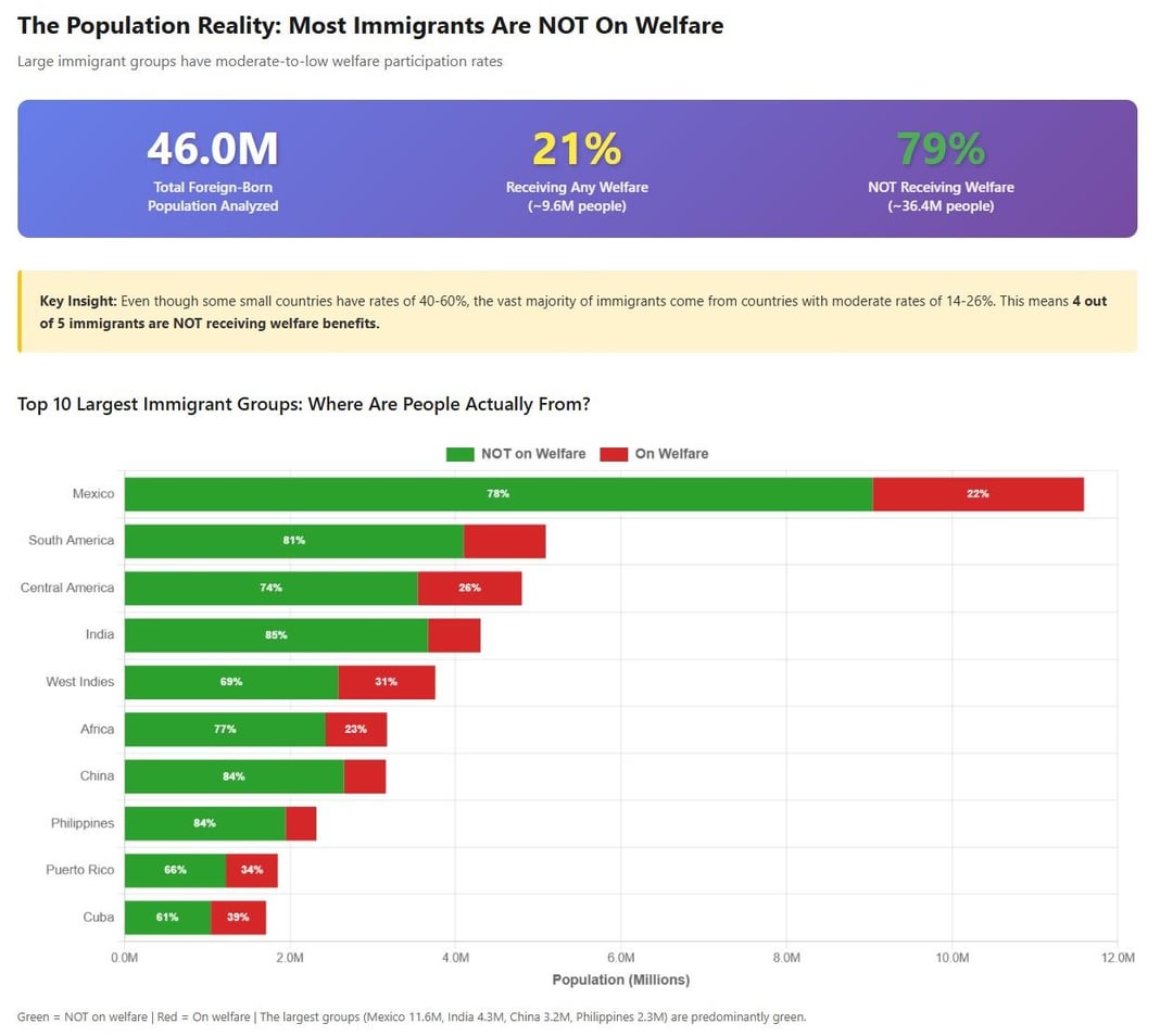
Graphs come from my blog, read link for full breakdown: https://polimetrics.substack.com/p/immigrant-welfare-participation-by
President Trump recently tweeted out screenshots of welfare program usage by immigrant households. He didn’t include any data source information or context for what was included in the numbers, so I dug up the numbers myself from the official data.
In the blog post, I point out that Trump’s list has artificially higher rates because he is looking at households rather than individuals. He also doesn’t include sample sizes for the estimates, which is particularly important for countries with smaller immigrant populations in the US, like Somalia, Bhutan, etc.
I find it interesting that the top countries in the official data source are countries experiencing extreme poverty/war/violence, and it makes perfect sense many of these would be high like this.
What do you all think?
Posted by Public_Finance_Guy
25 Comments
Does this include immigrants who became citizens?
[deleted]
Why is Puerto Rico listed as its own country?
edit: or other us territories , that have US citizenship that matter?
Pretty interesting, will review the sources. Might want to put (US) somewhere on first slide for added clarity.
“I find it interesting that the top countries in the official data source are countries experiencing extreme poverty/war/violence, and it makes perfect sense many of these would be high like this.”
Refugees having to start out on welfare, is not at all surprising. What’s surprising to me is that you’d have refugees on the same system as everyone else, given their vastly different needs to say, someone with a medical problem or permanent disability.
“Israel/Palestine” together is crazy work
The 21% average is actually lower than the overall usage of the social safety net (30% for the total US population):
[https://aspe.hhs.gov/reports/people-participate-social-safety-net](https://aspe.hhs.gov/reports/people-participate-social-safety-net)
“households rather than individuals”
I’m glad you posted your data, but I think that if a person in the house gets some official Fed gov’t help, that opens the door to get other help not charted, like from the state/county/city, or 3rd party NGO help….?
My family largely came over from Vietnam following the fall of Saigon. I’m sure they needed many welfare programs at first. Now that first generation generally worked low wage jobs like cleaning offices, but the second generation includes a pharmacist, intel engineer, and myself in FinTech. We pay a lot of taxes, far more than typical.
Using welfare as a way of life is undesirable, but using it as a means to keep your head above water until you can swim on your own is reasonable. Many immigrants come from successful families that value work and education, and if they need help it will be temporary. Not a lot of multigenerational poverty in most immigrant communities.
Immigrants from Puerto Rico? Your data is garbage.
We need a comparable line item for “born in the mainland US” to make sense of this data
Wonder how U.A.E made it on to the list – probably not citizens, but someone who fled from another country
your chart/dataset doesn’t show a lot of the countries. It’s just a select group of countries and regions. Why is that?
Illegal labor is heavily subsidized so their employers can keep wages low, and most of those subsidies aren’t included in “welfare” stats. E.g., Newsom not only gives MediCal to illegal aliens, he ran a radio ad urging them to sign up before the rules change. “Free” school lunches are another form of corporate socialism. Same with in-state tuition.
Now, Newsom is suing to overturn the new $100k H1B fee, for the same reason he offers “free” school lunches: to help his Big Biz donors.
Put your opinion of Trump aside and follow the money. And, note that Trump might do things specifically to play Bad Cop.
I think we should have another report about this data maybe 2 years since they arrived in the US, considering some may be asylum seekers who need to acquire at least some language skills before being productive.
Needs a control – add native-born as a reference point?
Now compare hat data to Corporate Welfare
People born in the U.S. Virgin Islands don’t immigrate to the US. They are born there.
It would be interesting to look at whether or not these immigrants are able to get work here in the US.
When we have an understaffed border with no end in sight and an understaffed immigration court system with no end in sight along with bans on immigrants getting welfare and getting jobs, one of those two bans is going to get ignored.
I’d like to phase out the entirety of the welfare state (for both immigrants and citizens) and make it as easy as possible for BOTH immigrants AND citizens to get jobs. But, I imagine that’s easier said than done.
Great work OP! Some small critiques, but I’m going to overlap with other comments to really emphasize how important it is.
* You should have USA as a very prominent, bold data point on the “Welfare Program Usage by Immigrant Country of Origin” plot. Maybe even as a vertical line to make comparison really easy, since everything is already ranked.
* On the same plot, you have South America (n.s.), Asia (n.s.), and so on, but you never explain what n.s. or n.e.c. stand for. Probably not specified and not elsewhere classified
* You make an excellent point about confidence intervals, and while people with training in statistics can plot this in their heads, it’s not obvious to a layperson. I actually think the “Welfare Program Usage by Immigrant Country of Origin” could be better visualized with just the black dot, and confidence intervals on top.
Again, great work!
Interesting. Immigrants from Europe have the lowest rates.
Seeing Switzerland above Turkey was wild
Is this “are currently receiving,” “have received at least once during the past X years,” or “have ever received at any time since immigrating”?
What is the rate for non-immigrants?
Show me corporate welfare by net worth.