

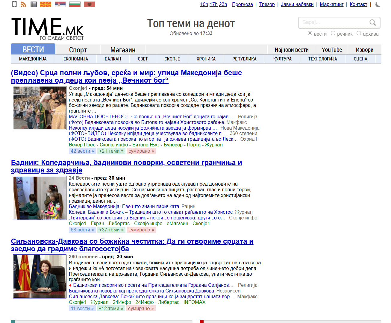
So, according to this: https://www.semrush.com/trending-websites/mk/allthe most visited Macedonian website is time.mk. I had never been on this website before and wanted to check it out. And god oh god… This seriously looks like it has never been updated, ever before. Then I realized that its only purpose is to redirect you to other websites. And most websites again look very old. Why is this so?
https://i.redd.it/bii0a41mbrbg1.png
Posted by tomi_tomi
21 Comments
Hi there, i visit Time.mk daily because it is **very** simple to navigate. Same as Wikipedia – Black and White is sometimes more than enough to keep yourself informed.
Its a news generator. Visiting mostly as a habbit. Check it once a day to get updated on daily topics related woth the country, region, economy and sport events.
Few months ago it was sued due to copyright infringements, about sharing content without consent from the online medias. Now, there are like half of the content without the most famous media houses, but yet, visiting as a habbit amd starting point.
P.s. I like time.ai option, that sumirize the most viewed and hot topics in ai generated 3 min read text.
Dont change anything that it isnt broken .
If something works don’t touch it.
Because the goal is to be simple.
Because it does what it’s supposed to do – shows you the latest news, and gives you multiple sources for each topic to help you deeuce the truth.
And it does it very well. It’s fast, it’s consistent, and it’s smart.
The UI is very clear, doesn’t change at all, it’s lightning fast, and the algorithms are very smart, and the ads aren’t intrusive (mostly)
Have you noticed it loads near instantly? Can you tell me a single site that loads faster? Nobody cares about latest cutting edge web design, if the website works great.
Tomi tomi please enlight us how one news agregator should look like in 2026 ( to poor Macedonian people)
Yeah lets make it dark theme and add a bunch of useless javascript on top and 50 animations for everything and auto scroll. 300mb initial load for some bullshit. It simple, works, and does its job.
Good question 😀
Немал ѓаволот работа си ги ебал дец’та
I think it’s actually a brilliant design. Very simple, incredibly user-friendly and the fact that it doesn’t have a style and character means that the audience is so wide there is no particular target group to shape it for, nor a particular niche.
As a designer I’d just do some slight spacing changes thats it 🤣
Old me would be shocked by this comment, but I do think now that UX is way more important than UI even if the cost is UI.
Mfw it’s 2026 and dudes still not using dark mode.
it’s a news agregator, it is good enough
Visit https://vibes.mk a new modern alternative
I think it looks good
Ne seri be
It’s because it’s a news aggregator
For the same reason as Craigslist. Does the job web and generates income.
Thats because the country is still in the early 00s 🤣
simple is good
So do American gov websites so what’s ur point? Samo gomna da se jade