
![[OC] The Educational Attainment Of Major News Audiences](https://www.byteseu.com/wp-content/uploads/2026/01/ae1dwd5pq7dg1-1386x1536.png "[OC] The Educational Attainment Of Major News Audiences")
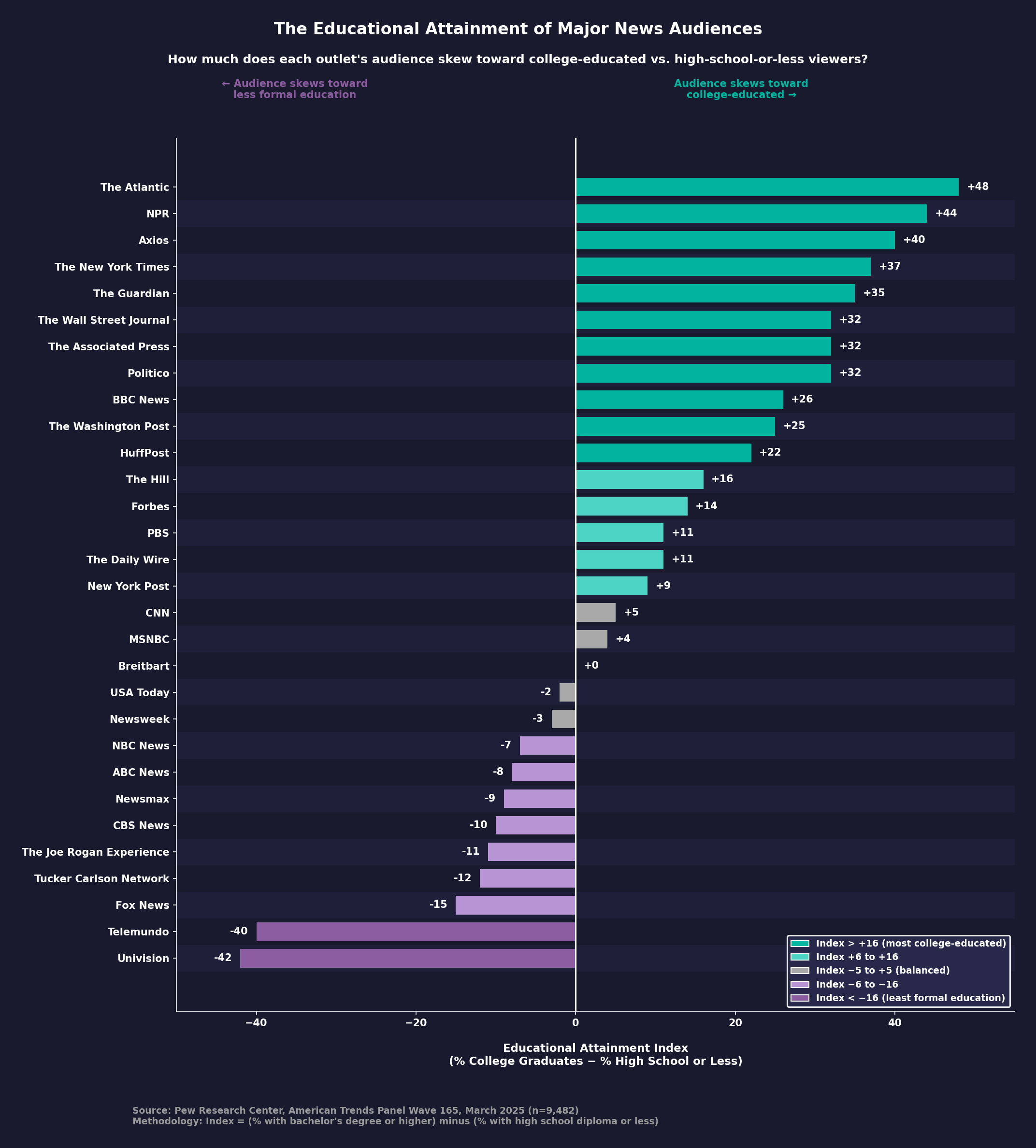
Submission Statement: Visualization was created using Datawrapper. The data comes from Pew Research Center's American Trends Panel Wave 165, which surveyed 9,482 U.S. adults from March 10-16, 2025. The full methodology is documented here.
An education breakdown is available in table format as part of a PDF document published by Pew Research Center.
The PDF document shows a more detailed breakdown of education levels ('College+', 'Some college', and 'High school or less') of U.S. audiences of outlets used regularly as a source of general news for 30 news sources. For example, The Atlantic shows 62% College+, 23% Some college, and 14% High school or less. The table was referenced in Pew's short-read article: How the audiences of 30 major news sources differ in their levels of education.
Posted by najumobi
17 Comments
My mom constantly watches Univison, as do her friends and sisters Not sure what to feel about this
Seems like with the exception of NPR, people who mostly read their news tend to have more education than those that watch/listen to it. Not surprising really, but interesting.
To further look at this trend, it might be interesting to break down the news orgs by what proportions/popularity of their content are in which medium.
I’ve got a feeling that “less formal education” actually means “less education”
Me sees a certain correlation of education to political leaning (except The Daily Wire). This is me, not surprised.
The Atlantic has some good shit. Approve.
Interesting that “Tucker Carlson Network” is on here…isn’t it just his podcast?
For comparison, I’d like to see where a media company like Crooked Media (which is very progressive) falls. I’m assuming it would fall in line similar to the other progressive sources, but would still be interesting to know.
MSNBC is currently between audiences
Where does the Economist sit?
If we were to have a line that averaged out all people (irrespective of which news they consume), where would they land on the education spectrum? What is the average person’s education level?
Odd that the New Yorker isn’t on there.
As a kid, I would watch Univision and Telemundo and a large part of their “news” was shit like “kid finds mouse in Doritos bag”, “yugioh cards linked to devil worship”, tarot reading from Walter Mercado and basic shit you would get on your local news stations like the weather, some crazy shooting or whatever. Looking back, it was all nonsense.
Clearly it’s time to buy Telemundo
The major TV networks are obviously in the negative because most Americans have never graduated from college and they appeal to wide cross sections of the American public.
Interesting, Univision and Telemundo seem to be the most representative of the organizations on this chart
Text labels are too small, particularly for the y axis, but everything should increase a bit.
Why does the legend not match the actual scale?
Don’t believe ANY media Including this chart if a Dem has been ANYWHERE near it!!
This is very interesting, however I’m not sure how accurate/ representative of a general population this is, as the sample size is only about 0.000027% of the us population