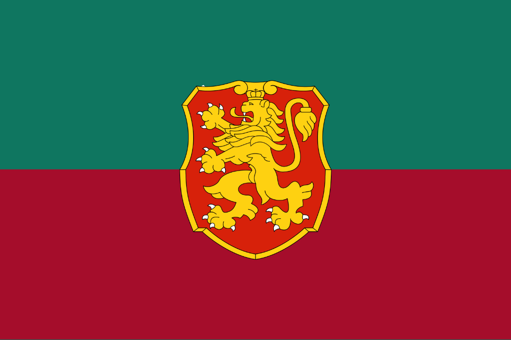
I feel like the white is integral. It just feels off without it.
Petrak1s on
This is not the Bulgarian flag.
rexi11zzz on
I like the symbol in the middle but it feels weird without the White
BalkanAnimeBoy on
It’s pretty good
konservata on
I think you are missing something here.
LAZY_RED-PANDA on
You forgot this:

Pidrshrek on
We already have a flag
PolluxDiS on
Hello Belarus
AdMysterious3410 on
Лъва на емблемата винаги ли е имал пишка?
snitsny on
You see, you’re attempting to design a flag that suggests historic association, yet completely ignoring the classic European heraldry principle – no color on color, no metal on metal.
A lot of flag color choices come from medieval system for coats of arms that used strict color rules to ensure contrast and visibility.
Heraldry divides colors (called tinctures) into
“metals” – gold/yellow and silver/white
and
“colors” – like red, blue, green, black, and purple.
So, according to the abovementioned principle red on white or yellow on blue works, but red on green or white on yellow was avoided.
This was mostly about readability at a distance, especially on banners. Many flags still reflect this logic.

11 Comments

I feel like the white is integral. It just feels off without it.
This is not the Bulgarian flag.
I like the symbol in the middle but it feels weird without the White
It’s pretty good
I think you are missing something here.
You forgot this:

We already have a flag
Hello Belarus
Лъва на емблемата винаги ли е имал пишка?
You see, you’re attempting to design a flag that suggests historic association, yet completely ignoring the classic European heraldry principle – no color on color, no metal on metal.
A lot of flag color choices come from medieval system for coats of arms that used strict color rules to ensure contrast and visibility.
Heraldry divides colors (called tinctures) into
“metals” – gold/yellow and silver/white
and
“colors” – like red, blue, green, black, and purple.
So, according to the abovementioned principle red on white or yellow on blue works, but red on green or white on yellow was avoided.
This was mostly about readability at a distance, especially on banners. Many flags still reflect this logic.