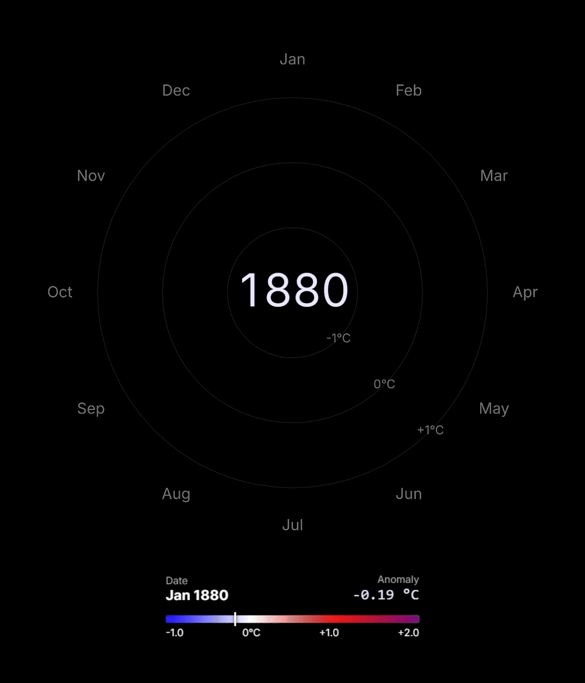
Interactive 3D climate spiral showing global temperature anomalies from 1880 to today (relative to the 1951–1980 baseline). Inspired by Ed Hawkins’ climate spiral.
Posted by Dudelcraft

![[OC] Interactive 3D Climate Spiral](https://www.byteseu.com/wp-content/uploads/2026/01/1768863286_zul0at638ceg1-878x1024.gif "[OC] Interactive 3D Climate Spiral")
Interactive 3D climate spiral showing global temperature anomalies from 1880 to today (relative to the 1951–1980 baseline). Inspired by Ed Hawkins’ climate spiral.
Posted by Dudelcraft
11 Comments
Custom interactive 3D visualization built with JavaScript and Three.js (WebGL)
Live demo: [https://betanumeric.github.io/climate_spiral/](https://betanumeric.github.io/climate_spiral/)
GitHub repo: [https://github.com/BetaNumeric/climate_spiral](https://github.com/BetaNumeric/climate_spiral)
Data source: NASA GISS global temperature anomalies [https://data.giss.nasa.gov/gistemp/](https://data.giss.nasa.gov/gistemp/)
Seen this kinda thing before. Well done again. Hard to argue with that simole level of visualization.
What if climate change protects us from the next ice age?
What caused the 1940 to 1950 period to be slightly hotter on average?
Beautiful? Yes.
Practical? Eh.
Beautiful? YES
Nice , if we can have more than 1 frame in the ending that would be good too
Jarvis, rerun simulation on data points since the ice age
How reliable is the data from 1880 compared today. Is there a way to see the raw data used for the calculations for 1880 compared to today?
Is there a r/dataisterrifying? Though yes, also beautiful visualization, well done!
Wow.. What are you going to propose next? That the earth is round?
2015 was the first year when we started to get major forest fire smoke around Vancouver during the summer. You can see the jump in temp.