
![[OC] NBA 3pt attempts since 1980](https://www.byteseu.com/wp-content/uploads/2026/01/jq5uljojqkeg1-1536x764.gif "[OC] NBA 3pt attempts since 1980")
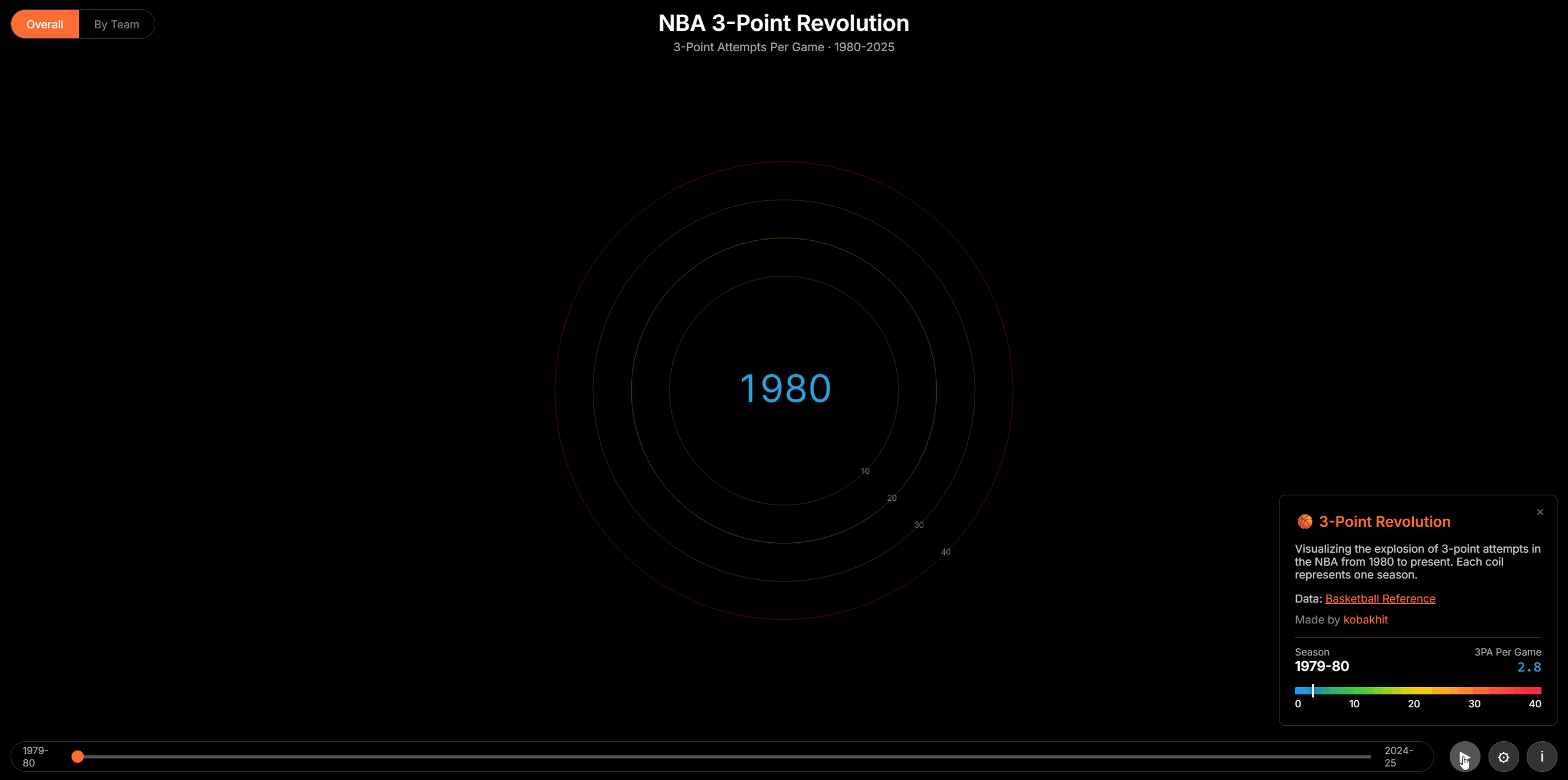
Inspired by the [OC] Interactive 3D Climate Spiral : r/dataisbeautiful I created a version for the NBA 3pt attempts by season to show how the style of play changed since 1980 towards more shots attemps beyond the arc.
Data Source: Basketball reference
Tools: html/css/javascript and three.js
Posted by dostre
3 Comments
Inspired by the [[OC] Interactive 3D Climate Spiral : r/dataisbeautiful](https://www.reddit.com/r/dataisbeautiful/comments/1qh9wl3/oc_interactive_3d_climate_spiral/) I created a version for the NBA 3pt attempts by season to show how the style of play changed since 1980 towards more shots attemps beyond the arc.
Data Source: Basketball reference
Tools: html/css/javascript and three.js
Why is this a good representation of data compared to a more simple thing?
It doesn’t really tell me much except that more attempts happen now than before. I don’t get a sense of scale nor do I have anything to compare it to. The milestone explainer text at the top goes by too fast for me to even delineate differences between each milestone, where normally if this were a typical graph where the X axis is the year and each milestone were labeled on the graph itself, I’d be able to see much better each milestone that increased 3 pointer attempts and be able to better see the impact of each one (such as if one caused it to skyrocket more than the other.
Just some thoughts.