
![[OC] Millennial and Gen Z homeownership is even worse than many think](https://www.byteseu.com/wp-content/uploads/2026/01/f6VQs9uLHb4898ZiEJ9f8g3QNL25iMw2uFrCaF7fG2E-1024x576.jpeg "[OC] Millennial and Gen Z homeownership is even worse than many think")
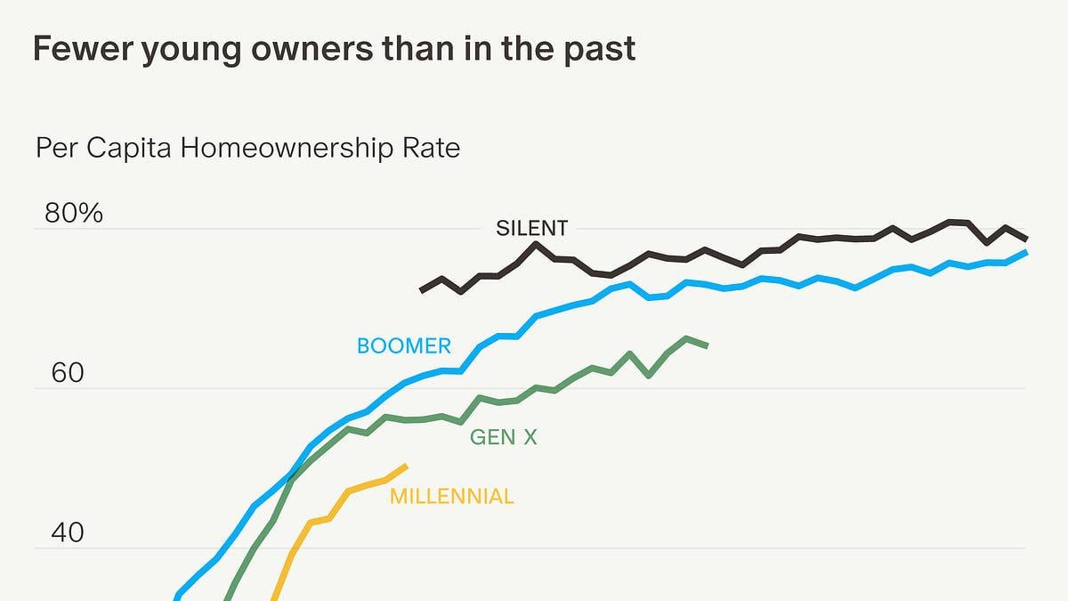
Many charts show homeownership as owners ÷ household heads—this lowballs the issue for the young: many of them live with parents/friends (ie they're not household heads). This chart is better: the per capita rate (owners as % of *all* adults in each generation, not just heads).
Data: Census Bureau
Method: Python -> SVG -> Adobe Illustrator
Posted by ComparisonFun6361
8 Comments
THAT’S FINE, NOTHING TO SEE HERE, BUSINESS AS USUAL.
This is way better than most people on reddit think, though. They’re not going to like this post
This makes it sound like lagging young home ownership is primarily a household formation issue and not a cost issue. While costs are likely a cause of delayed household formation, I would guess other factors are at least as important in causing the delay. Regardless, it looks like homeownership per capita has been going down every generation for decades now and may have reached a new baseline with Millennials and Gen Z on the same trajectory.
Woah, this looks like Gen Z is sllllightly out performing Millennials in ownership?
Not what I would have expected based on online rhetoric.
I wouldn’t be surprised if the Millennial rate of ownership ticks upward over the next decade as their boomer parents pass away and they inherit.
What is the X axis here? It wants me to sign in to see it.
This makes the situation look less bleak than if you show percent of budget going towards mortgage and such
I’m gen z and just bought a house. Just invest in mu/Nvidia