
![[OC] Home Price Gainers and Losers, by ZIP, in 2025](https://www.byteseu.com/wp-content/uploads/2026/01/an13wrpc7xeg1-1536x1302.png "[OC] Home Price Gainers and Losers, by ZIP, in 2025")
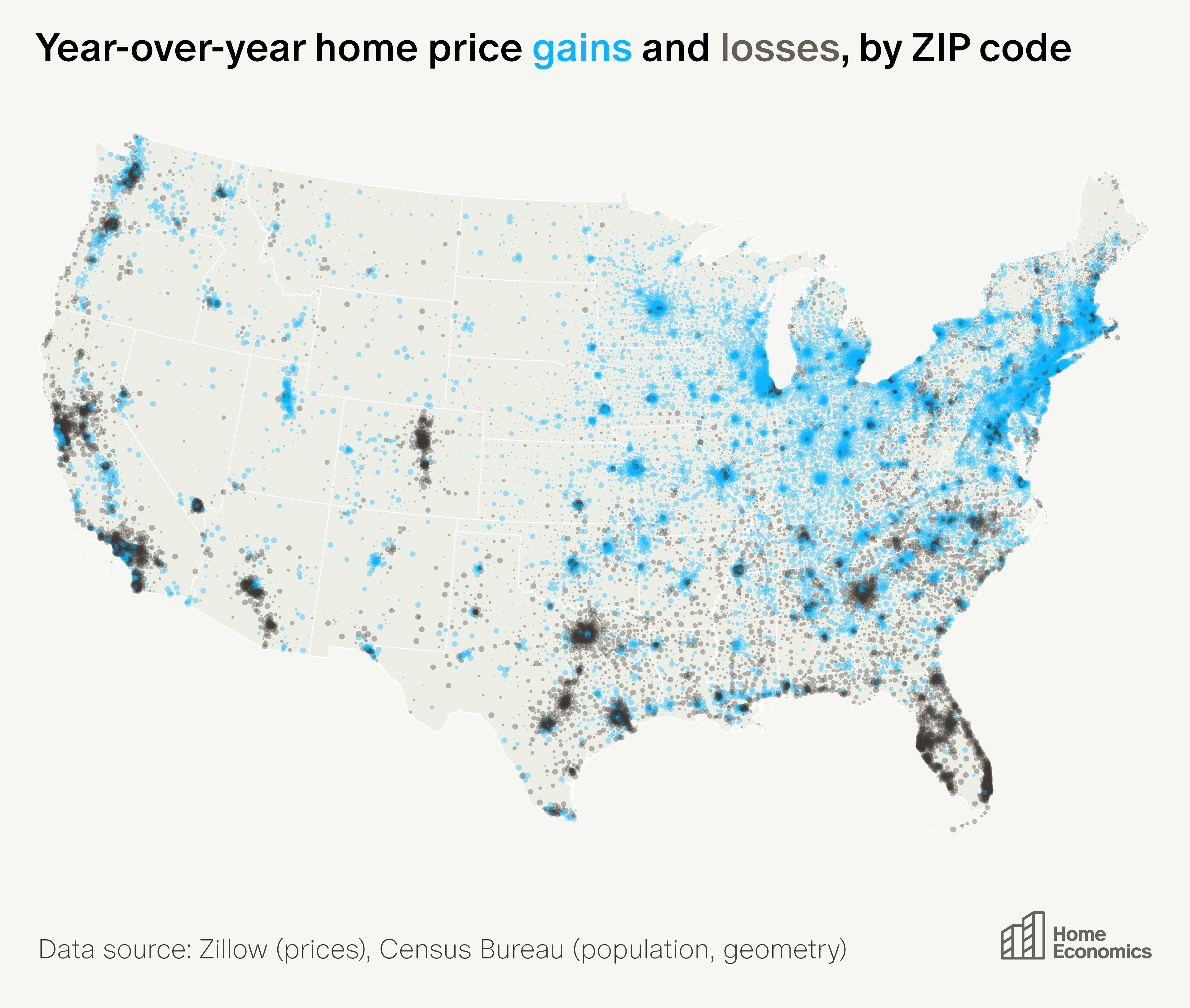
At the end of 2025, home prices had risen from a year earlier in 16,500 ZIP codes (63%). Prices were lower than a year earlier in 9,800 ZIP codes.
Gains were concentrated in the Midwest and Northeast—with over 85% of ZIP codes in states like Wisconsin, Indiana, Connecticut, and Illinois seeing appreciation. Losses were predominant in the Sunbelt, where Florida (96% of ZIPs), Texas (75%), Arizona (73%), and California (78%) saw widespread price drops.
It’s unusual to see home prices rising in one part of the country and falling elsewhere. Even if ‘real estate is local’, macro factors—interest rates, employment growth, etc.—tend to dominate, pushing most ZIP codes in the same direction, even if by different degrees.
So the divergence we see today—with some ZIPs up and some down—is surprising. But it merely reflects a statistical quirk: with national appreciation hovering near 0%, a normal distribution around that threshold yields a mix of gainers and losers.
As for the geographic pattern apparent in the map, the black swathes across the Sunbelt (representing falling prices) reflect a supply/demand imbalance: pandemic-era migration flows to the area reversed just as a lot of new construction came online.
If the housing market heats back up, this apparent divide will quietly disappear—even in Sunbelt ZIPs remain the laggards, the distribution will shift to the right, and nearly all ZIPs will be in the blue again.
Data source: Zillow (all homes)
Measure: y/y % change
Source of visualization: Home Economics
Posted by ComparisonFun6361
17 Comments
This is super cool. Thanks for making this. What I find really fascinating are the cities where the downtown area has gone down in value while the surrounding area/suburbs have gone up (e.g., Chicago, D.C., Boston) and cities where you see the opposite – downtown area going up and surrounding area/suburbs going down (e.g., San Francisco, LA, Dallas).
Nothing about this is beautiful.
Exploiting shelter isn’t beautiful.
No one benefits from this except property scalpers.
Interesting to see metros where the urban center gets more cheaper (Chicago) vs expensive (Dallas)
Florida is severe affordability problems vs wages paid in the state, plus insurance spikes.
This might have more to do with house insurance too. It’s hard to get coverage now in places like Florida and California due to hurricanes and wild fires. And general affordability.
Part of this is mapping where housing construction is tolerated and therefor catching up with demand.
>nearly all ZIPs will be in the *blue* again.
Be consistent with your data presentation!
What’s interesting is the gray cities in Texas and Florida are STILL the fastest growing cities in the US. They just build tons of housing which lowers prices. In Florida’s case rising home insurance costs also plays a factor.
[State Population Growth](https://worldpopulationreview.com/states)
[Metro Area population growth (graphic by me)](https://www.reddit.com/r/dataisbeautiful/s/Ijlkx2khtR)
I really can’t tell the difference between darkest blue and darkest grey. I zoom in on Burlington VT, and I can’t tell if prices rose or fell.
It looks like the west lost value, while the suburbs of the east gained, but I can’t be sure.
Minor quibble with this graphic.
Those should be ZCTAs (Zip Code Tabulation Areas), not Zip Codes.
Zip Codes don’t have geometries. ZCTAs are alpha shaped approximations conflated to census block boundaries of the routes covered by a zip code. ZCTAs overlap each other and cross jurisdictional lines, even though zip codes do not.
There are more technical differences besides that, but what mostly matters is that this is a map of zip code based data (price changes) by ZCTA based geometries.
I imagine most of Florida and New York City will be black once they’re both under the ocean
the florida and texas populations are growing. is this because of building policies? they are building more homes?
NJ going crazy…everything is up except for the pine forest.
Interesting how in Texas what appears to be the downtowns are gaining value but the suburbs and outer City are losing value.
Yes Wisconsin home prices have skyrocketed. 7 years ago I was getting ready to buy and covid hit. Canceled my plans. Then interest rates jumped and home prices to the moon. We are talking 200k homes 2 years ago now 400k. Duplexes jump from 80k-100k to 150k in my area. Trailer park homes are 150k. Cheapest area now is right next to an airport with a 1000 square ft. home being 250k-350k. Totally priced out if your a single person making a good salary for Wisconsin.
Don’t tell me that climate migration doesn’t exist.
Few questions if anyone can help me out here.
1: gains are represented by the blue and that displays an increase in house costs?
2. The cities, specifically in Midwest region (Chicago, Columbus, Detroit, Indianapolis) have blue suburbs and grey downtown area, is that correct?