
![Student Debt Burden for Bottom Quartile Students at every University in US [OC]](https://www.byteseu.com/wp-content/uploads/2026/01/s94usbtepzeg1-1024x789.jpeg "Student Debt Burden for Bottom Quartile Students at every University in US [OC]")
OC – Analyzed if bottom quartile students are able to comfortably able to pay their student loans for a data project I'm working on. Original write-up here.
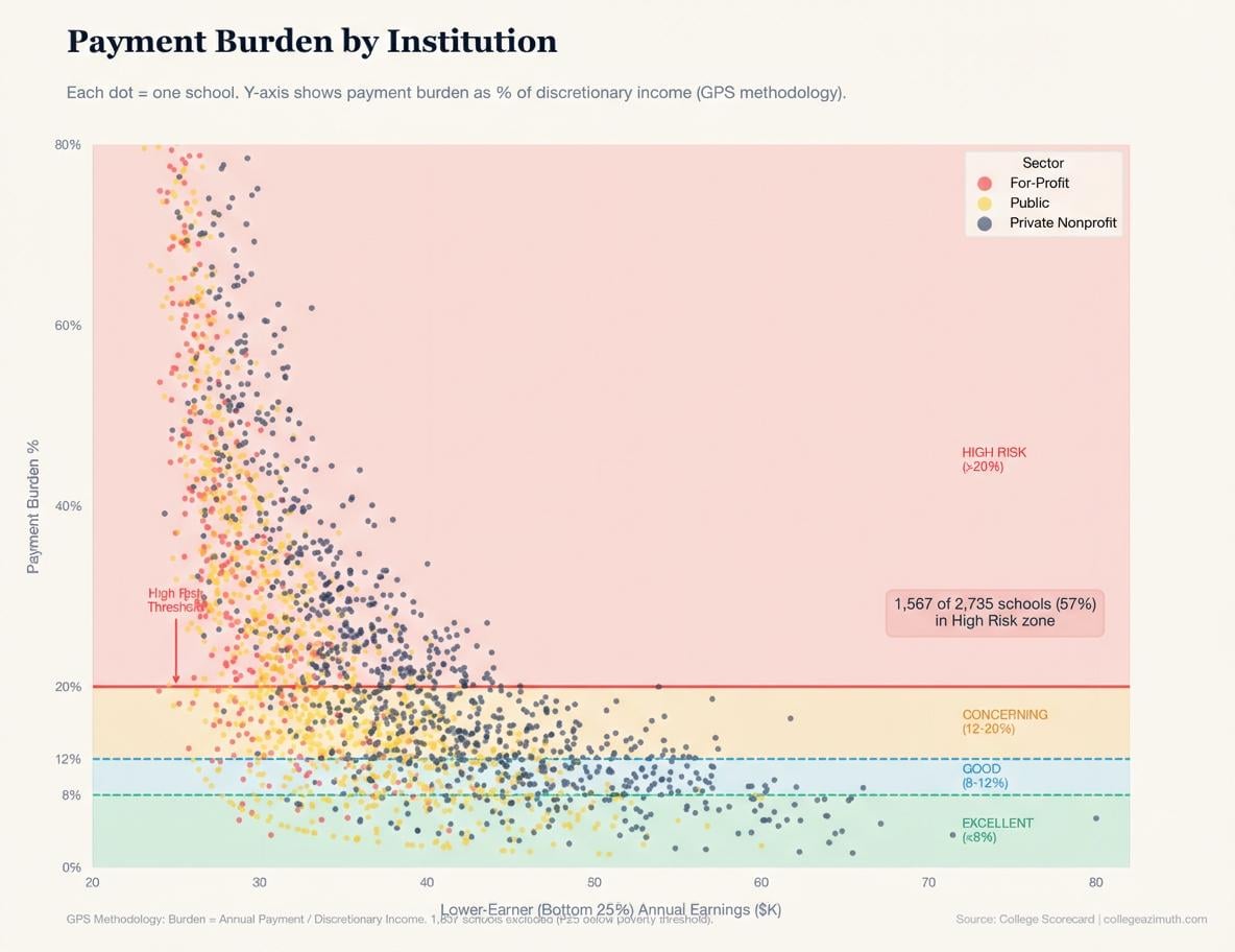
Data is from the College Scorecard, April 2024 release. Made with Matplotlib (Python).
Posted by DanielAZ923
8 Comments
Data is from the College Scorecard, April 2024 release. Made with Matplotlib (Python).
I set up the entire dataset into a bigquery database, and then run python on top of it to create visualizations. I also trained an AI agent on the data to help me write the queries specifically.
i don’t understand the x axis
Am I understanding this correctly? For an institution the y-axis is the average annual student loan payment as a percent of post-tax income. The x-axis is showing the average annual salary in $1,000s across the bottom 25% of graduates in terms of pay.
This is a beautiful graph and is very informative. It measures burden for who it matters most which is a challenging issue I had to tackle once for rent burden and had to split the data both by family type (# of children, spouse present) and the quantity of housing (it’s not good for a 6 person household to be able to afford a studio). It also bakes in the effect of school choice on payment burden. If going to Harvard predicts you have generational family wealth, you probably are graduating debt free.
One question I have is if the measure of discretionary income is net of housing expenses. Given housing costs are highly correlated with income, I wonder if a different picture would be painted?
Really good work, I would have probably noted that it does include those who don’t graduate, and maybe a slight explanation for your x axis to the heading section to give it real context. I did see that explanation in the whole post though.
Schools with the highest default risk for the lowest income students should get cut off from the student loan program
Push future student loan borrowers to better schools!
As others have said, this is a really interesting and useful chart, and I think the underlying dataset is even more valuable for further analysis. As a higher ed professional I think that universities would be interested in this info, but it will be even more useful when it’s more specific, basically it’s hard to look at every dot. EAB does a lot of analysis like this and monetizes it.
The same chart for different geographic regions would be great. Since you noted that there are subcategories (such as nursing schools within for profit) some other groupings would make it easier to interpret.
Anyway it’s cool, gonna keep staring at it for a while.
This is really neat. Thanks for sharing!
So you’ve charted that the debt to income ratio is higher when income is lower? So like, arithmetic… all (positive) ratios behave this way. What am I missing here