
![Severe US winter storm and the stratospheric polar vortex [OC]](https://www.byteseu.com/wp-content/uploads/2026/01/ffwx5gvpnbfg1-1024x995.png "Severe US winter storm and the stratospheric polar vortex [OC]")
data: GFS forecast from UCAR server
viz: ParaView, python, Powerpoint
data link: https://www.unidata.ucar.edu/data/nsf-unidatas-thredds-data-server
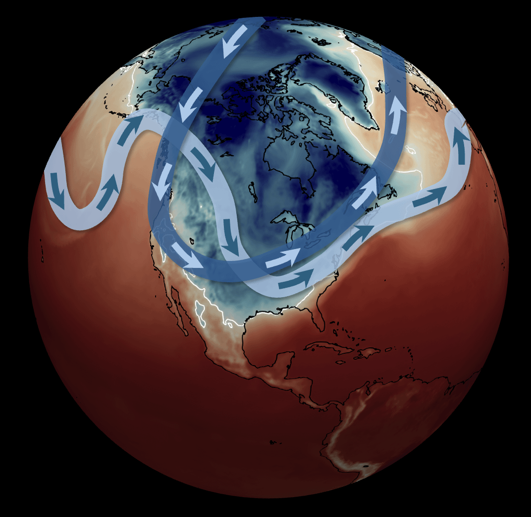
Forecast for Jan 26th at 18 UTC. Shaded colors are surface temperatures with a white line at the freezing point (0 C, 32 F). The light blue band is the jet stream in the middle of the troposphere and the dark blue band is the stratospheric polar vortex. For more info on the relationship and what we know and don't know about the link to climate change, please see: https://theconversation.com/how-the-polar-vortex-and-warm-ocean-are-intensifying-a-major-us-winter-storm-274243
This is a very dangerous storm, please use official NWS forecasts for guidance (weather.gov). Also, please note that our ability to predict, understand, and respond to severe weather critically relies on the work of US federal employees and national laboratories.
Mathew Barlow
Professor of Climate Science
University of Massachusetts Lowell
Posted by Mathew_Barlow
6 Comments
Fuck that’s an awesome visualization.
That’s an awesome graphic prof! Thanks!
Would like to see the Gulf Stream added.
The cheeky comment would be “see? This is why we need Greenland!”
I’ll just say this is a beautiful bit of data and thank you very much for the links.
Hah, missed me, Father Winter!
Amazing graphic.
This is a great graphic and great word of caution. Thank you for all you do.