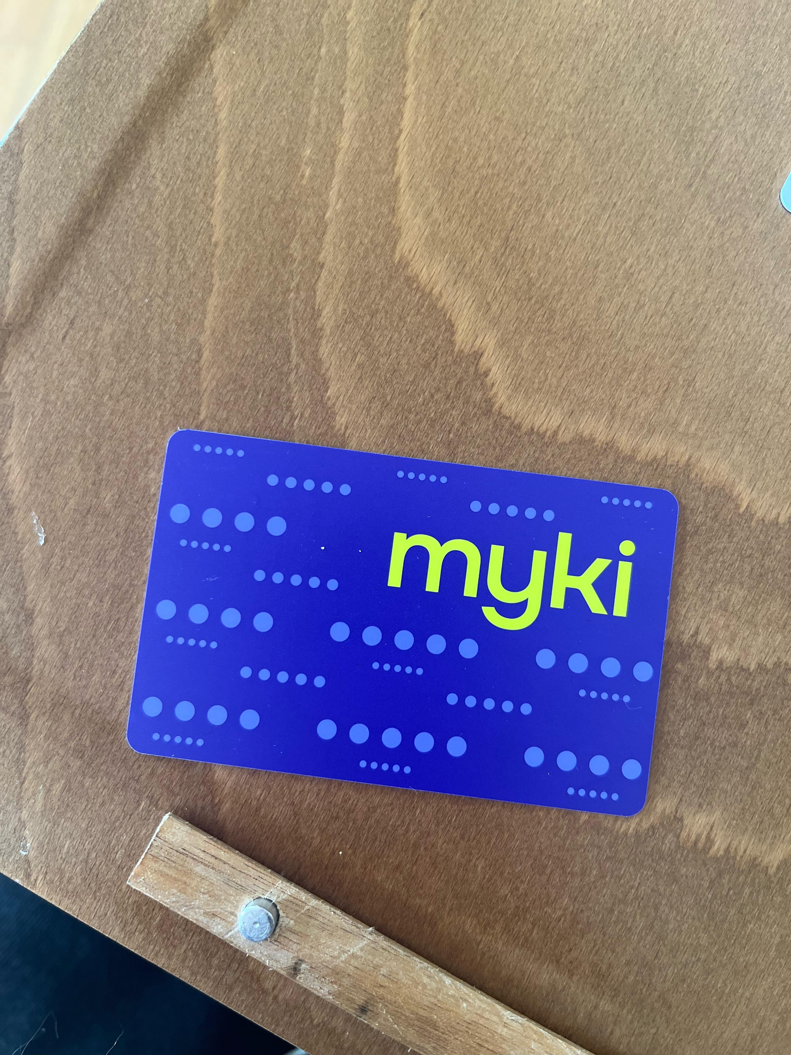
Share Facebook Twitter LinkedIn Pinterest Bluesky Threads Ooooo, new myki design! Posted by Old_Treacle7931
altandthrowitaway on February 2, 2026 4:04 am That fluro green on purple(blue?) looks absolutely awful.
Rare-Sample-9101 on February 2, 2026 4:07 am They are trying to gaslight you with a new design, bring out the pay with a debit card already!
Loakattack on February 2, 2026 4:19 am What should we do with this trillion dollars in revenue? Stop the free weekends and pay someone to design new cards of course!
Xaropit_ on February 2, 2026 4:40 am Interesting, I got a new myki concession less than a week ago and it was the usual grey background but with “myki” instead of ptv
o___olife on February 2, 2026 4:52 am Just as uninspired as their approach to providing an essential service
GoldBricked on February 2, 2026 5:03 am Interesting use of the five dots from the Transport Victoria logo. What does the back look like?
Different-Reason4262 on February 2, 2026 5:04 am Why the f#ck is Melbourne so behind? We need it on our phone app, from a decade ago
EdenFlorence on February 2, 2026 5:08 am Not sure how to feel about this… I guess it’s OK, but nothing too special.
ethnicprince on February 2, 2026 5:19 am Why the f do we still have myki cards. We should have ditched these at least 5 years ago at this point for debit tap
Tiramisu_Powder on February 2, 2026 5:22 am why does this look…..old? the actual old grey version looks like it’s the new one
hangrySaul on February 2, 2026 5:24 am People getting excited over plastic is how u know Australia is fcked
MostLikeylyJustFood on February 2, 2026 5:28 am I literally got one yesterday and it wasn’t this one?? Wtf.
Fabulous_Law_3785 on February 2, 2026 5:29 am When are they going to get rid of it? Public transport in adelaide is way better. Just tap on and off with ur cc. 
Adventurous_Jury6946 on February 2, 2026 5:57 am Catch up with rest of the advanced world with phone tap
SophMax on February 2, 2026 6:21 am I feel gypped. Because this is the new design I’ve got. https://preview.redd.it/9bk3btvby0hg1.png?width=1080&format=png&auto=webp&s=d62b7aacf37aa7110a9995a636aafc62700637c7 Edit: actually added the photo.


24 Comments
That fluro green on purple(blue?) looks absolutely awful.
They are trying to gaslight you with a new design, bring out the pay with a debit card already!
What should we do with this trillion dollars in revenue? Stop the free weekends and pay someone to design new cards of course!
Interesting, I got a new myki concession less than a week ago and it was the usual grey background but with “myki” instead of ptv
wow they found a way to make it even more boring
Maybe it will make it go faster 👀
lol…no it won’t
Aw, it reminds me of the metcard design
Just as uninspired as their approach to providing an essential service
Does it still expire in only 4yrs?
Lmao – Android users.
Interesting use of the five dots from the Transport Victoria logo. What does the back look like?
Why the f#ck is Melbourne so behind? We need it on our phone app, from a decade ago
I don’t hate it but it admittedly feels dated.
Not sure how to feel about this… I guess it’s OK, but nothing too special.
What’s a myki?
Why the f do we still have myki cards. We should have ditched these at least 5 years ago at this point for debit tap
why does this look…..old? the actual old grey version looks like it’s the new one
People getting excited over plastic is how u know Australia is fcked
I literally got one yesterday and it wasn’t this one?? Wtf.
When are they going to get rid of it? Public transport in adelaide is way better. Just tap on and off with ur cc.

Catch up with rest of the advanced world with phone tap
Wonder if the dots mean anything?
It’s cute!
I feel gypped. Because this is the new design I’ve got.
https://preview.redd.it/9bk3btvby0hg1.png?width=1080&format=png&auto=webp&s=d62b7aacf37aa7110a9995a636aafc62700637c7
Edit: actually added the photo.