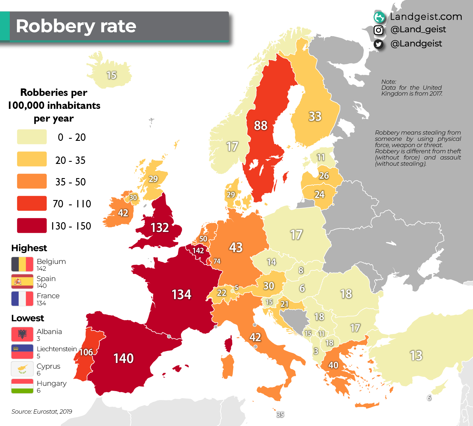
Spain and Belgium have the highest robbery rates in Europe
https://i.redd.it/7zvjt9euo2hg1.png
Posted by molondim


Spain and Belgium have the highest robbery rates in Europe
https://i.redd.it/7zvjt9euo2hg1.png
Posted by molondim
8 Comments
Highest recorded*
I highly doubt f. E. Albania being so low.
Show the murders or serious crimes statistics please
Madrid, Barcelona, Paris, London, Bruxelles. these cities are doing the heavy lifting
And that’s without even considering the government, which would need to be multiplied.
I wonder why :s
This graphic is deeply misleading: it does **not** show how dangerous a country is, but merely how often a very specific crime (*robbery with violence or threat*, as defined differently by each legal system) is reported. Presenting this as “risk” is statistical sleight of hand. Spain’s higher figure reflects broader legal definitions and a higher propensity to report crimes, not a society three times more dangerous than Italy’s. The map ignores severity, context, underreporting, urban concentration, and all other indicators of real personal safety—many of which place Spain among the safest countries in Europe. Framed this way, the chart doesn’t inform; it **distorts**, and its author should know better.
Link to source?
2019?