
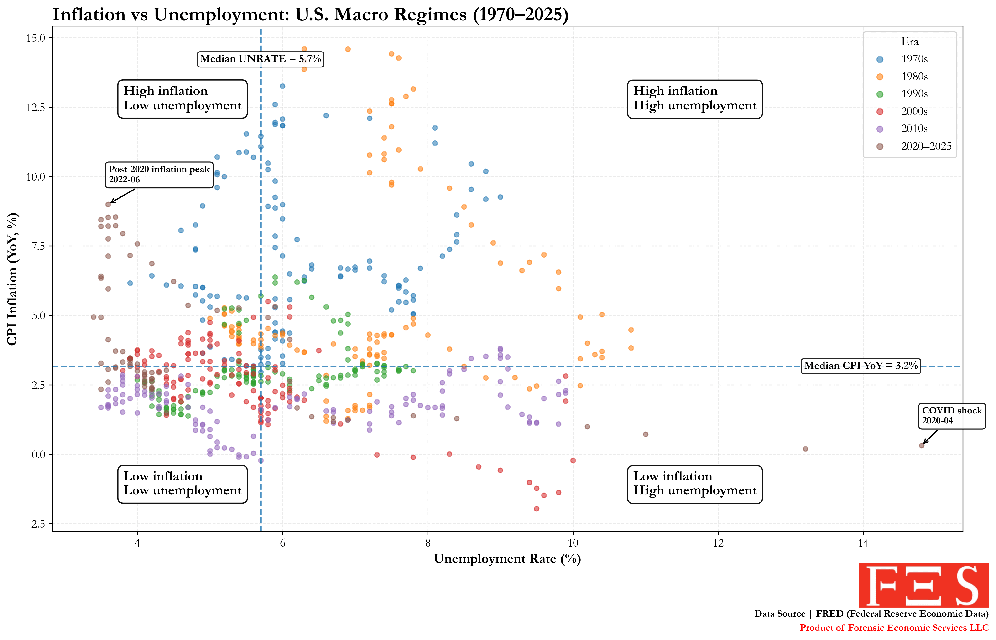
![Inflation vs. Unemployment in the U.S. (1970–2025) [OC]](https://www.byteseu.com/wp-content/uploads/2026/02/4ap6bjwms7hg1-1536x987.png "Inflation vs. Unemployment in the U.S. (1970–2025) [OC]")
OC – we created this visualization.
Data: Each dot a month of Unemployment and Inflation.
• CPI-U (YoY % change): FRED series CPIAUCSL
• Unemployment Rate: FRED series UNRATE
Methodology:
Monthly data from 1970–2025. CPI converted to year-over-year inflation.
Median inflation and unemployment values are shown to define four macroeconomic quadrants.
Points are color-coded by decade. April 2020 (COVID shock) is annotated.
Tools:
Python (pandas, matplotlib)
Posted by forensiceconomics
2 Comments
Sorry I’m having a hard time understanding, what exactly is each dot representing?
With the dots the way they are it’s really hard to track or see any trends.