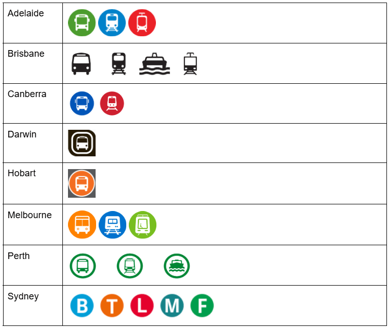
I tried to find all the public transport pictograms used throughout Australia’s cities. Which city do you think has the best system?
https://i.redd.it/leji22gxk1ig1.png

I tried to find all the public transport pictograms used throughout Australia’s cities. Which city do you think has the best system?
https://i.redd.it/leji22gxk1ig1.png
46 Comments
Perth is shit. Bus and train are too similar.
Adelaide… It’s gotta be first at something
Has to be either Darwin or Hobart – absolutely no confusion there!
Brisbane for sure. Sydney ones are more confusing, look more like bus routes.
Certainly not Sydney’s… they have to be the dumbest around.
They mean bugger all to non-English speakers.
God the Sydney one is so inaccessible, who’s fkn idea was that
Sydney’s is the clear winner with umm.. Boat, Tram, Locomotive, Monorail and Foot yeah?
It’s functionally the same, but you’re missing a purple train pictogram for Melbourne
Wow, today I learned that Darwin has only one train station.
Sydney: “FU non english speaking tourists!”
Sydneys for sure , easy to spot from afar
I don’t know what the best is, but Sydney’s is the worst.
I think the ones that are colour coded and have pictures making it distinguishable from each other.
So that would be Adelaide/Canberra/Melbourne having the best imo.
Darwin and Hobart have only one system so they pass by default, Brisbane is almost okay but from a distance the train can kinda look like a tram? And the boat looks strange, I like Sydney’s ferry better there.
We don’t have a tram here in Brisbane. That’s the Gold Coast. Unless OP means the Metro, which is just a long bus with wheel covers.
No vline train or coach?
Sydney be like BTL muthafucka!
I fucking hate the Sydney ones, they all got changed a few years ago and they are stupid as fuck.
WHY WOULD YOU USE LETTERS FOR TYPES OF TRANSPORT IN A CITY THAT ATTRACTS THAT ATTRACTS A LOT OF INTERNATIONAL TOURISTS
If English isn’t your first language none of it makes any sense
edit; I’ve travelled to nearly 100 countries and every time I come back to Sydney the stupidity of those “icons” completely floors me.
Neat! It’d be cool to align the columns by type of transport to make it easier to compare.
Brisbane seems straight forward
I dislike Brisbane and Perth for being monochromatic.
the syndey light rail is an L because it’s a L of a tram network
Perth is pretty great. But they hate using it.
As someone who has only ever visited Australia as a tourist, I’d find Adelaide, Melbourne or Canberra to be the best: they combine pictures to be descriptive and colours to help easy identification from a distance.
Sydney’s is the worst, because I’d have to think a bit about what the letters stand for. Also, I can imagine tourists getting a bit confused about the difference between trains, metro and light rail, especially if English isn’t their first language.
The cheapest or free. Social Mobility is a biggie for local economies
Sydney’s are the only ones that are recognisable from the end of a long street, which is exactly they get used. Massive, lit, and above every form of transit stop
I think Brisbane is the most visually clear. Especially if eyes are not 20-20 (eg me)
Adelaide is the best, the combo of colours feels nicer than melbourne. But they really should use colours with higher contrast than blue and green
[Melbourne wins because they are a 1-to-1 match with Shapes flavours.](https://www.reddit.com/r/melbourne/s/jdD25FtfXN)
Importantly … they should be standardized for all the obvious reasons …..
Brisbane ferries be phat!
Confusing for tourists doing multiple cities.
I vote Brisbane – best for accessibility
What is M and L in Sydney’s
idk but sydney having to go through life without cute little pictures of busses and trains and ferries is a tragedy 😔
Darwin’s is the easiest to understand *edit* and Hobart’s
Even though it would be anachronistic, I actually think a Monopoly style steam train icon would be easier to understand.
Another clear victory for us QUEEEEEEEEEEEEEEEEENSLANDERRRRRRRRRRRRRRS!
I vote Adelaide or Melbourne, colour differentiation is a pro
From a design clarity standpoint, Adelaide and Melbourne are easily the best. Sydney is easily the worst — what the actual fuck.
Brisbane would win if they had colour like Adelaide’s.
Give Blue to CityCats and change Rail to Purple and you got a nice system.
You missed v/line train logo :-/
Adelaide. Color coding makes sense
BTLMF sounds like a tasty burger
Brisbane, the use of colours seems redundant. The shapes could improve slightly but Bris is far better than the rest I feel
Brisbane or Perth, somehow.
And I say this with all the love we Melbournians feel for the place…WTAF SYDNEY?!?!? What the hell do they even mean? Wtf is the L for? Is the T for train or tram? Considering the vast majority of our tourism comes from non English speaking countries this is just stupid. Darwin and Hobart made me smile. Brisbane is really good if you have colour vision concerns.