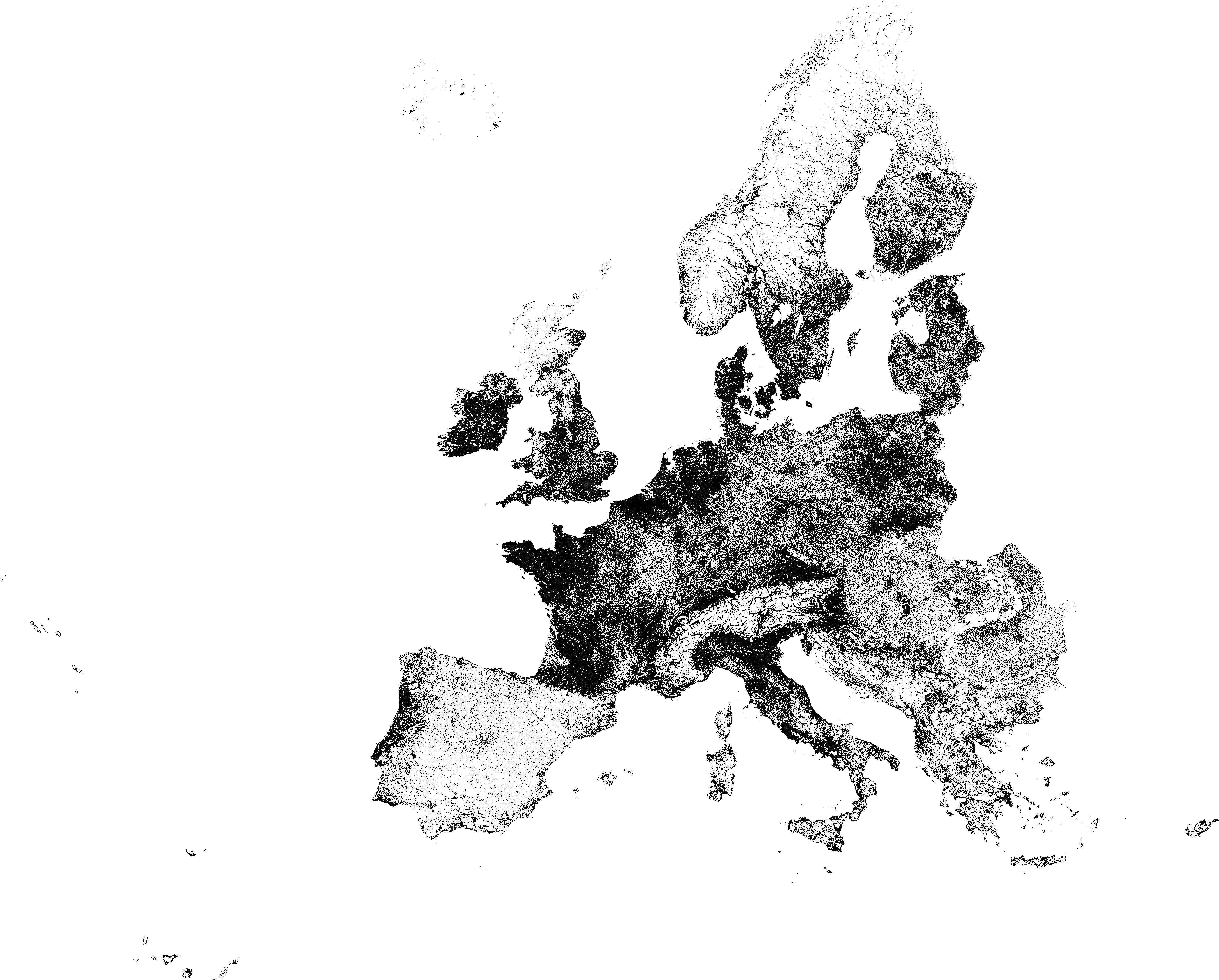
Map of population distribution (NOT density!!) in most of Europe in 2021, on a square grid with 1 pixel representing 1 square kilometre. Black means inhabited, white means empty.
https://i.redd.it/f8z511cuf8ig1.png
Posted by slopeclimber

 in most of Europe in 2021, on a square grid with 1 pixel representing 1 square kilometre. Black means inhabited, white means empty.")
Map of population distribution (NOT density!!) in most of Europe in 2021, on a square grid with 1 pixel representing 1 square kilometre. Black means inhabited, white means empty.
https://i.redd.it/f8z511cuf8ig1.png
Posted by slopeclimber
29 Comments
Source: https://ec.europa.eu/eurostat/web/gisco/geodata/population-distribution/population-grids
r/WidacZabory
So most of Spain isn’t inhabited. Funny
Crazy how Spain with roughly 50 million people looks almost as sparsely populated as Norway with 5 million.
So, you are basically never alone in France
Also pictured: the urban geography reason as to why Portugal historically pulled above its weight in the Iberian Peninsula, and was for all intents and purposes the dominant kingdom until the Union of Castile and Aragon, and why it remained independent.
Also pictured: why the Low Countries were and are tremendously OP relative to its size.
Wow, I had no idea Spain was mostly empty.
That’s just a population density chart with two buckets:
– White: 0 people per km2
– Black: more than 0 people per km2
/s
I wonder if there’s any data quality challenges in Spain. I.e. people living in some of the white spots here, but they are counted as living in the town where that land corresponds to.
For example, very small towns in Spain don’t have a mayor, and are counted as villages of nearby larger towns. Maybe they aren’t counted? It would be easy to check if you superimpose this map on a normal map and zoom in on small villages.
For some reason I feel like I can see the border of the former German Empire
crazy how clearly we can see mountainous area, I love those kind of maps 🤩
people surprised by Spain when inland is 45ºC in the summer “WOW I didnt know Spaiun was so empty!” There is a reason.
gorgeous map
Indeed, Spain people live in flats.
Do you have this as a georeferenced file (json, shp, etc.) or the source data? Just curious for some research I’m doing.
So it’s like density, but with 1 bit color resolution.
I guess the far East has nobody there?
Can share the source please?
I would think that except for lakes, large forests and mountains almost every SQ km has at least one person living in it.
Can someone explain the bordeaux region please?
Ireland’s rural population doing a lot of heavy lifting here.
What does the gradient like colour mean in large cities like London and Paris? I mean they must be completely blacked out in the center right?
Europe seems pretty uninhabited this way. Then again, Ican only imagine US, it’s crazy how sparsely populated it is.
I see the Athena Suburban Rail map. Like… it’s so visible. It’s such a shame that it’s underutilized due to rail works in the center of Athens. The traffic is INSANE!
I need to move to Spain. I hate neighbours.
Ireland, if we have it, we’re gona use it.
Northern Scotland real estate must be a steal.
Widać II RP
Interestingly the french “diagonale du vide” is not visible at all here. The northeast appears more sparsely populated than the southwest, but I was convinced it was the opposite…