

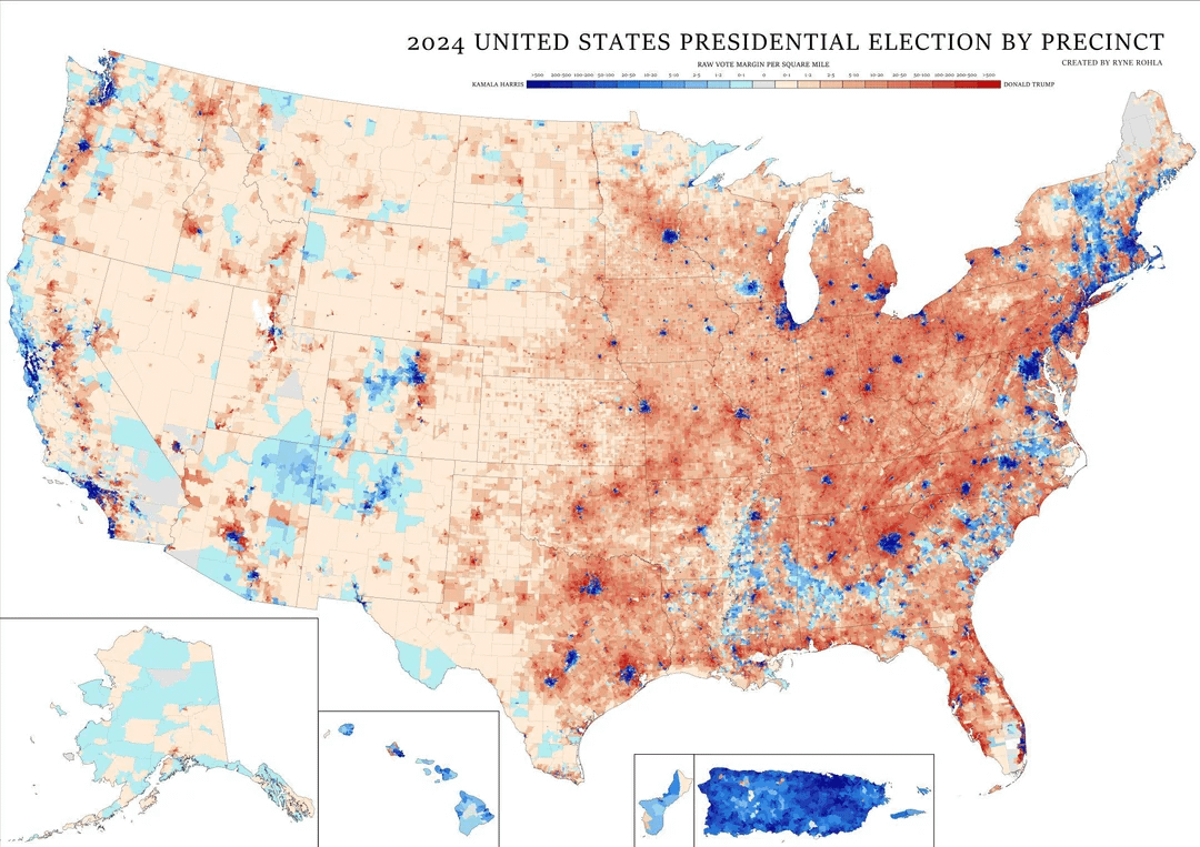
Map taken from u/Heatmap_BP3 on r/YAPms Edit: Thanks to u/NelsonMinar for providing the true source by Ryan Rohla.
I believe this map fixes the problem that most other maps of this kind have that they show a bunch of red counties without showing where the red voters actually are.
Also, the rural west is really empty.
Edit: The results in Guam and Puerto Rico are from the presidential straw polls they held in 2024.
Posted by False-Lettuce-6074
32 Comments
We definitely got the president Land wanted.
What are you using for the ~~Mariana Islands~~ Guam and Puerto Rico votes though?
You can easily spot the three corners of the Texas Triangle (Dallas/Houston/San Antonio). The red in between Austin and SA is New Braunfels. The rest of the I-35 corridor in that area has been getting bluer each year.
Interesting how some college towns seem to have more spread of the blue, Madison and Iowa City…
What’s that big democrat blob in Wisconsin?
Mississippi looks much bluer than shows up in elections.
Very interesting. It seems that it’s nearly a perfect divide between blue in the densely populated cities and red in the suburbs and the rural areas, except for Anchorage and Miami voting red and the not so densely populated places of the black belt, Navajo, and Vermont voting blue.
r/peopleliveincities
This looks more like a 49% red vs 48% blue than the county map Republicans like to post
Visually I’m not sure this does enough to compensate for density. I wouldn’t know for example how heavily California contributes to the scale of Democratic votes. It just looks like it has a couple of dark blue areas, on par with maybe a couple Seattles or Atlantas.
I’m like, what does this have to do with Dentistry?? 🦷
I-5 lookin like a big varicose vein going up the shaft of the west coast 🙁
This is the kind of voting map I can get behind. It still shows that there were a lot of Republican voters, but it’s not so crazily skewed towards how land votes.
What’s crazy to me is you can actually see the shape of the Piedmont in blue. And you can see the shape of the Appalachians. This is the coolest, most honest map of this sort that I’ve ever seen. Awesome
How is there data for PR?
Source: [Ryne Rohla](https://maps.rynerohla.com/election-maps/2024-general-election-national-precinct-maps/). I couldn’t find the post on r/YAPms but this website has a much higher resolution version than the one posted here.
Two other treatments with similar effects:
* [Washington Post](https://www.washingtonpost.com/elections/interactive/2024/2024-election-vote-map/?pwapi_token=eyJ0eXAiOiJKV1QiLCJhbGciOiJIUzI1NiJ9.eyJyZWFzb24iOiJnaWZ0IiwibmJmIjoxNzMxMzAxMjAwLCJpc3MiOiJzdWJzY3JpcHRpb25zIiwiZXhwIjoxNzMyNjgzNTk5LCJpYXQiOjE3MzEzMDEyMDAsImp0aSI6IjIwZWQ2YWU1LTQwYjEtNDQwNC1hNjc2LWMxNzZhMTlhNGNlOSIsInVybCI6Imh0dHBzOi8vd3d3Lndhc2hpbmd0b25wb3N0LmNvbS9lbGVjdGlvbnMvaW50ZXJhY3RpdmUvMjAyNC8yMDI0LWVsZWN0aW9uLXZvdGUtbWFwLyJ9.ON4zLEKjBGQNlm_4d9V_iGDpBaRAqgh9vMpaCJ_HUZQ&itid=gfta)
* [NYTimes](https://www.nytimes.com/interactive/2025/us/elections/2024-election-map-precinct-results.html)
Surprised no one has mentioned it. Anyone else surprised at Jackson WY?
Looking at this map again, it’s pretty clear that the BosWash corridor is ideologically connected vs the rest of the nation. The Blue metros spread throughout the rest of the nation function as islands of…idk what to call it 😂.
I mean on the other hand, it also lines up with the original 13 colonies save for the Carolinas and Georgia. And even then, you can clearly see the ‘Black Belt’ effect in those states.
For curiosity’s sake, I’d love to see a map showing the routes of the Underground Railroad overlayed on this map….
Alaska proves land doesn’t vote
This is always the map that should be used, not the county one
Are there any “inverse Vermonts?” Generally politics is pretty simple; rural votes moderate/red, urban votes **hard** blue. Only Vermont, and the black belt, really bucks that trend.
Does any major city vote overwhelmingly for red-team?
I wonder why Milwaukee’s suburbs are still so conservative when many other city’s suburbs (especially nearby Chicago’s) have become increasingly blue.
So what’s the deal with the light blue area in the southeastern US? The area running from north of New Orleans to the Atlantic. Looks like low density so are these even cities?
The truth is that the only thing the Constitution requires is that Congress approves of a territory becoming a state. There is no population requirement, there is no population growth requirement, there isn’t even a consent requirement. So the only question that really matters, legally speaking, is this: should the people of Guam be disenfranchised forever, or should there be a path for them to have equal say over American politics? And if your answer is “there aren’t enough of them to matter,” so be it.
So weird to be American and not see where I live on this map.
Is there a higher resolution image of this?
Any chance you have a higher resolution version of this map?
The level of political diversity around lake Tahoe is truly fascinating. I didn’t expect that at all.
This is so cool.
I’d love to see the blue and red combined to get a picture of which one is denser overall.
I wonder why Republicans refuse to give PR statehood. It’s probably a coincidence.
very cool map! I’d love to see a version of it where the number of people involved in each precinct is somehow represented. Perhaps a 3D rendering with altitude ? Or perhaps there is a way to distort the 2D view ?