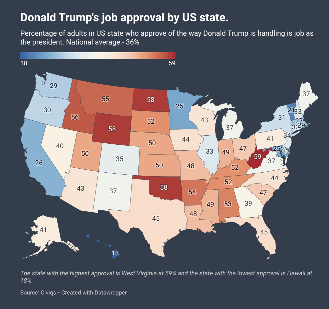
Wisconsin being basically the same as Texas makes me ashamed for Wisconsin and proud for Texas.
I’m conflicted as a WI resident.
worldalpha_com on
West Virginia gonna West Virginia…
baldbonehead on
How the hell is 1 in 4 up in Minnesota saying “yup, this is good”
lucianw on
I think the color scale is weird. You’ve picked 36 as the neutral color. I think it would have made more sense to pick 50 as the neutral color.
sciolycaptain on
The color scale makes this graphic deceptive.
a 50% approval (Utah) is solid red, while 35% approval (Colorado) basically appears to be the neutral color.
NotDiCaprio on
How are there still so many people… That’s still over 100 million people thinking: hey man, good job.
UsefulEngine1 on
Sticking to the presentation, I don’t like the colors here. First, red and blue should be reserved for directly partisan numbers IMO, and this isn’t really even red which kind of makes it worse.
More importantly, setting the gradient from the min and max data points makes the coloration arbitrary, and would prevent proper comparison to a past or future map with the same methodology. If it’s a 100-pecent scale the gradient should cover that range, or at least be centered on 50.
Finally, like all color-by-state maps, the visual takeaway can be very misleading both because population density is so different between states and because states aren’t homogeneous. I don’t think the border between Minnesota and North Dakota is the hot zone one might expect from this picture, for example.b
Room_Temp_Coffee on
I feel bad for my family stuck in Oklahoma
Trollercoaster101 on
I’d say USA is pretty happy with how Trump is handling his job. /s
I also love that you selected a divergent scale of color where a smaller rate of consensus is actually perceived as less problematic then a higher one.
Wellarmedsheepy010 on
Crazy to see Georgia being more rational than Pennsylvania. I feel like PA had gone farther right over the last 2 decades and GA left
calguy1955 on
The polls show he is doing better than every president, ever. Nobody has polls like him. He’s got great, beautiful polls. Why, just the other day he polled his cabinet and he aced it with a 500% approval rating. Maybe it was 600%.
No-Werewolf-5955 on
This map proves that Atlanta is the most progressive place of all the former confederate states. Georgia would be red if it wasn’t for Atlanta.
OttoLuck747 on
I love how Minnesota’s immediate neighbors are like, “Well, that’s happening over there. He’d never do that to *us*.”
KudosOfTheFroond on
My God that’s a huge basket of deplorables…
KnightsOfREM on
Lol Minnesota lost for a generation. Keep up the victory tour, ICE
NinjaTrilobite on
West Virginia’s ancestors would be so ashamed. They fought so many violent labor battles against the mining industry, and now they happily bend over and lube up to get fucked by the current “clean coal” regime. Enjoy your black lung and meth, you stupid motherfuckers.
Form_Function on
Putting the red into redneck
goldbeater on
Now overlay an intelligence map and let’s see what overlaps.
kingtacticool on
Hawaii swinging for the fences.
figleaf29 on
Interesting how range and color palette choice affects interpretation. Looking over this without paying attention to numbers, it looks overall okay for Trump. Then, I notice that the mid-point (white) is around 35% approval rating! If you set the range to 0 to 100, it would be so much bluer.
MDJR20 on
MD, VT, and HI holding the line
mochafiend on
I’m frankly surprised it’s this low in California. There are a LOT of Republicans here. Doesn’t it have the most Republicans by absolute number? Or would Texas still win out?
Shout-out to Hawaii for knowing what’s up.
Silvermane2 on
Ooh ooh ohh!
Now pair this map up with the average education level in the state!
crazunggoy47 on
This is not beautiful. 0 point should not be half way between min and max, but at 50% approval.
SirDiego on
The cutoff for blue/red is kinda weird, is it split just around the average of (astonishingly low) 36%?
I think I get the idea but it makes it seem like the country more in favor of Trump than it is, when e.g. Texas is slightly red but with Trump’s approval rating underwater there
LordTC on
What a terrible map. 58 is dark red but 41 isn’t even blue.
Bonzographer on
Oklahoma, 50th in education…
SonofTreehorn on
Below 50% in most Southern states is the biggest shock for me.
thouse275 on
Love to see that overlaid with level of education in each state
waffle299 on
Dot size for population is always a better representation.
007meow on
Another one of those “every map of the United States” statistics
Baelzabub on
Under 50% in Texas, Louisiana, Florida, and Mississippi is *wild* for a modern Republican leader.
wolverineFan64 on
At this point, if you haven’t fully turned on Trump, there’s just no saving you. I genuinely don’t know how you win over a populous that is either too stupid or too indoctrinated in the cult to listen to reason. Science, data, logic, statistics, basic mathematics – all of it screams one thing and they just sit there and say “nope, Trump’s right”.
It’s like trying to win a nuclear physics argument with a toddler.

![[OC] Donald Trump's job approval in the US by state](https://www.byteseu.com/wp-content/uploads/2026/02/kx05fsmu73jg1-1024x961.png "[OC] Donald Trump’s job approval in the US by state")
34 Comments
Source: [civiqs](https://civiqs.com/results/approve_president_trump_2025?uncertainty=true&zoomIn=true&annotations=true&map=true)
Tools: [Datawrapper ](https://www.datawrapper.de/)
Wisconsin being basically the same as Texas makes me ashamed for Wisconsin and proud for Texas.
I’m conflicted as a WI resident.
West Virginia gonna West Virginia…
How the hell is 1 in 4 up in Minnesota saying “yup, this is good”
I think the color scale is weird. You’ve picked 36 as the neutral color. I think it would have made more sense to pick 50 as the neutral color.
The color scale makes this graphic deceptive.
a 50% approval (Utah) is solid red, while 35% approval (Colorado) basically appears to be the neutral color.
How are there still so many people… That’s still over 100 million people thinking: hey man, good job.
Sticking to the presentation, I don’t like the colors here. First, red and blue should be reserved for directly partisan numbers IMO, and this isn’t really even red which kind of makes it worse.
More importantly, setting the gradient from the min and max data points makes the coloration arbitrary, and would prevent proper comparison to a past or future map with the same methodology. If it’s a 100-pecent scale the gradient should cover that range, or at least be centered on 50.
Finally, like all color-by-state maps, the visual takeaway can be very misleading both because population density is so different between states and because states aren’t homogeneous. I don’t think the border between Minnesota and North Dakota is the hot zone one might expect from this picture, for example.b
I feel bad for my family stuck in Oklahoma
I’d say USA is pretty happy with how Trump is handling his job. /s
I also love that you selected a divergent scale of color where a smaller rate of consensus is actually perceived as less problematic then a higher one.
Crazy to see Georgia being more rational than Pennsylvania. I feel like PA had gone farther right over the last 2 decades and GA left
The polls show he is doing better than every president, ever. Nobody has polls like him. He’s got great, beautiful polls. Why, just the other day he polled his cabinet and he aced it with a 500% approval rating. Maybe it was 600%.
This map proves that Atlanta is the most progressive place of all the former confederate states. Georgia would be red if it wasn’t for Atlanta.
I love how Minnesota’s immediate neighbors are like, “Well, that’s happening over there. He’d never do that to *us*.”
My God that’s a huge basket of deplorables…
Lol Minnesota lost for a generation. Keep up the victory tour, ICE
West Virginia’s ancestors would be so ashamed. They fought so many violent labor battles against the mining industry, and now they happily bend over and lube up to get fucked by the current “clean coal” regime. Enjoy your black lung and meth, you stupid motherfuckers.
Putting the red into redneck
Now overlay an intelligence map and let’s see what overlaps.
Hawaii swinging for the fences.
Interesting how range and color palette choice affects interpretation. Looking over this without paying attention to numbers, it looks overall okay for Trump. Then, I notice that the mid-point (white) is around 35% approval rating! If you set the range to 0 to 100, it would be so much bluer.
MD, VT, and HI holding the line
I’m frankly surprised it’s this low in California. There are a LOT of Republicans here. Doesn’t it have the most Republicans by absolute number? Or would Texas still win out?
Shout-out to Hawaii for knowing what’s up.
Ooh ooh ohh!
Now pair this map up with the average education level in the state!
This is not beautiful. 0 point should not be half way between min and max, but at 50% approval.
The cutoff for blue/red is kinda weird, is it split just around the average of (astonishingly low) 36%?
I think I get the idea but it makes it seem like the country more in favor of Trump than it is, when e.g. Texas is slightly red but with Trump’s approval rating underwater there
What a terrible map. 58 is dark red but 41 isn’t even blue.
Oklahoma, 50th in education…
Below 50% in most Southern states is the biggest shock for me.
Love to see that overlaid with level of education in each state
Dot size for population is always a better representation.
Another one of those “every map of the United States” statistics
Under 50% in Texas, Louisiana, Florida, and Mississippi is *wild* for a modern Republican leader.
At this point, if you haven’t fully turned on Trump, there’s just no saving you. I genuinely don’t know how you win over a populous that is either too stupid or too indoctrinated in the cult to listen to reason. Science, data, logic, statistics, basic mathematics – all of it screams one thing and they just sit there and say “nope, Trump’s right”.
It’s like trying to win a nuclear physics argument with a toddler.