If anyone wanted to see how this could be displayed on a map, you can check this website: http://geacron.com/home-en/
GruGruxLob on
Didn’t know how bad I wanted to see this until I saw it
a_rabid_anti_dentite on
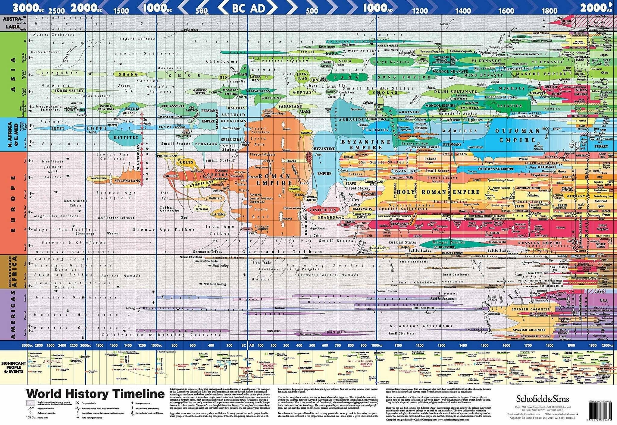
Very Eurocentric. The size of the Han relative to the Roman Empire tells me a lot. Still a cool concept.
falnex1 on
So unbiased hahaha, guess who made this
TryingUnsuccessfully on
Sumeria doesn’t deserve a highlight? I don’t understand on what assumptions this graphic was made, but I’d suspect the author needs more education in history.
durakraft on
We’re all mad here!
I can only show you the door.
“Good morning, and in case I don’t see ya, good afternoon, good evening, and good night!”
Prime_Director on
I really like this, but the way the data is presented, I think gives a false impression of the scale and significance of various polities. For example, the Roman Empire takes up about 1/3 of the chart at it’s peak, while the contemporaneous Han Dynasty takes up like 1/20th. At their respective peaks around the first century AD, the Han controlled more land than Rome, and had a slightly larger population. But in the chart it’s a fraction of the size. It makes places outside Europe seem like an afterthought.
repostit_ on
Recorded history by white people, mostly.
An_Aussie_Guy on
Australia uninhabited until 1000BCE? Yeah righteo.
Alexhtfnutty on
I can maybe see Europe being larger than Africa on this map, but the fact that it’s larger than Asia, I mean the bias couldn’t be more obvious like come on 🙄
topdwg on
Actually, according to ancient astronauts theorists…
yemsius on
Let the “Byzantine Empire” name die already.
bukhrin on
The more prosperous part of the Roman Empire never stopped being Roman, is this a western european centric thinking to portray it as such?
tomfalcon86 on
Cool, but unreadable
Spaser on
This is either wildly outdated or just poorly researched. For instance the Norte Chico civilization was prospering in South America since at least 3000 BC.
symbionet on
Why is any Chinese empire never as large as the Ottoman Empire or even the Egyptian Malmluks…?
More-City-7496 on
Either China should also show in SEA or Vietnam should be east Asia with China. Furthermore I think Asia is way too condensed, if using the same scale Europe should just be one subsection


21 Comments
Quality
Where can i get this in hi res?
yess!! please share!!
This is really cool.
If anyone wanted to see how this could be displayed on a map, you can check this website: http://geacron.com/home-en/
Didn’t know how bad I wanted to see this until I saw it
Very Eurocentric. The size of the Han relative to the Roman Empire tells me a lot. Still a cool concept.
So unbiased hahaha, guess who made this
Sumeria doesn’t deserve a highlight? I don’t understand on what assumptions this graphic was made, but I’d suspect the author needs more education in history.
We’re all mad here!
I can only show you the door.
“Good morning, and in case I don’t see ya, good afternoon, good evening, and good night!”
I really like this, but the way the data is presented, I think gives a false impression of the scale and significance of various polities. For example, the Roman Empire takes up about 1/3 of the chart at it’s peak, while the contemporaneous Han Dynasty takes up like 1/20th. At their respective peaks around the first century AD, the Han controlled more land than Rome, and had a slightly larger population. But in the chart it’s a fraction of the size. It makes places outside Europe seem like an afterthought.
Recorded history by white people, mostly.
Australia uninhabited until 1000BCE? Yeah righteo.
I can maybe see Europe being larger than Africa on this map, but the fact that it’s larger than Asia, I mean the bias couldn’t be more obvious like come on 🙄
Actually, according to ancient astronauts theorists…
Let the “Byzantine Empire” name die already.
The more prosperous part of the Roman Empire never stopped being Roman, is this a western european centric thinking to portray it as such?
Cool, but unreadable
This is either wildly outdated or just poorly researched. For instance the Norte Chico civilization was prospering in South America since at least 3000 BC.
Why is any Chinese empire never as large as the Ottoman Empire or even the Egyptian Malmluks…?
Either China should also show in SEA or Vietnam should be east Asia with China. Furthermore I think Asia is way too condensed, if using the same scale Europe should just be one subsection
This is my fav new map, my god I love that