
![How Rome sprawled: 75 years of urban expansion mapped decade by decade (1950–2025) [OC]](https://www.byteseu.com/wp-content/uploads/2026/02/5t96mmrwahjg1-1024x569.png "How Rome sprawled: 75 years of urban expansion mapped decade by decade (1950–2025) [OC]")
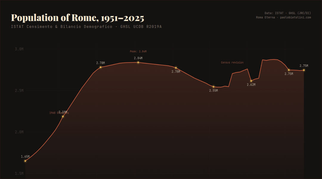
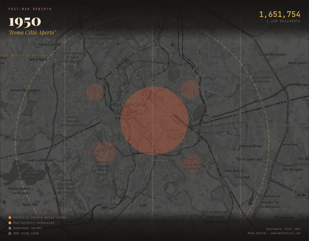
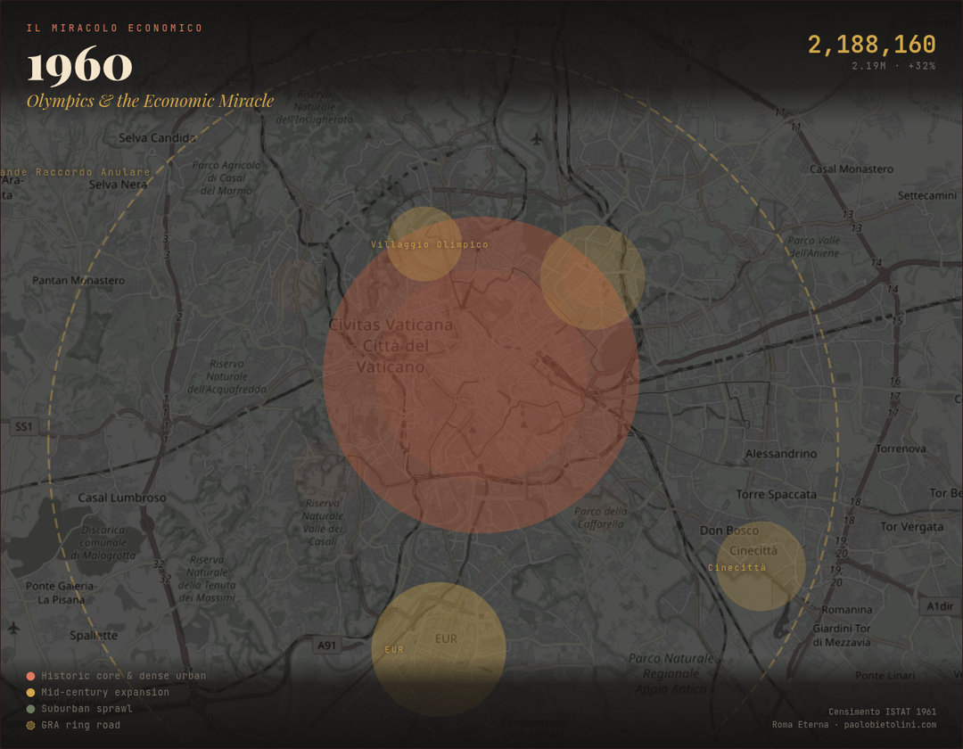
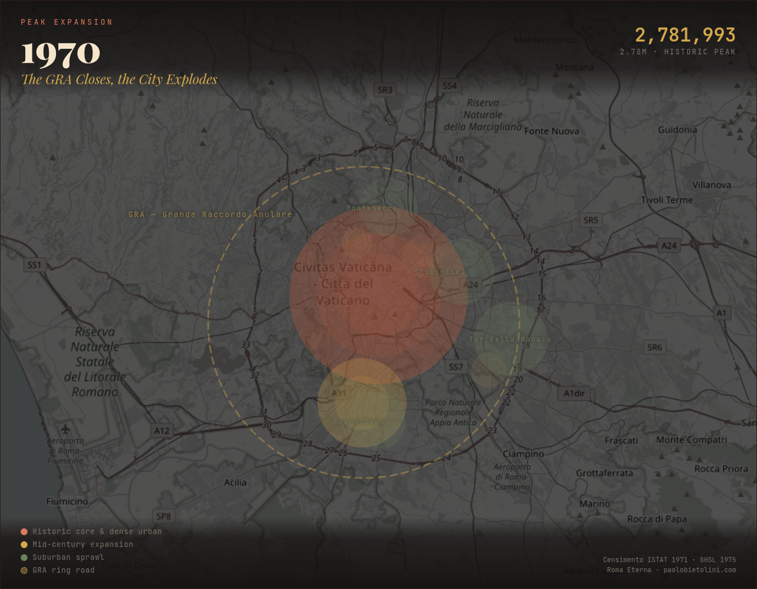
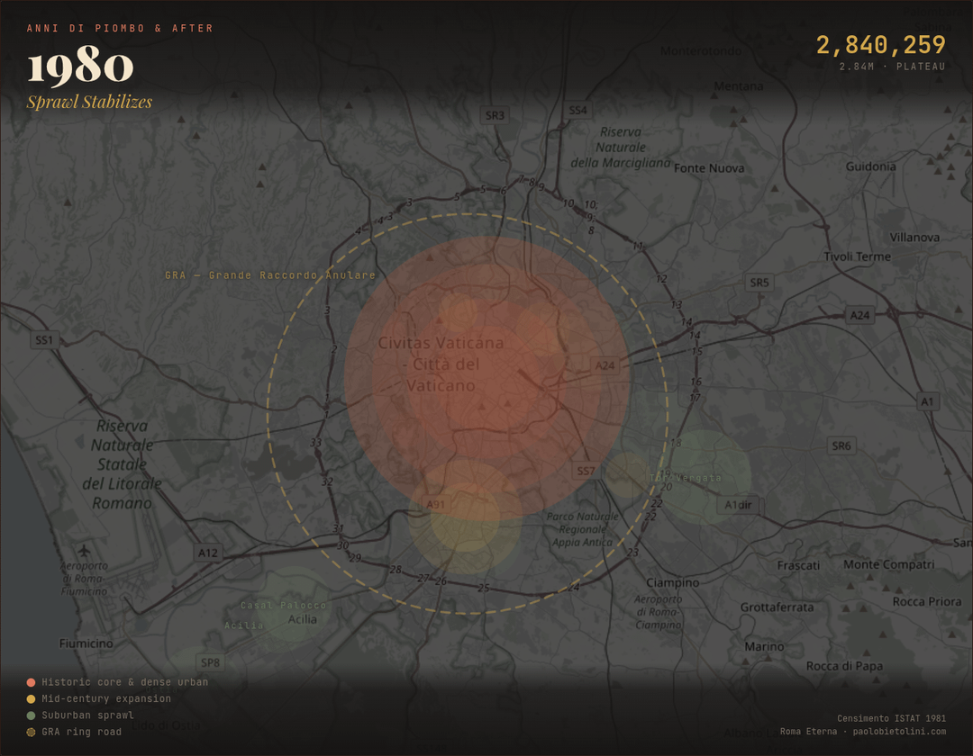
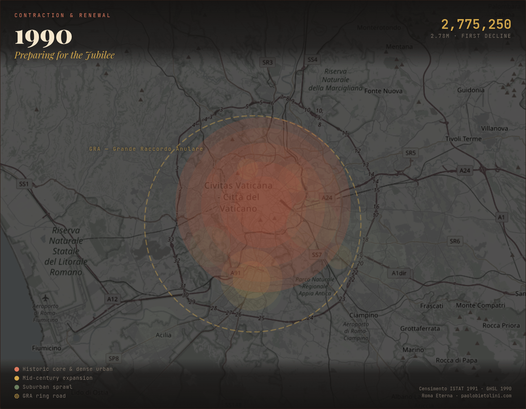
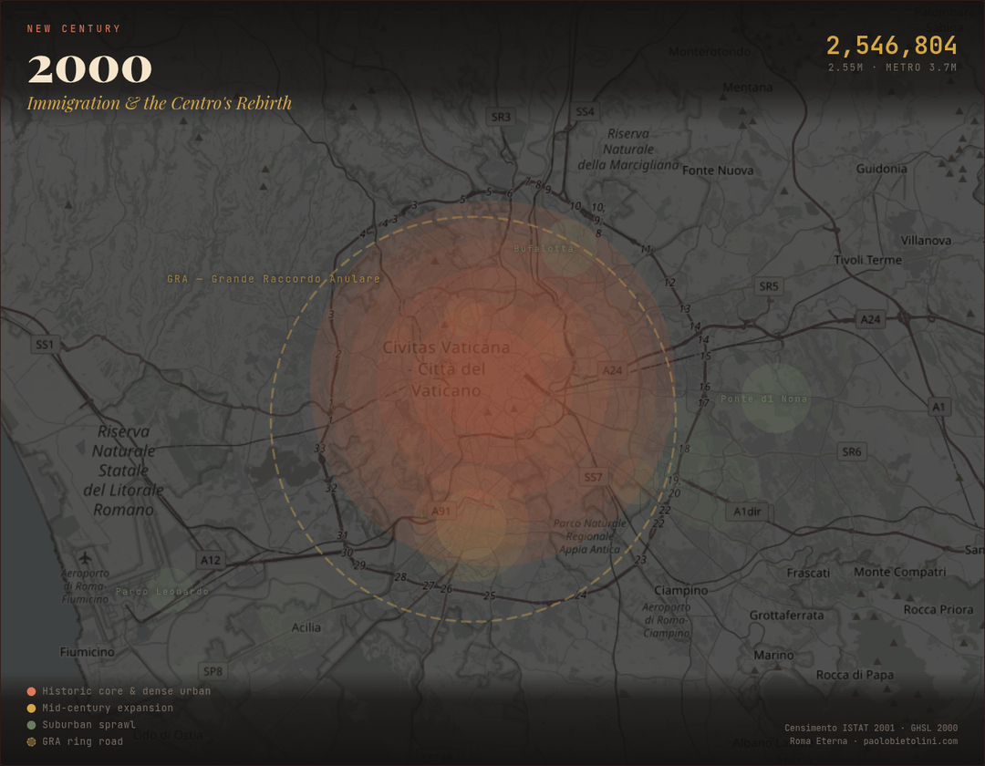
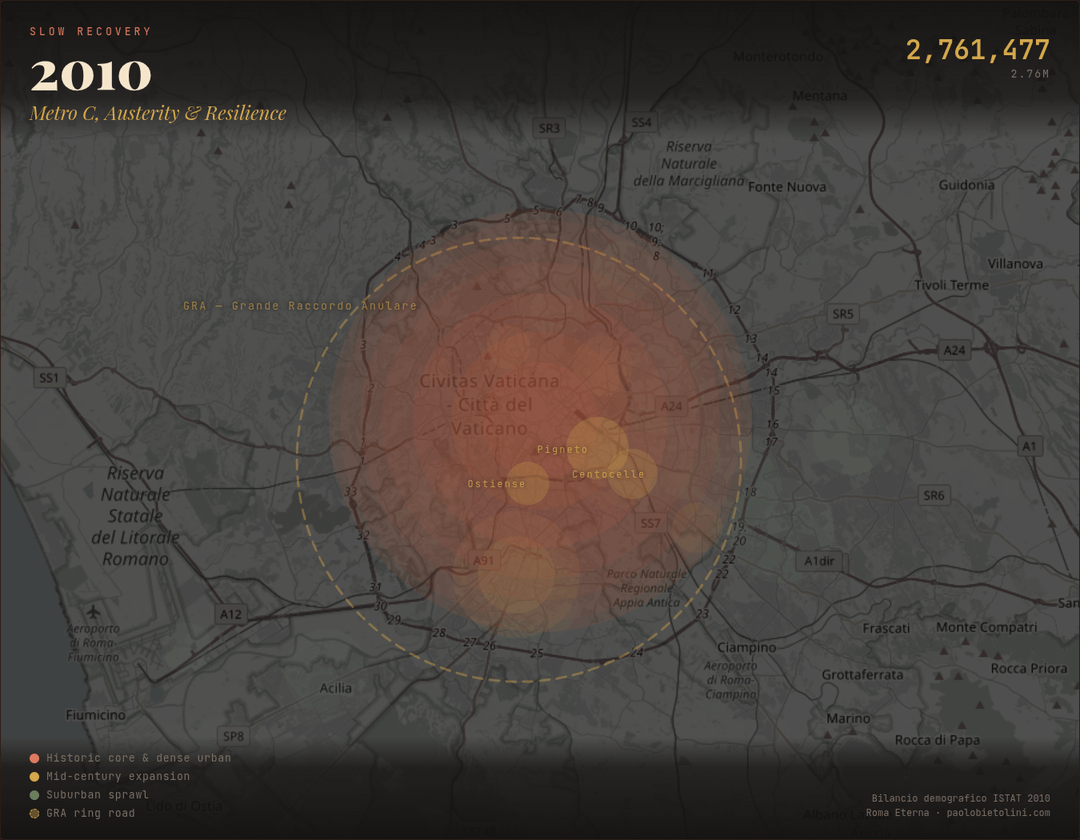
Rome went from a compact post-war city of 1.65 million to a sprawling metropolis of 2.84 million at its peak in 1981, then lost 300000 residents whilte its concrete footprint kept growing.
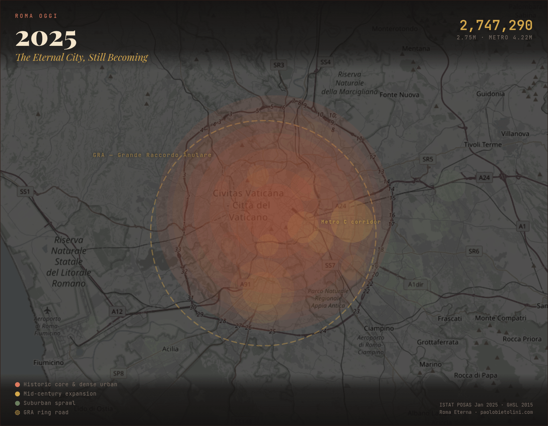
Each map shows the same area around Rome's historic center. The colored overlays represent approximate urban density:
- terracotta for the dense historic core (it makes sense to use terracotta here *wink wink*),
- ochre for mid-century expansion zones (EUR, Villaggio Olimpico),
- olive for suburban sprawl.
The dashed circle is the GRA (Grande Raccordo Anulare), the 68 km ring road built 1951–1970 that defined the city's growth boundary,and was quickly leapfrogged (my parents bought an apartment just outside its perimeter in 1975).
Some things that stood out to me:
- The 1960s "economic miracle" added 600,000 people in a single decade, mostly
- southern Italians migrating north for construction and factory jobs
- Rome's population peaked in 1981 at 2.84M, then declined steadily for 20 years as
- families moved to cheaper suburbs
- Despite losing population, the built-up area grew 16% between 1975 and 2015 (from 218 to 253 km²), classic sprawl
- The 2006 and 2014 census revisions created visible "jumps" in the population data
- as previously unregistered immigrants were counted
- Average temperature in the urban core rose 1°C between 1990 and 2014 (from 15.3°C to 16.3°C)
I'm from Rome, so this was a personal project.
Sources:
- ISTAT Censimento (1951–2021),
- ISTAT Bilancio Demografico (2002–2024),
- ISTAT POSAS January 2025,
- GHSL Urban Centre Database R2019A (JRC/European Commission),
- OpenStreetMap
Tools:
- Leaflet.js,
- HTML/CSS/Canvas,
- Chrome DevTools for export
PS: Forza Roma 🐺
Posted by TalkDataToMe_
1 Comment
not complaining but I wish we had data going further back.