
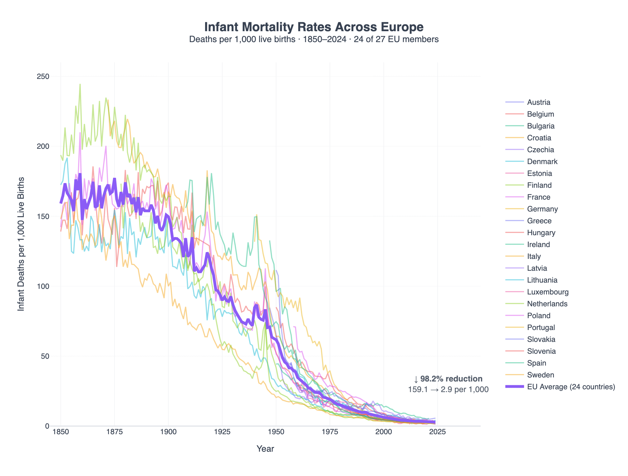
![[OC] Infant Mortality Rates Across Europe (1850 - 2024)](https://www.byteseu.com/wp-content/uploads/2026/02/lljcxrfwhtjg1-1536x1165.png "[OC] Infant Mortality Rates Across Europe (1850 – 2024)")
Source: HMD. Human Mortality Database. Max Planck Institute for Demographic Research (Germany), University of California, Berkeley (USA), and French Institute for Demographic Studies (France). Available at www.mortality.org (data downloaded on Feb 16, 2026).
Tools: Kasipa / https://kasipa.com/graph/G1xVdKvc
Posted by dcastm
9 Comments
Crazy how high it was not that long ago
Source: HMD. Human Mortality Database. Max Planck Institute for Demographic Research (Germany), University of California, Berkeley (USA), and French Institute for Demographic Studies (France). Available at [www.mortality.org](http://www.mortality.org) (data downloaded on Feb 16, 2026).
Tools: [Kasipa](https://kasipa.com/) / [https://kasipa.com/graph/G1xVdKvc](https://kasipa.com/graph/G1xVdKvc)
Pretty insane it was well over 50 still in the 1950ies. We have come a long way.
There’s so many dead babies, that if you were to put all the deaths humans have accumulated, babies will likely be the clear majority. And no people weren’t desensitized to their children dying, which makes the situation sad for how common it was.
The legend isn’t super helpful since you reuse colors. What are the high and low countries? I’m particularly interested to see what the two outside yellows are.
Maybe even grouping into different areas, like western/eastern/Northern Europe, or former Soviet countries would be very interesting.
Now include the US. For extra credit, track Black and white people in the US separately. We should be more outraged to be trailing so many countries in infant mortality. We’re talking about babies dying needlessly because of racism and the profit motive being mixed up in healthcare, both of which are issues that can be dealt with (and had been in the past) to lower the rate of infant mortality.
using the same colour for different countries it’s not very smart
Why they count Poland and Lithuania if they don’t exist as a state until 1917, but not count another Russian Empire provinces of that time?
Jarvis, add abortion data on this chart